Health & Wellness Promotional Email Template
“The monthly revival — 30% off inside”
Design Score
83/100This is a strong, visually striking email that effectively leverages ARMRA's premium, clinical brand identity. The stark contrast, bold typography, and clear scannability make it easy to digest. However, it leaves money on the table by burying the actual details of its core offer ('Up to 30% off') at the very bottom of the email. Moving the concrete offer details above the fold and tightening the introductory copy will significantly reduce friction and drive higher click-through rates.
Create Your Own
Generate professional email designs like this one in seconds with Kopi AI.
Email Details
- Subject Line
- The monthly revival — 30% off inside
- Brand
- ARMRA [eval-prod 2026-05-22]
- Industry
- Health & Wellness
- Email Type
- Promotional
- Created
- May 22, 2026
Brand Colors
Email Copy
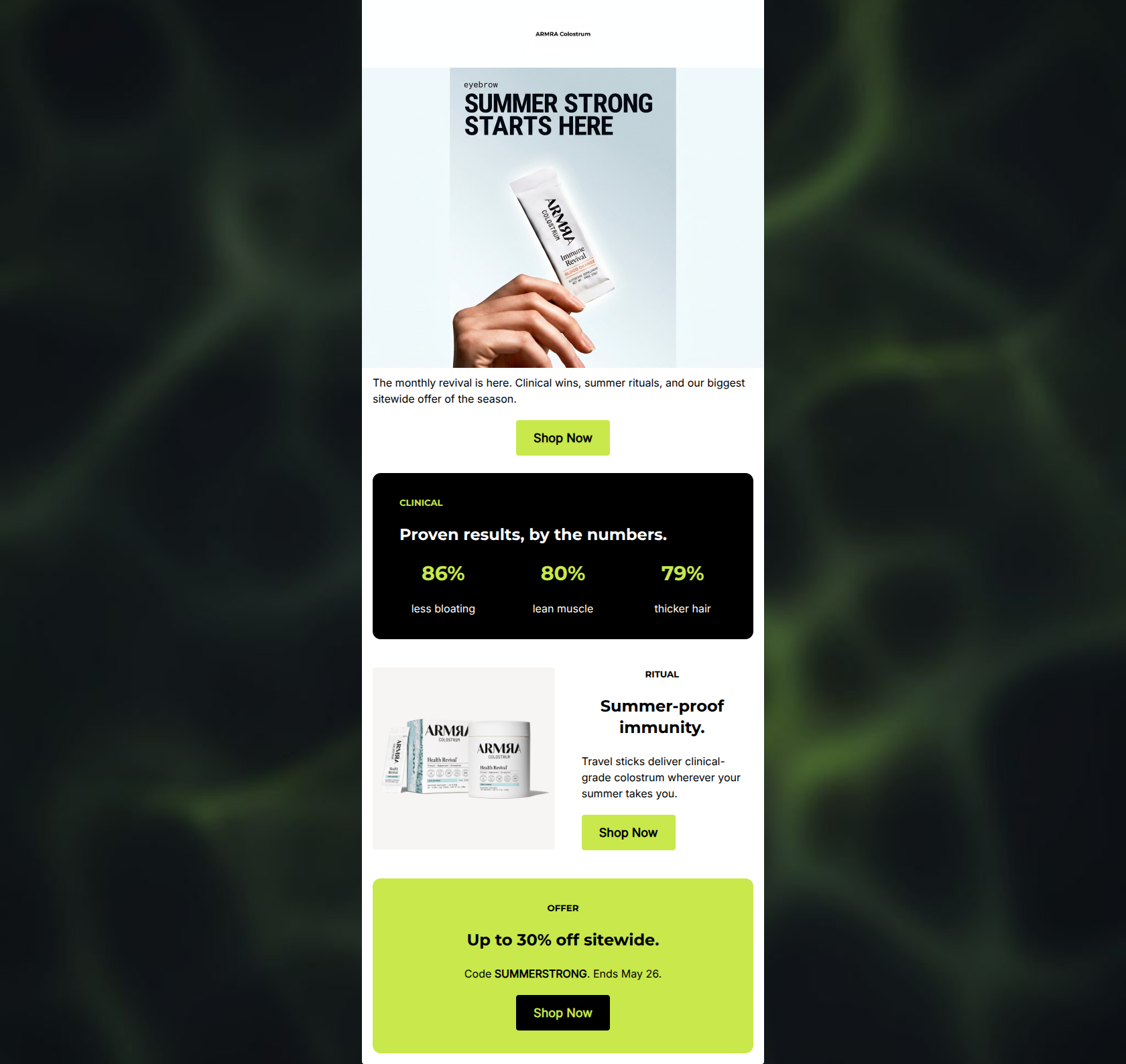
The monthly revival is here. Clinical wins, summer rituals, and our biggest sitewide offer of the season.
→ Shop Now
CLINICAL
Proven results, by the numbers.
86%
less bloating
80%
lean muscle
79%
thicker hair
RITUAL
Summer-proof immunity.
Travel sticks deliver clinical-grade colostrum wherever your summer takes you.
→ Shop Now
OFFER
Up to 30% off sitewide.
Code SUMMERSTRONG. Ends May 26.
→ Shop Now
Why This Email Works
This is a strong, visually striking email that effectively leverages ARMRA's premium, clinical brand identity. The stark contrast, bold typography, and clear scannability make it easy to digest. However, it leaves money on the table by burying the actual details of its core offer ('Up to 30% off') at the very bottom of the email. Moving the concrete offer details above the fold and tightening the introductory copy will significantly reduce friction and drive higher click-through rates.
Hero (top/initial part) Impact
70/100- High-quality, on-brand imagery that feels premium.
- Immediate establishment of the seasonal theme ('Summer Strong').
Content Structure & Flow
85/100- Clear demarcation of sections using high-contrast background colors.
- Excellent pacing; the email doesn't feel overwhelming to scroll.
Visual Hierarchy & Layout
90/100- Outstanding use of the brand's stark black, white, and neon color palette.
- Effective use of negative space inside the rounded 'cards'.
Call-to-Action Strength
95/100- Perfect consistency in CTA copy and destination.
- Excellent color contrast for the buttons (neon on white, black on neon).
Message Clarity & Tone
80/100- Strong, authoritative voice that leans into the brand's scientific positioning.
- Focus on tangible outcomes rather than just ingredients.
Readability & Scannability
92/100- Brilliant use of oversized typography for key statistics.
- Short, punchy sentences that respect the reader's time.
Offer & Value Proposition
75/100- Clear instructions on how to redeem (Code SUMMERSTRONG).
- Clear deadline provided ('Ends May 26').
Personalization & Audience Fit
85/100- Positions the product as a solution to a specific seasonal lifestyle need (travel).
- Appeals to the audience's desire for clinical validation.
Copy Conciseness & Word Economy
82/100- The statistics section uses absolute minimal text to convey maximum value.
- The ritual section gets straight to the point about product utility.
Quick Wins
- Move the 'Up to 30% off sitewide' headline into the hero section.
- Remove the introductory 'The monthly revival is here' sentence.
- Clarify the '80% lean muscle' statistic so it is scientifically precise.

Create Professional Email Designs
Generate beautiful, on-brand email designs in seconds. Just enter your brand URL and let AI do the rest.