Health & Wellness Newsletter Email Template
“The Monthly Pulse: rituals + results”
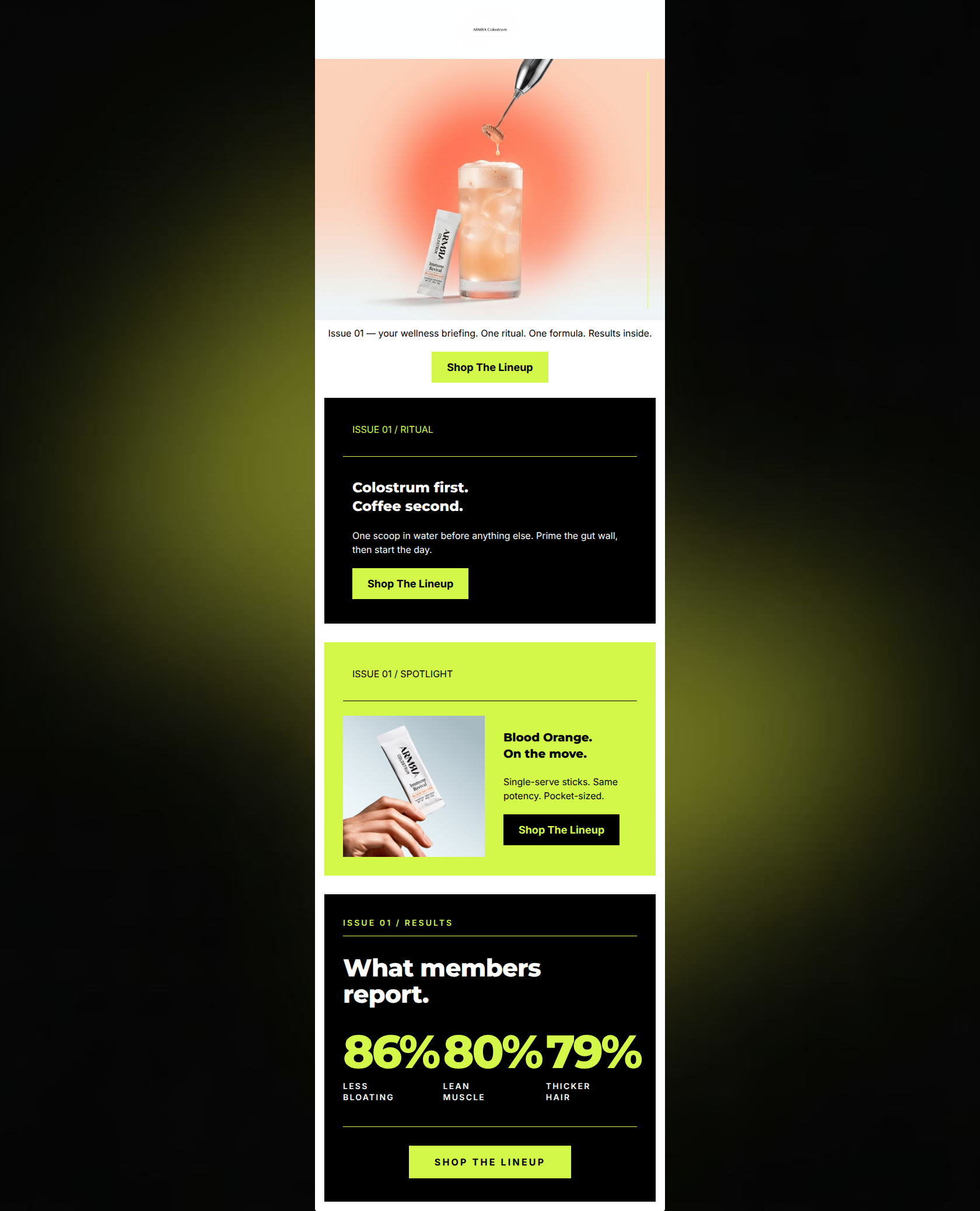
Design Score
88/100This email is a visually striking, highly effective piece of marketing that perfectly executes ARMRA's 'Premium Scientific Vitality' aesthetic. The brutalist, high-contrast layout using stark black, white, and neon chartreuse creates a strong, scannable hierarchy. The copy is exceptionally tight, relying on punchy, staccato sentences that respect the reader's time. The consistent repetition of the 'Shop The Lineup' CTA is a textbook example of driving a single conversion goal. The only notable weakness is the hero section's copy, which leans a bit too heavily into abstract 'newsletter' framing ('Issue 01') rather than immediately hooking the reader with a concrete benefit.
Create Your Own
Generate professional email designs like this one in seconds with Kopi AI.
Email Details
- Subject Line
- The Monthly Pulse: rituals + results
- Brand
- ARMRA [eval-prod 2026-05-22]
- Industry
- Health & Wellness
- Email Type
- Newsletter
- Created
- May 22, 2026
Brand Colors
Email Copy
Issue 01 — your wellness briefing. One ritual. One formula. Results inside.
→ Shop The Lineup
ISSUE 01 / RITUAL
Colostrum first. Coffee second.
One scoop in water before anything else. Prime the gut wall, then start the day.
→ Shop The Lineup
ISSUE 01 / SPOTLIGHT
Blood Orange. On the move.
Single-serve sticks. Same potency. Pocket-sized.
→ Shop The Lineup
Why This Email Works
This email is a visually striking, highly effective piece of marketing that perfectly executes ARMRA's 'Premium Scientific Vitality' aesthetic. The brutalist, high-contrast layout using stark black, white, and neon chartreuse creates a strong, scannable hierarchy. The copy is exceptionally tight, relying on punchy, staccato sentences that respect the reader's time. The consistent repetition of the 'Shop The Lineup' CTA is a textbook example of driving a single conversion goal. The only notable weakness is the hero section's copy, which leans a bit too heavily into abstract 'newsletter' framing ('Issue 01') rather than immediately hooking the reader with a concrete benefit.
Hero Impact
75/100- High-quality, conceptual product photography immediately establishes a premium feel.
- Clear, high-contrast primary CTA immediately visible above the fold.
Content Structure & Flow
90/100- Excellent use of the 'inverted pyramid' within distinct sections, leading the eye down to a CTA each time.
- The use of 'Issue 01' sub-labels creates a cohesive editorial theme without cluttering the main message.
Visual Hierarchy & Layout
95/100- The stark contrast between the black, white, and chartreuse sections makes the email incredibly easy to parse.
- The stats block at the bottom uses massive typography to ensure the most important proof points cannot be missed.
Call-to-Action Strength
95/100- Perfect adherence to the single-goal rule with consistent hrefs and copy.
- Excellent use of contrasting colors (black on chartreuse, chartreuse on black) to make the buttons pop against their respective backgrounds.
Message Clarity & Tone
88/100- Authoritative, no-nonsense brand voice.
- Provides a clear, actionable heuristic ('Colostrum first. Coffee second.').
Readability & Scannability
92/100- Zero 'walls of text'. Every word earns its place.
- The 'What members report' section uses oversized numbers to communicate value instantly.
Offer & Value Proposition
85/100- Effectively communicates the physical benefits (the 'why') in the results section.
- Sells the convenience (the 'how') in the Spotlight section ('Pocket-sized').
Personalization & Audience Fit
88/100- The 'clinical data-report' aesthetic directly appeals to the target psychographic.
- Focuses on outcomes (bloating, muscle, hair) that are highly relevant to the demographic's pain points.
Copy Conciseness & Word Economy
95/100- Staccato sentence structure drives momentum and reduces cognitive load.
- No filler adjectives or throat-clearing in the body modules.
Quick Wins
- Rewrite the hero text to lead with a concrete product benefit rather than the abstract 'Issue 01 — your wellness briefing'.
- Left-align the text in the hero section to match the structural, geometric alignment of the typography in the rest of the email.
Create Professional Email Designs
Generate beautiful, on-brand email designs in seconds. Just enter your brand URL and let AI do the rest.