Health & Wellness Promotional Email Template
“The mission behind the mix”
Design Score
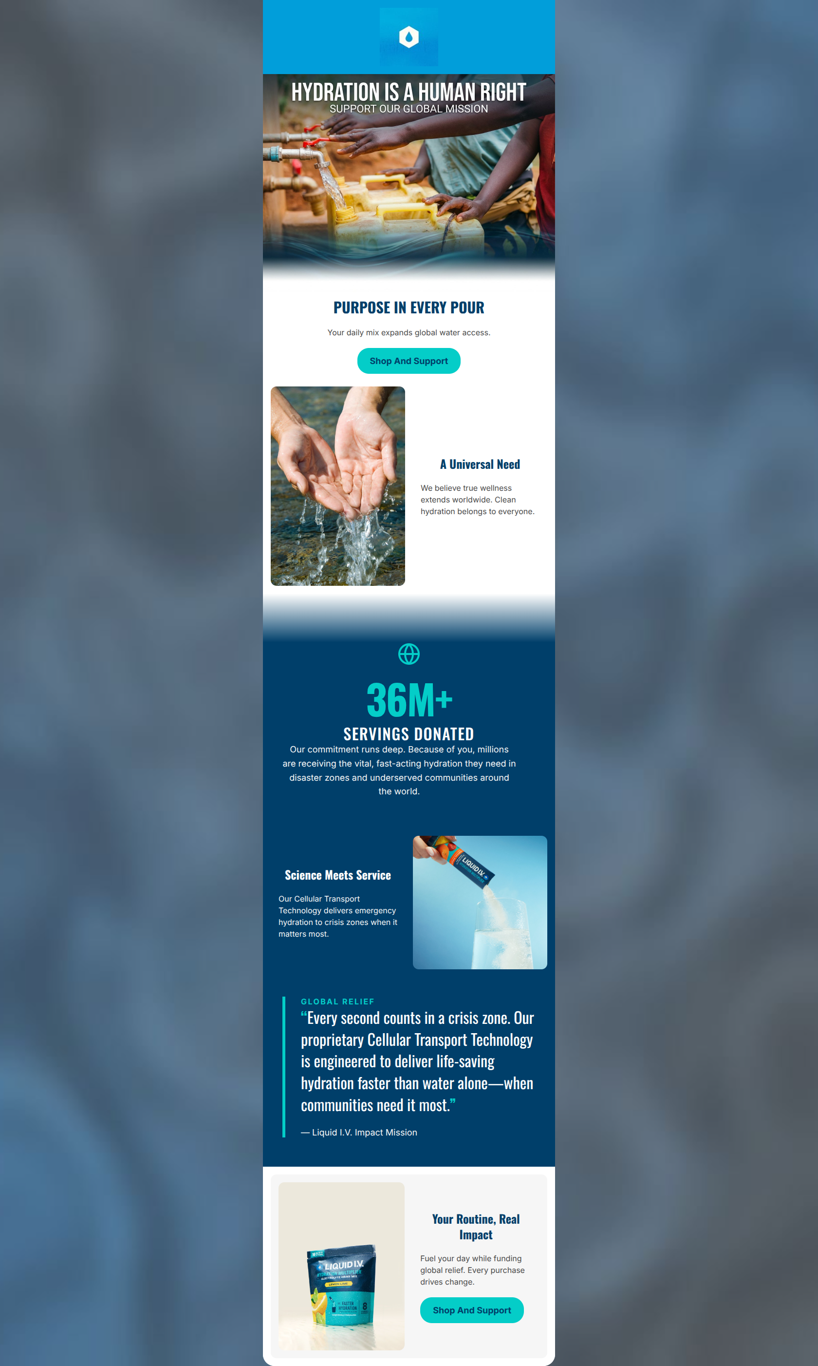
77/100This is a visually striking, mission-driven email that successfully taps into the brand's social impact pillars. It effectively uses emotional imagery and a strong, high-contrast color palette to draw the eye down the page. However, it relies too heavily on brand-building at the expense of conversion. The email suffers from large gaps between calls-to-action, text-heavy middle sections that disrupt scanning, and critical messaging trapped within an image. To move this from a 'feel-good' newsletter to a high-converting asset, the copy needs tightening and the click opportunities must be distributed more evenly throughout the narrative.
Create Your Own
Generate professional email designs like this one in seconds with Kopi AI.
Email Details
- Subject Line
- The mission behind the mix
- Brand
- Liquid IV [eval 2026-03-26]
- Industry
- Health & Wellness
- Email Type
- Promotional
- Created
- March 26, 2026
Brand Colors
Email Copy
PURPOSE IN EVERY POUR
Your daily mix expands global water access.
→ Shop And Support
A Universal Need
We believe true wellness extends worldwide. Clean hydration belongs to everyone.
Science Meets Service
Our Cellular Transport Technology delivers emergency hydration to crisis zones when it matters most.
Your Routine, Real Impact
Fuel your day while funding global relief. Every purchase drives change.
→ Shop And Support
Why This Email Works
This is a visually striking, mission-driven email that successfully taps into the brand's social impact pillars. It effectively uses emotional imagery and a strong, high-contrast color palette to draw the eye down the page. However, it relies too heavily on brand-building at the expense of conversion. The email suffers from large gaps between calls-to-action, text-heavy middle sections that disrupt scanning, and critical messaging trapped within an image. To move this from a 'feel-good' newsletter to a high-converting asset, the copy needs tightening and the click opportunities must be distributed more evenly throughout the narrative.
Hero (top/initial part) Impact
70/100- Powerful, emotionally resonant imagery immediately establishes the 'why' of the email.
- Primary CTA is present above the fold.
- Color palette is immediately recognizable.
Content Structure & Flow
82/100- Excellent use of the Z-pattern layout in the alternating image/text blocks to keep the eye moving.
- Clear progression from high-level mission to individual customer impact.
- The dark navy block effectively anchors the most important metric (36M+ servings).
Visual Hierarchy & Layout
78/100- The '36M+' stat is undeniably the focal point of the email's midsection, exactly as it should be.
- High contrast between sections prevents visual fatigue.
- Clean, modern aesthetic aligns perfectly with a premium wellness brand.
Call-to-Action Strength
68/100- High-contrast cyan buttons pop aggressively against both white and navy backgrounds.
- 'Shop And Support' is a highly effective, benefit-driven CTA phrase.
- Buttons are appropriately sized for easy interaction.
Message Clarity & Tone
88/100- Excellent use of 'We/Our' transitioning to 'You/Your' at the end to make the customer the hero ('Because of you...', 'Your Routine').
- The connection between science and social service is articulated clearly and confidently.
- Avoids being overly somber; maintains an uplifting, action-oriented tone.
Readability & Scannability
72/100- Strong use of H2s to summarize the content of each block.
- Color contrast across all text elements ensures high legibility.
- Adequate padding around text blocks prevents the layout from feeling cramped.
Offer & Value Proposition
75/100- The emotional value prop ('Fuel your day while funding global relief') is clearly stated and compelling.
- It elevates the product from a simple hydration mix to a vehicle for global change.
Personalization & Audience Fit
85/100- Appeals directly to the psychographic desire for efficiency and social responsibility.
- The imagery reflects both the global impact and the sleek, modern aesthetic the target audience expects.
Copy Conciseness & Word Economy
74/100- Headings are punchy and economical (e.g., 'Science Meets Service', 'A Universal Need').
- The CTA copy is tight and action-oriented.
Quick Wins
- Add a 'Shop And Support' button directly below the '36M+ Servings Donated' text block.
- Change the center-aligned body text under the 36M+ stat to left-aligned.
- Edit the pull quote to remove corporate jargon and focus purely on the speed and impact of the hydration.
- Extract the 'HYDRATION IS A HUMAN RIGHT' text from the hero image and render it as the primary HTML H1 above 'Purpose in Every Pour'.

Create Professional Email Designs
Generate beautiful, on-brand email designs in seconds. Just enter your brand URL and let AI do the rest.