Health & Wellness Announcement Email Template
“The mission behind every stick.”
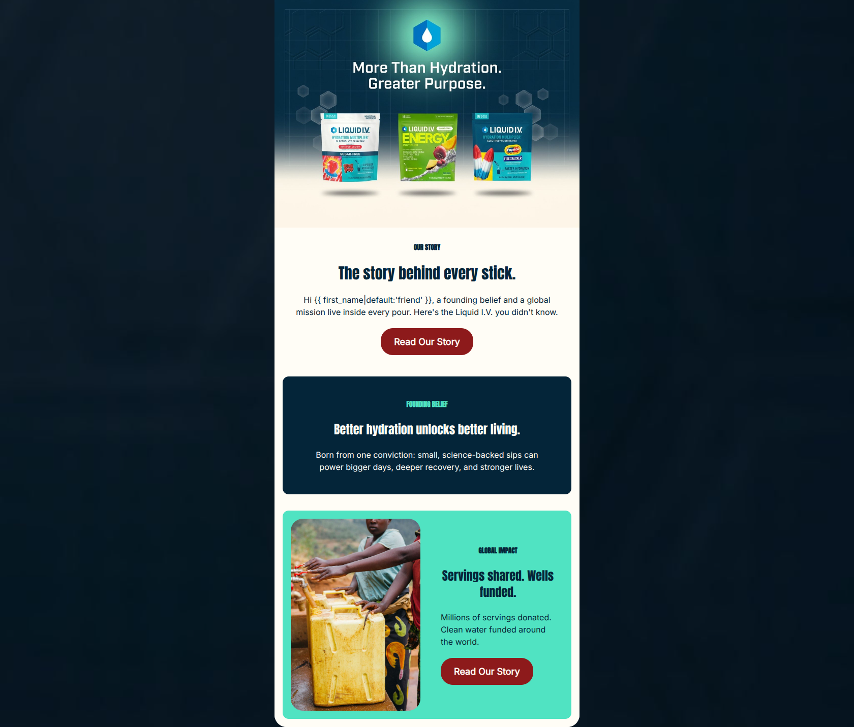
Design Score
83/100This is a strong, visually punchy, and well-executed brand mission email. It effectively utilizes high-contrast color blocking and highly scannable typography to communicate the Liquid I.V. ethos without overwhelming the reader. The word economy is excellent, and the CTA strategy strictly adheres to best practices by driving a single, unambiguous action. The primary missed opportunity is a 'dead zone' in the middle of the email where momentum builds but no click avenue is provided.
Create Your Own
Generate professional email designs like this one in seconds with Kopi AI.
Email Details
- Subject Line
- The mission behind every stick.
- Brand
- Liquid IV [eval-prod 2026-06-04]
- Industry
- Health & Wellness
- Email Type
- Announcement
- Created
- June 4, 2026
Brand Colors
Email Copy
Preview text: From our founding to millions of servings donated — meet the Liquid I.V. you didn't know.
OUR STORY
The story behind every stick.
Hi friend, a founding belief and a global mission live inside every pour. Here's the Liquid I.V. you didn't know.
→ Read Our Story
FOUNDING BELIEF
Better hydration unlocks better living.
Born from one conviction: small, science-backed sips can power bigger days, deeper recovery, and stronger lives.
GLOBAL IMPACT
Servings shared. Wells funded.
Millions of servings donated. Clean water funded around the world.
→ Read Our Story
Why This Email Works
This is a strong, visually punchy, and well-executed brand mission email. It effectively utilizes high-contrast color blocking and highly scannable typography to communicate the Liquid I.V. ethos without overwhelming the reader. The word economy is excellent, and the CTA strategy strictly adheres to best practices by driving a single, unambiguous action. The primary missed opportunity is a 'dead zone' in the middle of the email where momentum builds but no click avenue is provided.
Hero (top/initial part) Impact
75/100- Striking visual composition that immediately communicates the 'More Than Hydration' theme.
- Features core products alongside the mission statement, anchoring the brand story in tangible items.
Content Structure & Flow
85/100- Excellent use of background colors (Cream to Dark Blue to Cyan) to visually separate distinct thoughts.
- Logical narrative progression from the abstract 'story' to concrete 'impact'.
Visual Hierarchy & Layout
88/100- Strict, clear distinction between eyebrows, headlines, and body copy.
- Ample padding and margin around the color blocks prevent visual crowding.
Call-to-Action Strength
88/100- Unambiguous, singular conversion goal with perfectly consistent button copy.
- High-contrast button color (#8D1A1B) ensures the CTAs are the most prominent elements in their respective sections.
Message Clarity & Tone
85/100- Strong translation of product features ('science-backed sips') into emotional and physical benefits ('stronger lives').
- Confident, purpose-driven voice that doesn't sound overly corporate.
Readability & Scannability
92/100- Zero walls of text; every paragraph is easily digestible.
- Excellent text-to-background contrast across all three sections.
Offer & Value Proposition
80/100- Clearly communicates the brand's core differentiator (global impact/clean water) in a compelling way.
Personalization & Audience Fit
70/100- Appeals directly to the audience's psychographic profile: health-conscious, active, and purpose-driven.
Copy Conciseness & Word Economy
95/100- Exceptional brevity in the 'Global Impact' section.
- No filler adjectives; relies on strong verbs and concrete nouns.
Quick Wins
- Duplicate the 'Read Our Story' CTA button and insert it into the dark blue 'Founding Belief' section.
- Left-align the text in the bottom cyan block to match the alignment of the button below it, creating a cleaner vertical axis for the eye to follow.

Create Professional Email Designs
Generate beautiful, on-brand email designs in seconds. Just enter your brand URL and let AI do the rest.