SaaS & Software Promotional Email Template
“The honest difference between free and paid”
Design Score
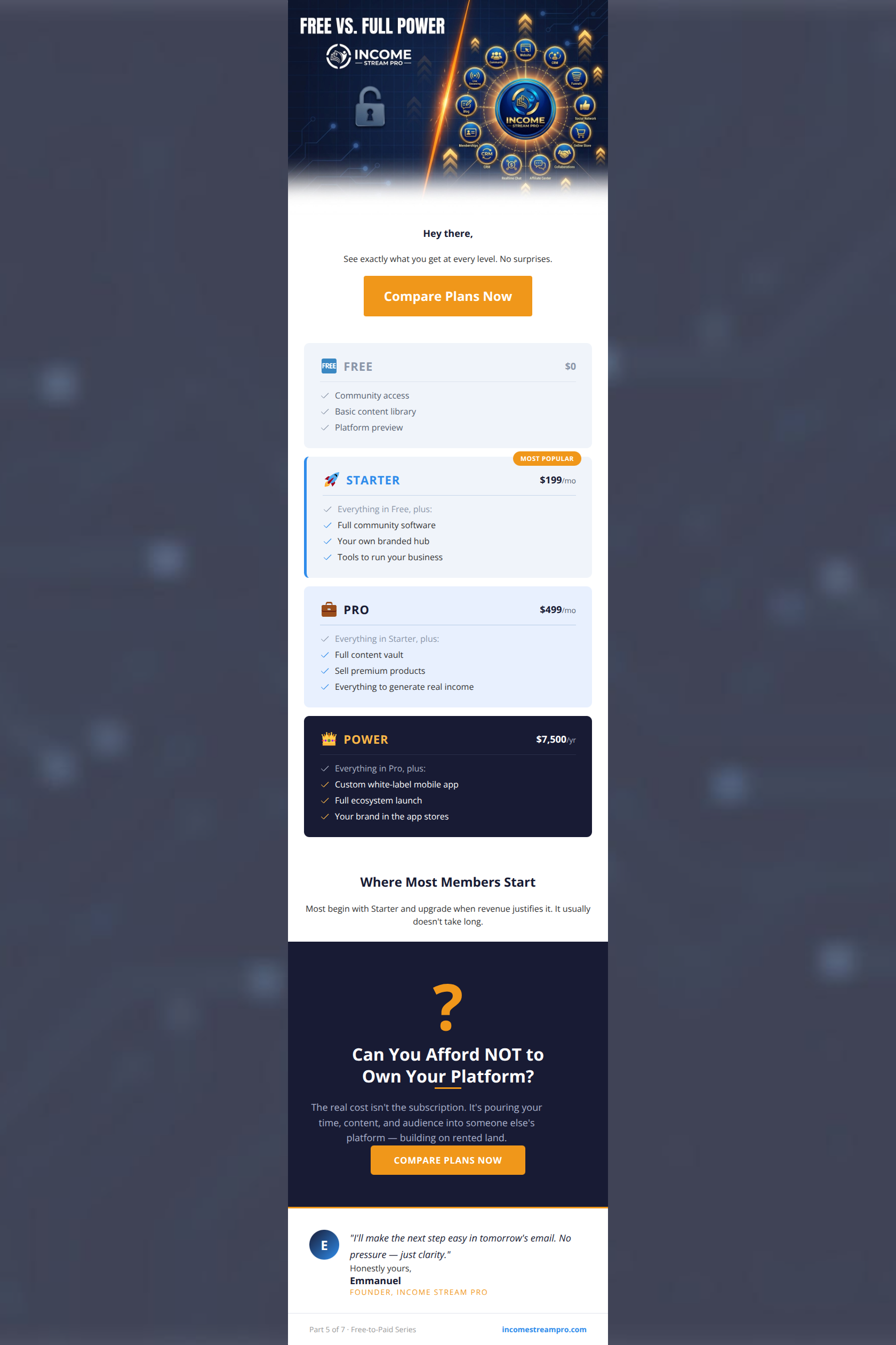
82/100This is a strong, visually sophisticated upgrade email that leverages the brand's premium aesthetic to great effect. The visual hierarchy of the pricing cards is the standout feature, making complex tier information instantly digestible while subtly guiding the user toward the 'Starter' plan. The concluding 'rented land' framing is an excellent piece of psychological copywriting that directly hits the target audience's pain points. However, the email's flow is disrupted by a premature primary CTA, and the CTA copy itself creates a logical loop by asking the user to 'Compare Plans' when the email has already done that for them. Fixing these structural friction points will elevate this from a good email to a high-converting one.
Create Your Own
Generate professional email designs like this one in seconds with Kopi AI.
Email Details
- Subject Line
- The honest difference between free and paid
- Brand
- Income Stream Pro
- Industry
- SaaS & Software
- Email Type
- Promotional
- Created
- March 31, 2026
Brand Colors
Email Copy
Hey there,
See exactly what you get at every level. No surprises.
→ Compare Plans Now
Where Most Members Start
Most begin with Starter and upgrade when revenue justifies it. It usually doesn't take long.
Why This Email Works
This is a strong, visually sophisticated upgrade email that leverages the brand's premium aesthetic to great effect. The visual hierarchy of the pricing cards is the standout feature, making complex tier information instantly digestible while subtly guiding the user toward the 'Starter' plan. The concluding 'rented land' framing is an excellent piece of psychological copywriting that directly hits the target audience's pain points. However, the email's flow is disrupted by a premature primary CTA, and the CTA copy itself creates a logical loop by asking the user to 'Compare Plans' when the email has already done that for them. Fixing these structural friction points will elevate this from a good email to a high-converting one.
Hero Impact
65/100- Clear, unmissable statement of the email's intent.
- The header graphic effectively sets the 'ecosystem' context before diving into pricing.
Content Structure & Flow
75/100- Excellent use of a 'recommendation' section to guide users suffering from choice paralysis.
- The bottom section acts as a strong, emotional closing argument after the logical presentation of features.
Visual Hierarchy & Layout
95/100- Masterful use of background color to indicate tier hierarchy.
- The 'Most Popular' badge utilizes the bright brand orange to draw the eye exactly where you want it.
- Clean, distinct separation between different email modules.
Call-to-Action Strength
68/100- High-contrast orange buttons pop perfectly against both white and navy backgrounds.
- Sufficiently large tap targets.
Message Clarity & Tone
88/100- Strong, evocative language ('rented land') that agitates a known customer pain point.
- Confident, direct tone that avoids marketing fluff.
- The sign-off ('I'll make the next step easy...') is reassuring and reduces anxiety.
Readability & Scannability
92/100- Excellent use of checkmarks and short bullet points in the pricing cards.
- High contrast typography ensures readability even on the dark 'Power' card.
- Short, punchy headlines guide the eye down the page.
Offer & Value Proposition
85/100- Transparent presentation of pricing builds trust.
- Effectively uses the 'Decoy Effect' by placing the extremely high-ticket 'Power' plan next to the accessible 'Starter' and 'Pro' plans, making them look more affordable.
Personalization & Audience Fit
80/100- Deep understanding of the target audience's core anxieties and aspirations.
- The tiered presentation respects that users are at different stages of their entrepreneurial journey.
Copy Conciseness & Word Economy
90/100- Zero filler words or 'fluff' adjectives.
- Complex pricing structures are distilled into easily digestible 3-bullet summaries.
Quick Wins
- Change the CTA button copy from 'Compare Plans Now' to a decisive action like 'Choose Your Plan' or 'Upgrade to Starter'.
- Move the primary CTA button from the Hero section to sit directly below the four pricing cards.


Create Professional Email Designs
Generate beautiful, on-brand email designs in seconds. Just enter your brand URL and let AI do the rest.