SaaS & Software Promotional Email Template
“The hidden trap of DIY websites”
Design Score
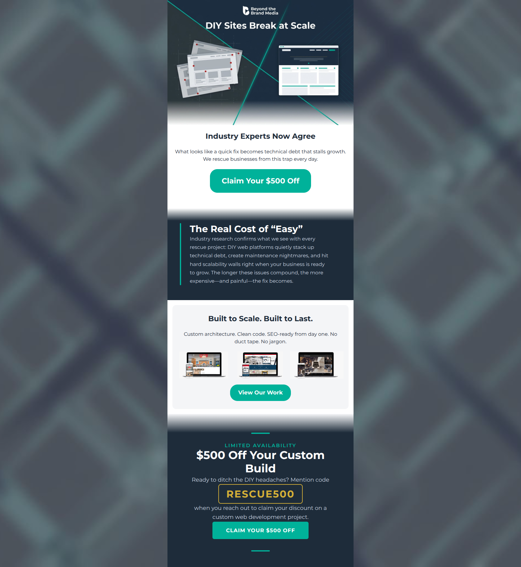
80/100This is a strong, highly targeted email that excels at speaking directly to the target audience's pain points. The brand voice is executed perfectly—authoritative yet jargon-free. The core value proposition of 'escaping the DIY trap' is compelling. However, the email's effectiveness is hampered by a slight mismatch between the premium B2B service being offered and the tactical '$500 off' discount strategy, which feels rushed when introduced immediately in the hero section. Visually, the color blocking is solid, but the muddy gradient transitions detract from the brand's sharp, modern aesthetic.
Create Your Own
Generate professional email designs like this one in seconds with Kopi AI.
Email Details
- Subject Line
- The hidden trap of DIY websites
- Brand
- Beyond the Brand Media®
- Industry
- SaaS & Software
- Email Type
- Promotional
- Created
- April 2, 2026
Brand Colors
Email Copy
Industry Experts Now Agree
What looks like a quick fix becomes technical debt that stalls growth. We rescue businesses from this trap every day.
→ Claim Your $500 Off
Built to Scale. Built to Last.
Custom architecture. Clean code. SEO-ready from day one. No duct tape. No jargon.
→ View Our Work
Why This Email Works
This is a strong, highly targeted email that excels at speaking directly to the target audience's pain points. The brand voice is executed perfectly—authoritative yet jargon-free. The core value proposition of 'escaping the DIY trap' is compelling. However, the email's effectiveness is hampered by a slight mismatch between the premium B2B service being offered and the tactical '$500 off' discount strategy, which feels rushed when introduced immediately in the hero section. Visually, the color blocking is solid, but the muddy gradient transitions detract from the brand's sharp, modern aesthetic.
Hero Impact
65/100- The headline baked into the image ('DIY Sites Break at Scale') immediately identifies a major pain point.
- The body copy perfectly captures the frustration of 'technical debt'.
Content Structure & Flow
75/100- Clear delineation between the problem, the solution, and the offer.
- The sequence logically guides the reader from realizing their pain to seeing proof that Beyond the Brand Media can solve it.
Visual Hierarchy & Layout
70/100- The vertical teal accent line in the navy section creates a sleek, highly readable visual anchor.
- Color contrast is excellent throughout, making primary elements stand out.
Call-to-Action Strength
75/100- Excellent visual pop—the vibrant teal buttons on navy and white backgrounds pass the 'squint test' effortlessly.
- The CTA copy is clear and leaves no ambiguity about what happens upon clicking.
Message Clarity & Tone
92/100- Phrases like 'No duct tape. No jargon.' perfectly align with the target audience's desire for straightforward, professional solutions.
- The copy effectively translates technical concepts (CMS scalability) into business impacts (mounting technical debt, maintenance nightmares).
Readability & Scannability
88/100- Excellent use of short, staccato sentences ('Custom architecture. Clean code.') to drive rhythm and readability.
- Generous padding around text blocks prevents visual crowding.
Offer & Value Proposition
78/100- The value proposition directly targets the exact pain point of the intended audience.
- The use of a promo code ('RESCUE500') adds a tangible element to the offer.
Personalization & Audience Fit
88/100- The messaging treats the reader as a smart business operator who has outgrown their current tools.
- Visually matches the professional, modern aesthetic expected by mid-to-high-end commercial clients.
Copy Conciseness & Word Economy
85/100- The 'Built to Scale. Built to Last.' section is a masterclass in concise, impactful copywriting.
- Avoids long, rambling paragraphs in favor of punchy, easily digestible statements.
Quick Wins
- Remove the blurry gradient fades between color sections and replace them with sharp, clean lines to match the brand's geometric aesthetic.
- Increase the size of the three portfolio thumbnails so the quality of the work is actually discernible.
- Change the hero sub-headline from 'Industry Experts Now Agree' to a more direct, pain-focused question.



Create Professional Email Designs
Generate beautiful, on-brand email designs in seconds. Just enter your brand URL and let AI do the rest.