Health & Wellness Promotional Email Template
“The health layer most people ignore”
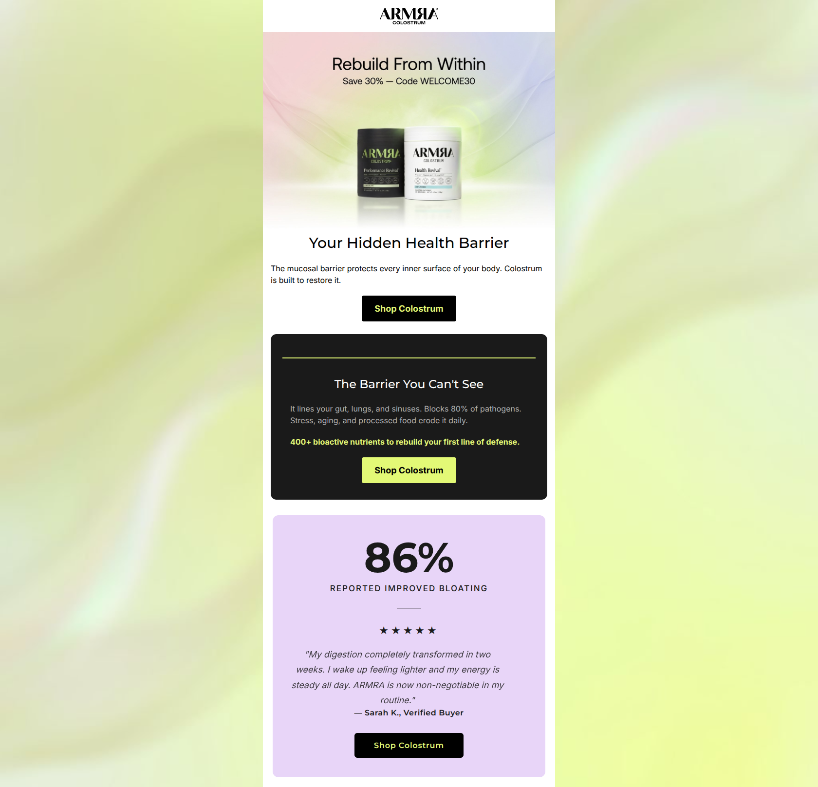
Design Score
80/100This is a strong, aesthetically pleasing email that deeply understands its target audience. The visual flow from the ethereal hero into the clinical black card and the soft testimonial card creates an excellent scanning experience. The copy is generally tight and authoritative. However, the email makes a critical conversion error by baking the primary 30% off offer entirely into the hero image. Additionally, the repetitive CTA copy ('Shop Colostrum' three times) misses opportunities to drive action through varied psychological triggers.
Create Your Own
Generate professional email designs like this one in seconds with Kopi AI.
Email Details
- Subject Line
- The health layer most people ignore
- Brand
- ARMRA [eval 2026-03-26]
- Industry
- Health & Wellness
- Email Type
- Promotional
- Created
- March 26, 2026
Brand Colors
Email Copy
Your Hidden Health Barrier
The mucosal barrier protects every inner surface of your body. Colostrum is built to restore it.
→ Shop Colostrum
The Barrier You Can't See
It lines your gut, lungs, and sinuses. Blocks 80% of pathogens. Stress, aging, and processed food erode it daily.
400+ bioactive nutrients to rebuild your first line of defense.
→ Shop Colostrum
Why This Email Works
This is a strong, aesthetically pleasing email that deeply understands its target audience. The visual flow from the ethereal hero into the clinical black card and the soft testimonial card creates an excellent scanning experience. The copy is generally tight and authoritative. However, the email makes a critical conversion error by baking the primary 30% off offer entirely into the hero image. Additionally, the repetitive CTA copy ('Shop Colostrum' three times) misses opportunities to drive action through varied psychological triggers.
Hero Impact
70/100- Beautiful, brand-aligned imagery that immediately signals premium wellness.
- Clear headline ('Rebuild From Within') sets the thematic stage quickly.
Content Structure & Flow
88/100- Flawless inverted pyramid flow in each distinct section.
- Clear distinction between sections using distinct background colors prevents visual fatigue.
Visual Hierarchy & Layout
90/100- High-contrast color blocking makes scanning effortless.
- The oversized '86%' stat immediately demands attention and gives the testimonial weight.
Call-to-Action Strength
65/100- Buttons have excellent contrast against their respective backgrounds.
- CTAs are placed at logical intervals, meaning a click is never more than a short scroll away.
Message Clarity & Tone
85/100- Authoritative, science-backed tone ('Blocks 80% of pathogens').
- Directly addresses lifestyle factors that erode health ('Stress, aging, and processed food').
Readability & Scannability
88/100- Short, punchy sentences make the science easy to consume.
- Excellent use of color contrast (chartreuse on black) to highlight the most important sentence ('400+ bioactive nutrients...').
Offer & Value Proposition
60/100- The functional value proposition ('rebuild your first line of defense') is crystal clear.
- The inclusion of a specific promo code (WELCOME30) creates an immediate reason to act.
Personalization & Audience Fit
90/100- Directly addresses issues relevant to the demographic (bloating, digestion, stress).
- Focuses on 'optimization' and 'defense', which are key triggers for this psychographic.
Copy Conciseness & Word Economy
85/100- No throat-clearing openers. The email gets right to the point.
- The testimonial is well-edited to highlight the exact transformation ('digestion completely transformed in two weeks').
Quick Wins
- Move the 'Save 30% - Code WELCOME30' text out of the image and into live HTML.
- Vary the CTA button copy across the three sections (e.g., 'Claim 30% Off', 'Rebuild Your Defense', 'Shop Colostrum').
- Change the second H2 ('The Barrier You Can't See') to avoid repeating the 'hidden' concept from the H1.

Create Professional Email Designs
Generate beautiful, on-brand email designs in seconds. Just enter your brand URL and let AI do the rest.