Beauty & Skincare Promotional Email Template
“The fundamentals of daily care.”

Design Score
65/100This email fundamentally understands the Aesop brand voice and aesthetic—utilizing stark layouts, literary copy, and distinct color blocking. However, a glaring QA failure in the hero image and disjointed visual assets severely undercut the 'uncompromising quality' the copy boasts about. While the structure is logical, the execution feels unpolished for a luxury brand, leaving money on the table through missed value proposition framing and embedded image text.
Create Your Own
Generate professional email designs like this one in seconds with Kopi AI.
Email Details
- Subject Line
- The fundamentals of daily care.
- Brand
- Aesop
- Industry
- Beauty & Skincare
- Email Type
- Promotional
- Created
- March 20, 2026
Brand Colors
Email Copy
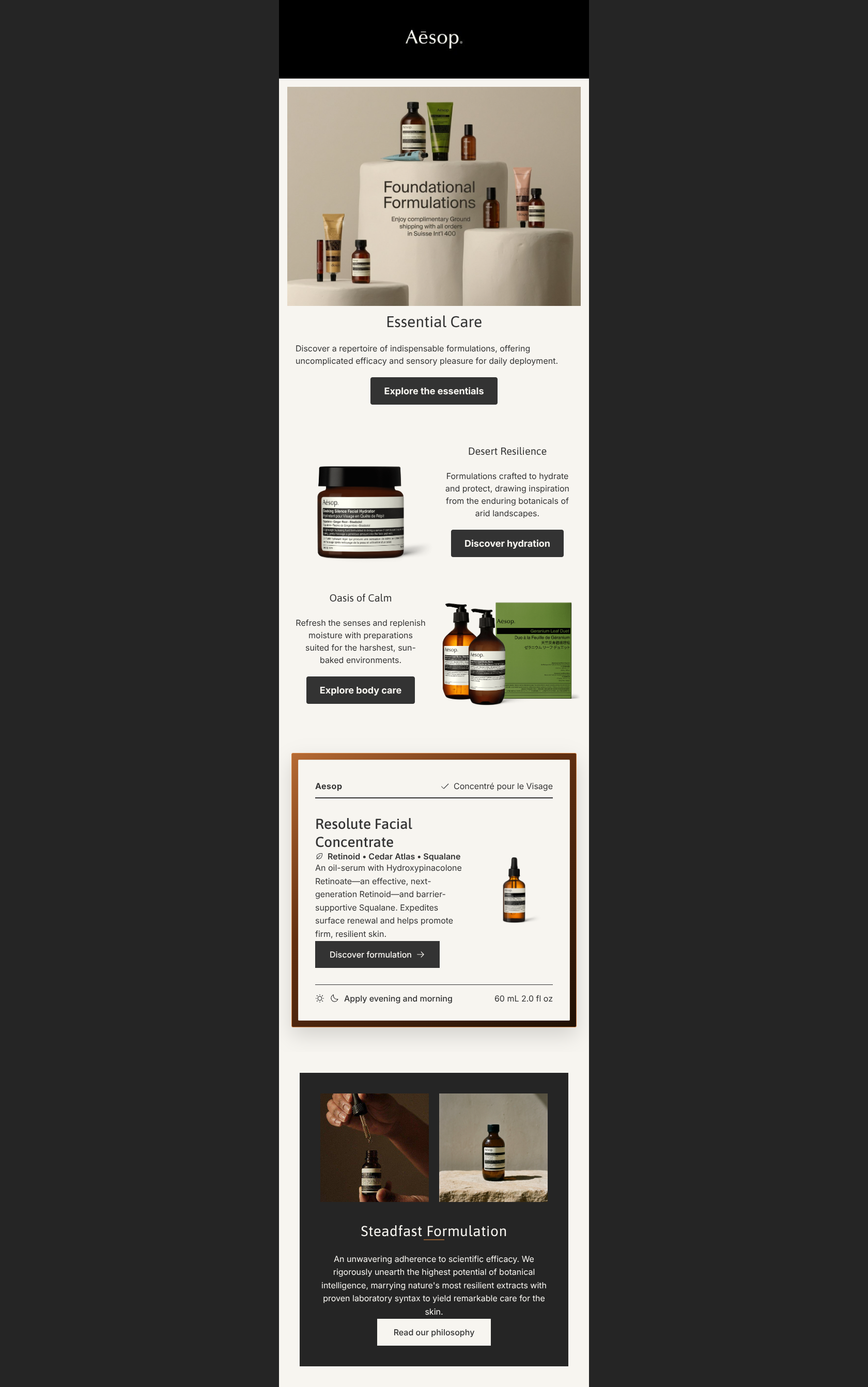
Essential Care
Discover a repertoire of indispensable formulations, offering uncomplicated efficacy and sensory pleasure for daily deployment.
→ Explore the essentials
Desert Resilience
Formulations crafted to hydrate and protect, drawing inspiration from the enduring botanicals of arid landscapes.
→ Discover hydration
Oasis of Calm
Refresh the senses and replenish moisture with preparations suited for the harshest, sun-baked environments.
→ Explore body care
Why This Email Works
This email fundamentally understands the Aesop brand voice and aesthetic—utilizing stark layouts, literary copy, and distinct color blocking. However, a glaring QA failure in the hero image and disjointed visual assets severely undercut the 'uncompromising quality' the copy boasts about. While the structure is logical, the execution feels unpolished for a luxury brand, leaving money on the table through missed value proposition framing and embedded image text.
Hero (top/initial part) Impact
45/100- High-quality, on-brand hero photography utilizing characteristic travertine and amber.
- Clear, high-contrast primary CTA immediately visible without scrolling.
Content Structure & Flow
75/100- Linear, single-column design eliminates reading friction.
- Generous use of negative space allows the content to breathe.
Visual Hierarchy & Layout
60/100- The dark philosophy block at the bottom successfully anchors the email and signals the conclusion.
- Alignment of text and buttons is tight and purposeful.
Call-to-Action Strength
75/100- Buttons are appropriately sized with clear, uncluttered tap targets.
- High contrast between the #333333 button fill and #F7F5F0 background.
Message Clarity & Tone
85/100- Avoids typical beauty industry hyperbole in favor of understated confidence.
- Vocabulary perfectly matches the 'intellectual apothecary' positioning.
Readability & Scannability
80/100- Excellent color contrast between text and background across all modules.
- Appropriate line height (leading) improves overall legibility.
Offer & Value Proposition
60/100- The brand's overarching value proposition (scientific rigor + botanicals) is clearly stated in the final module.
Personalization & Audience Fit
75/100- The overall vibe aligns flawlessly with the customer's desire for sophistication and calm.
Quick Wins
- Immediately replace the hero image to remove the 'in Suisse Int'l 400' design artifact.
- Move the free shipping offer out of the image and into a dedicated text banner at the top of the email.
- Change the secondary CTA copy from 'Discover the collection' to something distinct from the primary CTA, like 'View the routine'.
Create Professional Email Designs
Generate beautiful, on-brand email designs in seconds. Just enter your brand URL and let AI do the rest.