Beauty & Skincare Promotional Email Template
“Salon Results at Home — Save 20%”
Design Score
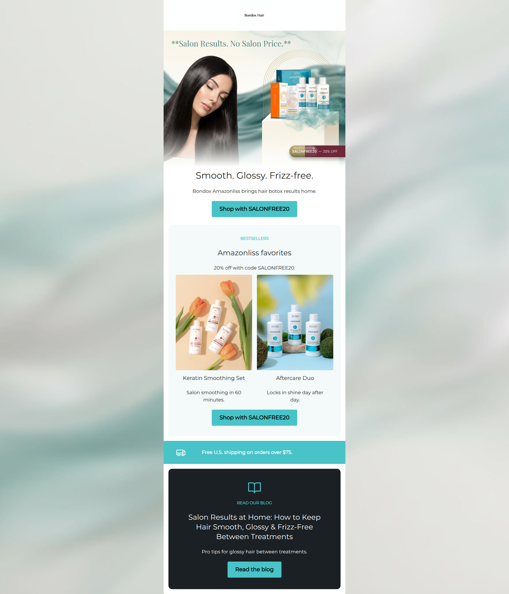
82/100This is a strong, conversion-focused promotional email that effectively communicates its primary value proposition: salon-quality hair at home. The layout is clean, the color palette aligns with the 'clinical beauty' brand aesthetic, and the copy is generally punchy and benefit-driven. However, a significant quality assurance error in the hero image (visible markdown asterisks) undermines the premium positioning. Additionally, the inclusion of a highly prominent secondary CTA for the blog distracts from the primary purchasing goal.
Create Your Own
Generate professional email designs like this one in seconds with Kopi AI.
Email Details
- Subject Line
- Salon Results at Home — Save 20%
- Brand
- Bondox Hair
- Industry
- Beauty & Skincare
- Email Type
- Promotional
- Created
- May 18, 2026
Brand Colors
Email Copy
Smooth. Glossy. Frizz-free.
Bondox Amazonliss brings hair botox results home.
→ Shop with SALONFREE20
BESTSELLERS
Amazonliss favorites
20% off with code SALONFREE20.
Keratin Smoothing Set
Salon smoothing in 60 minutes.
Aftercare Duo
Locks in shine day after day.
→ Shop with SALONFREE20
Free U.S. shipping on orders over $75.
READ OUR BLOG
Salon Results at Home: How to Keep Hair Smooth, Glossy & Frizz-Free Between Treatments
Pro tips for glossy hair between treatments.
→ Read the blog
Why This Email Works
This is a strong, conversion-focused promotional email that effectively communicates its primary value proposition: salon-quality hair at home. The layout is clean, the color palette aligns with the 'clinical beauty' brand aesthetic, and the copy is generally punchy and benefit-driven. However, a significant quality assurance error in the hero image (visible markdown asterisks) undermines the premium positioning. Additionally, the inclusion of a highly prominent secondary CTA for the blog distracts from the primary purchasing goal.
Hero (top/initial part) Impact
70/100- The H1 'Smooth. Glossy. Frizz-free.' is excellent—it instantly communicates the end-benefit rather than just listing features.
- The supporting text cleanly bridges the gap between the brand's 'hair botox' positioning and the at-home convenience.
Content Structure & Flow
85/100- The inclusion of the shipping banner acts as a strong, logical 'kicker' just before the footer area, addressing a common friction point.
- Grouping the products into a 'favorites' grid helps the user understand their options quickly without excessive scrolling.
Visual Hierarchy & Layout
78/100- The alternating background colors (white, soft teal, dark charcoal) clearly delineate different sections and maintain visual interest.
- The primary brand color (#48C3C8) is used strictly for high-priority elements (CTAs, key headings, icons), ensuring they stand out.
Call-to-Action Strength
80/100- The primary CTA button ('Shop with SALONFREE20') is repeated twice and shares the exact same destination, reinforcing the desired action.
- Embedding the promo code directly into the button text eliminates the need for the user to memorize it while clicking through.
Message Clarity & Tone
85/100- Phrases like 'Salon smoothing in 60 minutes' provide concrete, specific promises that resonate with a time-poor demographic.
- The language feels elevated yet accessible, fitting the mid-range to premium positioning.
Readability & Scannability
92/100- High contrast text on all backgrounds ensures legibility.
- Product descriptions under the images are limited to single, impactful sentences rather than dense paragraphs.
Offer & Value Proposition
90/100- The offer is front-and-center in the hero image, the hero CTA, the section header, and the secondary CTA.
- The value proposition directly attacks the primary customer pain point (expensive, time-consuming salon visits).
Personalization & Audience Fit
75/100- The aesthetic and messaging are perfectly calibrated for women seeking 'clinical beauty' solutions.
- The imagery features hair types that match the desired end-state of the target demographic.
Copy Conciseness & Word Economy
82/100- The hero H1 is a masterclass in word economy: three words that completely summarize the brand promise.
- Product descriptions ('Locks in shine day after day') focus entirely on the benefit without wasting words on features.
Quick Wins
- Replace the hero image to remove the baked-in markdown asterisks ('**').
- Change the 'Read the blog' button to a simple text link to prevent it from competing visually with the primary purchasing CTA.
- Shorten the blog section heading to remove repetitive phrasing that was already used in the hero section.

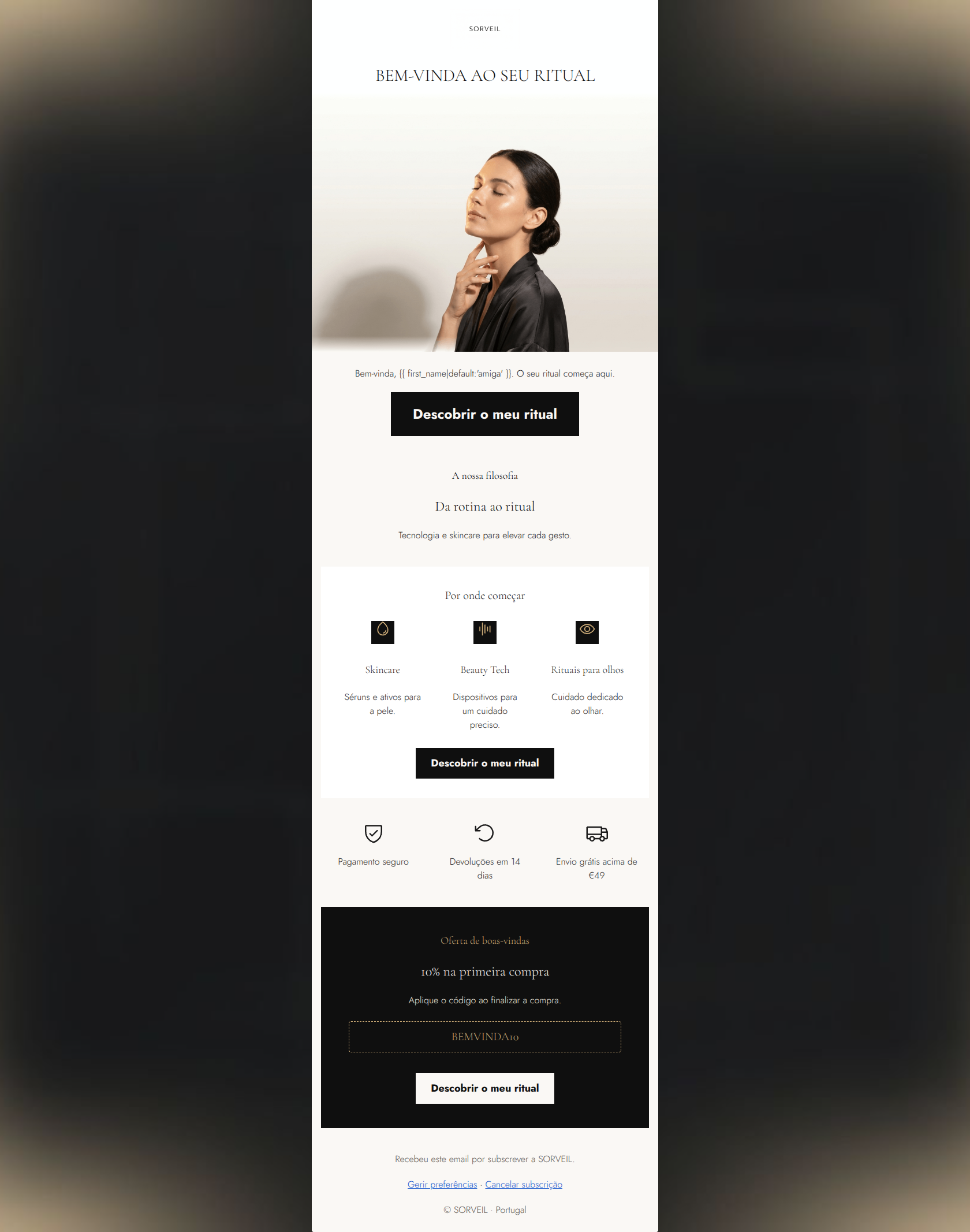


Create Professional Email Designs
Generate beautiful, on-brand email designs in seconds. Just enter your brand URL and let AI do the rest.