Fashion & Apparel Product Launch Email Template
“The collection is live.”
Design Score
88/100This email is a highly effective, brand-led execution. It confidently delivers on its 'stealth-luxury' positioning through stark monochrome visuals, minimal copy, and aggressive use of negative space. The inverted pyramid structure funnels attention beautifully toward the primary action, and the repetition of the core CTA is textbook conversion optimization. The primary areas for refinement involve fixing a structural hiccup at the end of the product grid and injecting a fraction more material detail to ground the lofty aesthetic in tangible quality.
Create Your Own
Generate professional email designs like this one in seconds with Kopi AI.
Email Details
- Subject Line
- The collection is live.
- Brand
- My Store
- Industry
- Fashion & Apparel
- Email Type
- Product Launch
- Created
- May 25, 2026
Brand Colors
Email Copy
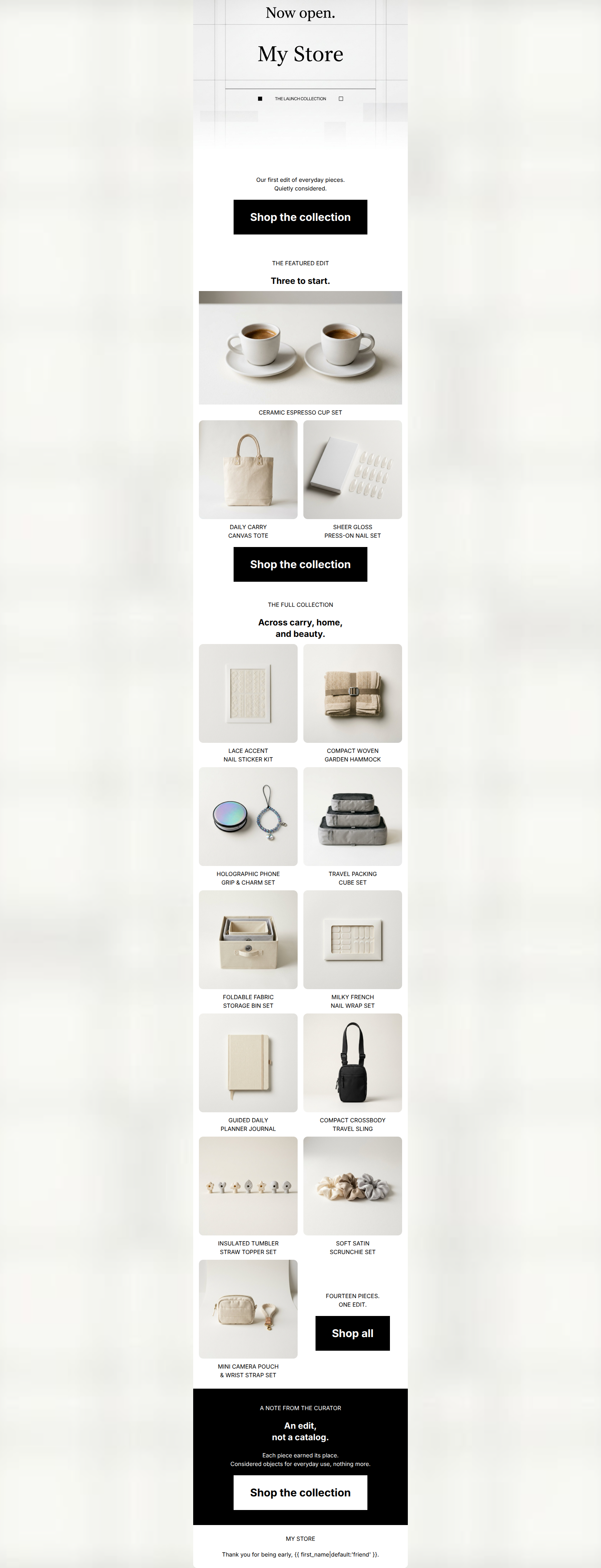
Our first edit of everyday pieces. Quietly considered.
→ Shop the collection
THE FEATURED EDIT
Three to start.
CERAMIC ESPRESSO CUP SET
DAILY CARRY CANVAS TOTE
SHEER GLOSS PRESS-ON NAIL SET
→ Shop the collection
THE FULL COLLECTION
Across carry, home, and beauty.
LACE ACCENT NAIL STICKER KIT
COMPACT WOVEN GARDEN HAMMOCK
HOLOGRAPHIC PHONE GRIP & CHARM SET
TRAVEL PACKING CUBE SET
FOLDABLE FABRIC STORAGE BIN SET
MILKY FRENCH NAIL WRAP SET
GUIDED DAILY PLANNER JOURNAL
COMPACT CROSSBODY TRAVEL SLING
INSULATED TUMBLER STRAW TOPPER SET
SOFT SATIN SCRUNCHIE SET
MINI CAMERA POUCH & WRIST STRAP SET
FOURTEEN PIECES. ONE EDIT.
→ Shop all
A NOTE FROM THE CURATOR
An edit, not a catalog.
Each piece earned its place. Considered objects for everyday use, nothing more.
→ Shop the collection
MY STORE
Thank you for being early, friend.
Why This Email Works
This email is a highly effective, brand-led execution. It confidently delivers on its 'stealth-luxury' positioning through stark monochrome visuals, minimal copy, and aggressive use of negative space. The inverted pyramid structure funnels attention beautifully toward the primary action, and the repetition of the core CTA is textbook conversion optimization. The primary areas for refinement involve fixing a structural hiccup at the end of the product grid and injecting a fraction more material detail to ground the lofty aesthetic in tangible quality.
Hero Impact
85/100- Striking visual contrast immediately arrests scrolling.
- Clear, definitive headline ('Now open').
- Immediate introduction of the primary conversion action above the fold.
Content Structure & Flow
82/100- Logical progression from macro (launch) to micro (products) to emotional (curator note).
- Clear section dividers maintain structure and categorization.
Visual Hierarchy & Layout
88/100- Flawless use of white space to communicate premium positioning.
- High-contrast elements ensure the eye is drawn directly to CTAs.
- Consistent typographical hierarchy (H2s vs kickers).
Call-to-Action Strength
95/100- Perfect repetition of the primary conversion goal.
- Excellent visual contrast (black on white, white on black) makes the buttons unmissable.
- Slight copy variance ('Shop all' vs 'Shop the collection') maintains unambiguous intent while fitting the specific context.
Message Clarity & Tone
90/100- Tone is consistently authoritative and restrained.
- The 'Curator' framing adds a layer of exclusivity and intentionality.
- Avoids needy marketing fluff entirely.
Readability & Scannability
85/100- Maximum color contrast between text and background.
- Bite-sized copy blocks prevent cognitive overload.
- Clear headings guide the eye down the page.
Offer & Value Proposition
78/100- The exclusivity of the launch is well communicated.
- The 'edit, not a catalog' messaging frames a small inventory as a deliberate benefit.
Personalization & Audience Fit
88/100- Aesthetic perfectly matches the target audience's desires.
- Effectively validates the user's status as an 'early' supporter.
- Unapologetic design choices signal confidence.
Copy Conciseness & Word Economy
96/100- Zero filler words or generic marketing jargon.
- Sentences are incredibly tight and impactful.
- Lets the visuals do the heavy lifting, as intended.
Quick Wins
- Convert all product titles under the images from ALL CAPS to Title Case to significantly improve scanning speed.
- Realign the final row of the product grid: move the 'FOURTEEN PIECES' text and button to a full-width centered block below the grid to fix the awkward layout break.
- Ensure the final 'Shop all' button width visually matches the weight of the full-width buttons used elsewhere to maintain consistency.



Create Professional Email Designs
Generate beautiful, on-brand email designs in seconds. Just enter your brand URL and let AI do the rest.