Media & Entertainment Order Confirmation Email Template
“Thank you for trusting our small shop”
Design Score
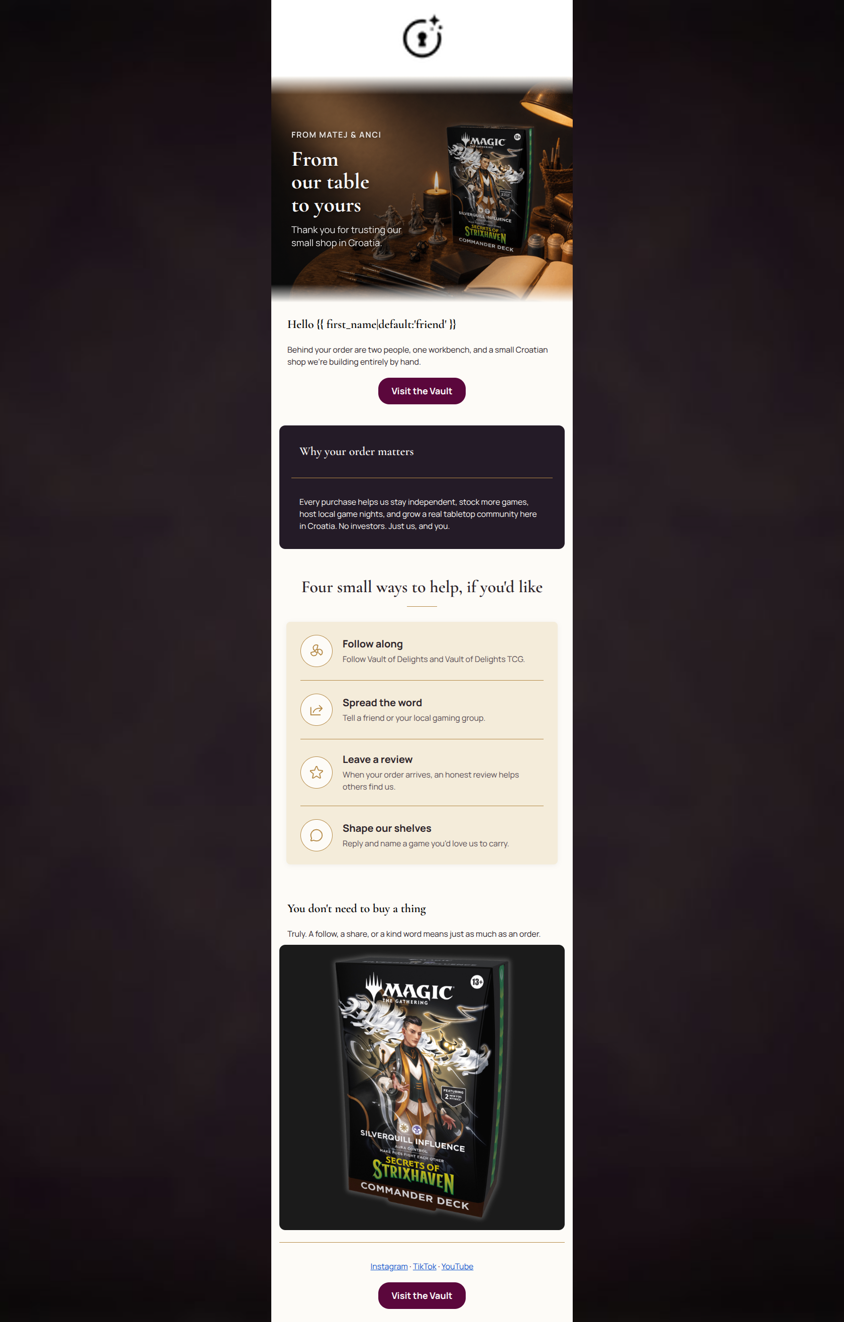
80/100Vault of Delights has crafted a visually stunning, emotionally resonant post-purchase email that beautifully executes the 'elevated dark academia' brand aesthetic. The founder-led tone is authentic, welcoming, and effectively humanizes the shop. However, the email loses focus in the bottom third. By presenting a massive product image immediately after explicitly stating 'You don't need to buy a thing,' the layout introduces visual and narrative friction. Furthermore, while the copy asks the user to follow, review, or share, the primary CTA ('Visit the Vault') generically directs them back to the homepage. Streamlining the final asks and aligning the visual hierarchy with the community-focused message will elevate this from a beautiful design into a high-converting loyalty driver.
Create Your Own
Generate professional email designs like this one in seconds with Kopi AI.
Email Details
- Subject Line
- Thank you for trusting our small shop
- Brand
- Vault of Delights
- Industry
- Media & Entertainment
- Email Type
- Order Confirmation
- Created
- July 14, 2026
Brand Colors
Email Copy
Hello friend
Behind your order are two people, one workbench, and a small Croatian shop we're building entirely by hand.
→ Visit the Vault
Why your order matters
Every purchase helps us stay independent, stock more games, host local game nights, and grow a real tabletop community here in Croatia. No investors. Just us, and you.
You don't need to buy a thing
Truly. A follow, a share, or a kind word means just as much as an order.
Instagram · TikTok · YouTube
→ Visit the Vault
Why This Email Works
Vault of Delights has crafted a visually stunning, emotionally resonant post-purchase email that beautifully executes the 'elevated dark academia' brand aesthetic. The founder-led tone is authentic, welcoming, and effectively humanizes the shop. However, the email loses focus in the bottom third. By presenting a massive product image immediately after explicitly stating 'You don't need to buy a thing,' the layout introduces visual and narrative friction. Furthermore, while the copy asks the user to follow, review, or share, the primary CTA ('Visit the Vault') generically directs them back to the homepage. Streamlining the final asks and aligning the visual hierarchy with the community-focused message will elevate this from a beautiful design into a high-converting loyalty driver.
Hero Impact
85/100- Beautifully integrates custom imagery with the brand's dark academia aesthetic.
- The headline 'From our table to yours' instantly establishes an intimate, welcoming tone.
- Kicker and sub-headline create an immediate emotional connection.
Content Structure & Flow
75/100- The inverted pyramid effectively funnels attention from a broad brand connection down to specific community actions.
- The contrast between the dark informational card and the light list card creates a pleasing, scannable rhythm.
Visual Hierarchy & Layout
72/100- Excellent use of the dark purple (#241B27) for emphasis and parchment (#FDFBF7) for body sections.
- The custom icon list is elegant, well-spaced, and highly scannable.
Call-to-Action Strength
78/100- The primary CTA button features high-contrast plum (#5B073C) against the light background, making it unmissable.
- Button repetition is present and appropriately spaced.
Message Clarity & Tone
82/100- The tone perfectly embodies the brand's sophisticated, knowledgeable mentor persona.
- The copy 'Behind your order are two people, one workbench...' is incredibly strong and builds immediate trust.
Readability & Scannability
92/100- Excellent use of varied typography to guide the eye and establish hierarchy.
- The icon-led list format makes complex, multi-part requests extremely easy to digest.
Offer & Value Proposition
75/100- Effectively positions brand mission as a compelling reason to stay engaged.
- Highlights the tangible local impact of the customer's purchase.
Personalization & Audience Fit
85/100- Uses first-name personalization naturally in the greeting.
- Nails the 'anti-flipper' and 'anti-mass-market' sentiment that resonates deeply with discerning hobbyists.
Copy Conciseness & Word Economy
80/100- Key sentences are incredibly tight and impactful ('No investors. Just us, and you.').
- The icon list distills what could have been long paragraphs into highly actionable bullet points.
Quick Wins
- Remove the large, uncaptioned product image at the bottom of the email to resolve the severe visual contradiction with the 'You don't need to buy a thing' messaging.
- Hyperlink the text within the 'Four small ways to help' list (e.g., link 'Follow Vault of Delights' directly to social profiles) to reduce friction for users who want to take immediate action.
- Trim the 'You don't need to buy a thing / Truly...' text block; the preceding icon list already gracefully communicates this sentiment without sounding redundant.
Create Professional Email Designs
Generate beautiful, on-brand email designs in seconds. Just enter your brand URL and let AI do the rest.