Media & Entertainment Announcement Email Template
“Tela de abertura épica para simulador anime”
Design Score
88/100This is a strong, highly targeted email that successfully appeals to Roblox creators aiming to elevate their game development skills. The dark mode aesthetic, punchy copy, and excellent use of the primary brand green (#00B06F) for CTAs create a clear, scannable, and engaging experience. The email strictly adheres to best practices for CTA repetition and visual hierarchy. Its primary opportunity for improvement lies in shifting the copy from purely feature-focused (e.g., lens flares, speed lines) to benefit-focused (e.g., higher player retention, standing out on the platform) to provide a stronger 'why' behind the 'what'.
Create Your Own
Generate professional email designs like this one in seconds with Kopi AI.
Email Details
- Subject Line
- Tela de abertura épica para simulador anime
- Brand
- Roblox
- Industry
- Media & Entertainment
- Email Type
- Announcement
- Created
- May 26, 2026
Brand Colors
Email Copy
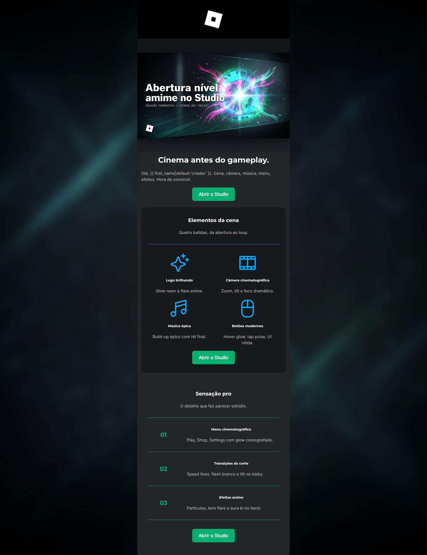
Cinema antes do gameplay.
Olá, criador. Cena, câmera, música, menu, efeitos. Hora de construir.
→ Abrir o Studio
Elementos da cena
Quatro batidas, da abertura ao loop.
Logo brilhando
Glow neon e flare anime.
Câmera cinematográfica
Zoom, tilt e foco dramático.
Música épica
Build-up épico com hit final.
Botões modernos
Hover glow, tap pulse, UI nítida.
→ Abrir o Studio
Sensação pro
O detalhe que faz parecer estúdio.
01
Menu cinematográfico
Play, Shop, Settings com glow coreografado.
02
Transições de corte
Speed lines, flash branco e tilt no lobby.
03
Efeitos anime
Partículas, lens flare e aura ki no herói.
→ Abrir o Studio
Why This Email Works
This is a strong, highly targeted email that successfully appeals to Roblox creators aiming to elevate their game development skills. The dark mode aesthetic, punchy copy, and excellent use of the primary brand green (#00B06F) for CTAs create a clear, scannable, and engaging experience. The email strictly adheres to best practices for CTA repetition and visual hierarchy. Its primary opportunity for improvement lies in shifting the copy from purely feature-focused (e.g., lens flares, speed lines) to benefit-focused (e.g., higher player retention, standing out on the platform) to provide a stronger 'why' behind the 'what'.
Hero Impact
85/100- Striking visual that aligns perfectly with the 'anime-level' theme.
- Headline 'Cinema antes do gameplay' is intriguing and clear.
- Immediate placement of the primary CTA above the fold.
Content Structure & Flow
88/100- Clear division of concepts using distinct background colors (#17181A and #232527).
- Logical progression from 'What is it?' to 'How to do it.'
- Effective use of dividers to separate list items.
Visual Hierarchy & Layout
90/100- Masterful use of dark mode branding.
- Icons and numbers are sized appropriately to draw attention without overwhelming the text.
- CTAs are undeniably the most prominent elements on the page.
Call-to-Action Strength
95/100- Identical, unambiguous copy ('Abrir o Studio') used across all buttons.
- High-contrast background color (#00B06F) makes them unmissable.
- Strategic placement at the top, middle, and bottom of the user's scroll path.
Message Clarity & Tone
85/100- Uses industry-specific language (lens flare, UI nítida, build-up) that builds credibility.
- Empowering and authoritative brand voice.
Readability & Scannability
90/100- Excellent contrast ratio between text (#FFFFFF/#BDBDBD) and background.
- Short paragraphs prevent reader fatigue.
- Numbered lists naturally draw the eye down the page.
Offer & Value Proposition
78/100- Clearly outlines exactly what elements make up a 'pro' feeling intro.
- Positions Roblox Studio as a high-end creation tool, elevating the platform's perceived value.
Personalization & Audience Fit
88/100- Use of the first-name fallback tag.
- Visuals and copy perfectly match the chaotic, vibrant energy of popular Roblox genres.
Copy Conciseness & Word Economy
92/100- No throat-clearing or unnecessary filler phrases.
- Descriptions are kept to a single line, maximizing scannability.
Quick Wins
- Add a benefit-driven sentence to the hero text explaining why cinematic intros matter (e.g., 'Keep players hooked from the start.').
- Standardize the accent divider colors to maintain visual consistency across sections.
- Add slight padding above the final CTA to separate it from the preceding divider line.
Create Professional Email Designs
Generate beautiful, on-brand email designs in seconds. Just enter your brand URL and let AI do the rest.