Outdoor & Sports Product Launch Email Template

64/100Needs Work

System Optimized: The New Collection

Arc'teryx
Share:
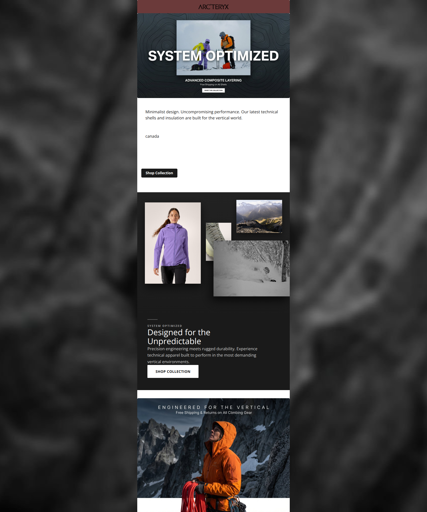
Minimalist layout featuring alpinists, technical fabric close-ups, and new performance outerwear.

Design Score

64/100
D - Needs Work

This email captures the stark, clinical aesthetic of Arc'teryx but fails on execution and precision—ironic for a brand obsessed with those qualities. While the tone is on-point, the presence of a broken image asset in the visual grid is a catastrophic quality control failure for a luxury brand, and the reliance on text embedded within images (hero and footer) limits accessibility and click-through potential.

Create Your Own

Generate professional email designs like this one in seconds with Kopi AI.

Start Creating

Email Details

Subject Line
System Optimized: The New Collection
Brand
Arc'teryx
Industry
Outdoor & Sports
Email Type
Product Launch
Created
February 7, 2026

Brand Colors

Email Copy

Minimalist design. Uncompromising performance. Our latest technical shells and insulation are built for the vertical world. canada

Shop Collection

Why This Email Works

This email captures the stark, clinical aesthetic of Arc'teryx but fails on execution and precision—ironic for a brand obsessed with those qualities. While the tone is on-point, the presence of a broken image asset in the visual grid is a catastrophic quality control failure for a luxury brand, and the reliance on text embedded within images (hero and footer) limits accessibility and click-through potential.

Hero Impact

72/100
  • Imagery and headline ('SYSTEM OPTIMIZED') perfectly match the 'Technical Luxury' brand positioning.
  • Topographic background texture adds depth without clutter.

Content Structure & Flow

75/100
  • Simple, linear narrative that doesn't overwhelm the user.
  • Clear separation between the intro text and the visual grid.

Visual Hierarchy & Layout

40/100
  • Excellent use of negative space around the main body copy.
  • Consistent black-and-white color usage maintains brand identity.

Call-to-Action Strength

60/100
  • Primary body CTA is a standard, recognizable button component.
  • High contrast (black on white) for the main button makes it pop.

Message Clarity & Tone

85/100
  • Voice is consistent: clinical, precise, and authoritative.
  • Copy length is respectful of the reader's time.

Readability & Scannability

65/100
  • Short sentences and clean typography in the main body section.
  • High contrast between text and background in the HTML section.

Offer & Value Proposition

60/100
  • Implied value of 'performance' is strong for this audience.
  • Free shipping and returns are mentioned (albeit quietly).

Personalization & Audience Fit

70/100
  • Imagery accurately reflects the extreme conditions the target audience aspires to.
  • Tone respects the intelligence of the expert user.

Quick Wins

  • Fix the broken image asset in the collage immediately.
  • Add a 'Shop Now' HTML button to the bottom 'Engineered for the Vertical' section.
  • Increase the font size of the text block under the collage images.
  • Make the 'Free Shipping' text a standalone text element so it's searchable and readable.

Create Professional Email Designs

Generate beautiful, on-brand email designs in seconds. Just enter your brand URL and let AI do the rest.

Start Creating for Free