Beauty & Skincare Promotional Email Template
“Sun-ready skin starts here”
Design Score
82/100This is a strong, highly on-brand promotional email that successfully leverages Glossier's 'Skin First' minimalist aesthetic. The tone is perfectly calibrated for the target audience—confident, effortless, and community-driven. The email flows well from a broad lifestyle hook to specific product benefits and social proof. However, it leaves money on the table by relying on repetitive, generic CTA copy and promising a 'Summer Edit' collection while only showcasing a single product. Tightening the CTA relevance and expanding the product showcase would elevate this from a good email to a high-converting powerhouse.
Create Your Own
Generate professional email designs like this one in seconds with Kopi AI.
Email Details
- Subject Line
- Sun-ready skin starts here
- Brand
- Glossier [eval 2026-03-21]
- Industry
- Beauty & Skincare
- Email Type
- Promotional
- Created
- March 21, 2026
Brand Colors
Email Copy
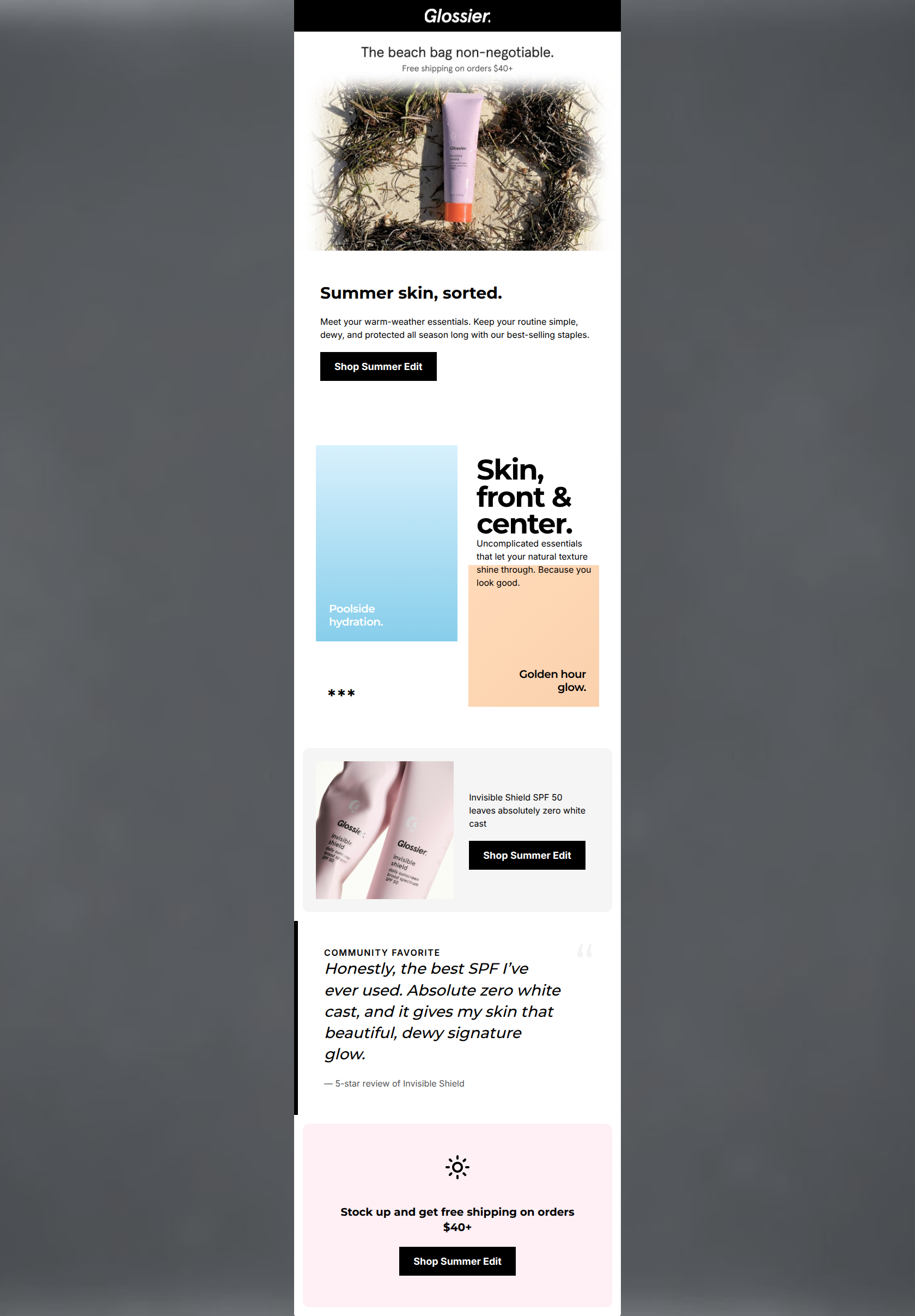
Summer skin, sorted.
Meet your warm-weather essentials. Keep your routine simple, dewy, and protected all season long with our best-selling staples.
→ Shop Summer Edit
Invisible Shield SPF 50 leaves absolutely zero white cast
→ Shop Summer Edit
Stock up and get free shipping on orders $40+
→ Shop Summer Edit
Why This Email Works
This is a strong, highly on-brand promotional email that successfully leverages Glossier's 'Skin First' minimalist aesthetic. The tone is perfectly calibrated for the target audience—confident, effortless, and community-driven. The email flows well from a broad lifestyle hook to specific product benefits and social proof. However, it leaves money on the table by relying on repetitive, generic CTA copy and promising a 'Summer Edit' collection while only showcasing a single product. Tightening the CTA relevance and expanding the product showcase would elevate this from a good email to a high-converting powerhouse.
Hero (top/initial part) Impact
85/100- Clear, immediate value proposition with the free shipping offer.
- Strong, on-brand, unpretentious headline copy.
- Lifestyle imagery immediately establishes the seasonal context.
Content Structure & Flow
80/100- Logical progression from inspiration to product detail to social proof.
- The inclusion of a community review reinforces Glossier's peer-to-peer brand ethos.
- Clean compartmentalization of sections using subtle background color shifts.
Visual Hierarchy & Layout
78/100- Excellent use of negative space to let the content breathe.
- High-contrast black typography on light backgrounds ensures effortless reading.
- The asymmetrical layout of the editorial block adds visual interest without causing clutter.
Call-to-Action Strength
70/100- Stark black buttons provide excellent contrast against the pale backgrounds.
- Sufficient padding around the buttons makes them clear and easy tap targets.
Message Clarity & Tone
88/100- Zero jargon; product benefits are explained in simple, relatable terms.
- The pull quote feels authentic and perfectly mirrors the desired customer outcome ('signature glow').
- Confident, concise phrasing respects the reader's time.
Readability & Scannability
85/100- Headings do the heavy lifting, allowing users to understand the narrative just by scanning.
- Left-aligned body copy (where appropriate) improves readability.
- The bold italicization of the pull quote clearly distinguishes it from brand copy.
Offer & Value Proposition
75/100- Free shipping threshold is stated immediately at the top to set expectations.
- The product value prop tackles a major customer pain point (white cast from SPF) head-on.
Personalization & Audience Fit
90/100- Imagery and copy align flawlessly with the audience's preference for raw, unpretentious aesthetics.
- Addresses specific pain points (sun protection without ruining a natural look) highly relevant to the season.
Quick Wins
- Update the CTA button under the Invisible Shield feature to read 'Shop Invisible Shield' instead of 'Shop Summer Edit'.
- Remove the stray asterisks (***) in the editorial section.
- Make the 'Poolside hydration' and 'Golden hour glow' blocks clickable, linking them to relevant product sub-categories.


Create Professional Email Designs
Generate beautiful, on-brand email designs in seconds. Just enter your brand URL and let AI do the rest.