SaaS & Software Promotional Email Template
“Structural precision. Welcome to Denis Zelenykh.”
Design Score
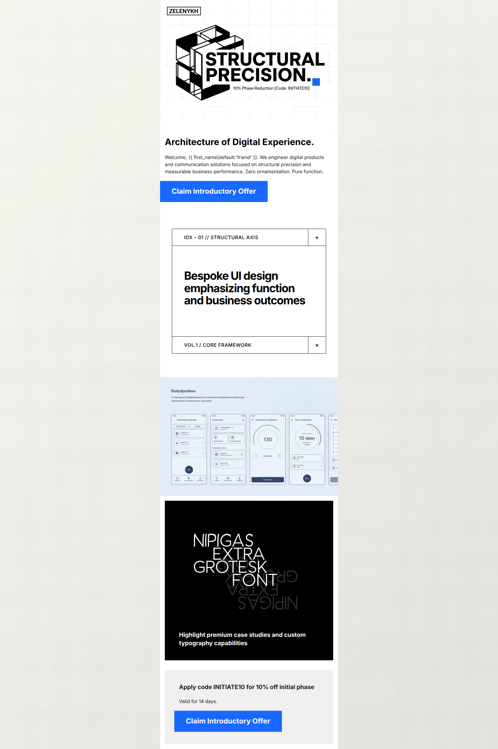
50/100This email successfully establishes a striking, brutalist visual identity that matches the brand's clinical tone, but it suffers from a critical failure: obvious placeholder copy in the typography section. This completely undermines the brand's core promise of 'structural precision' and caps the overall score.
Create Your Own
Generate professional email designs like this one in seconds with Kopi AI.
Email Details
- Subject Line
- Structural precision. Welcome to Denis Zelenykh.
- Brand
- Denis Zelenykh
- Industry
- SaaS & Software
- Email Type
- Promotional
- Created
- March 5, 2026
Brand Colors
Email Copy
Architecture of Digital Experience.
Welcome, friend. We engineer digital products and communication solutions focused on structural precision and measurable business performance. Zero ornamentation. Pure function.
→ Claim Introductory Offer
Highlight premium case studies and custom typography capabilities
Apply code INITIATE10 for 10% off initial phase
Valid for 14 days.
→ Claim Introductory Offer
Why This Email Works
This email successfully establishes a striking, brutalist visual identity that matches the brand's clinical tone, but it suffers from a critical failure: obvious placeholder copy in the typography section. This completely undermines the brand's core promise of 'structural precision' and caps the overall score.
Hero Impact
75/100- The striking geometric visual immediately sets the premium, highly technical tone of the brand.
- The introductory offer is visually introduced right away in the hero asset.
Content Structure & Flow
55/100- The email follows a standard, effective funnel structure: Value Prop -> Proof/Portfolio -> Promotional Offer.
- Distinct background colors (white, black, grey) effectively separate the email into digestible chapters.
Visual Hierarchy & Layout
80/100- The stark black-and-white contrast combined with rigid left-alignment creates a disciplined, easy-to-follow scan path.
- The primary blue CTAs are given massive visual priority over the monochrome layout.
Call-to-Action Strength
75/100- Buttons are large, highly visible, and utilize excellent color contrast.
- 'Claim Introductory Offer' is specific and action-oriented compared to generic alternatives.
Message Clarity & Tone
40/100- The introductory copy ('We engineer digital products...', 'Zero ornamentation') perfectly nails the clinical, confident brand voice.
Readability & Scannability
85/100- Paragraphs are kept extremely brief, reducing cognitive load.
- The use of stark scale contrast (massive headings vs. small technical labels) clearly signals what is most important to read.
Offer & Value Proposition
75/100- The promo code (INITIATE10) and discount amount (10%) are prominently displayed in high-contrast text.
- The addition of 'Valid for 14 days' adds a clear, believable layer of urgency.
Personalization & Audience Fit
70/100- The use of the first name variable establishes a direct, 1-to-1 communication style.
- The stark, no-nonsense presentation appeals directly to efficiency-focused decision-makers.
Quick Wins
- Replace the placeholder internal prompt in the black typography card with real, benefit-driven copy.
- Clarify exactly what the 'initial phase' entails in the bottom offer block.
- Add left and right padding to the wireframe image to maintain the rigid vertical alignment of the grid.


Create Professional Email Designs
Generate beautiful, on-brand email designs in seconds. Just enter your brand URL and let AI do the rest.