Other Promotional Email Template
“Let's get you in the door”
Design Score
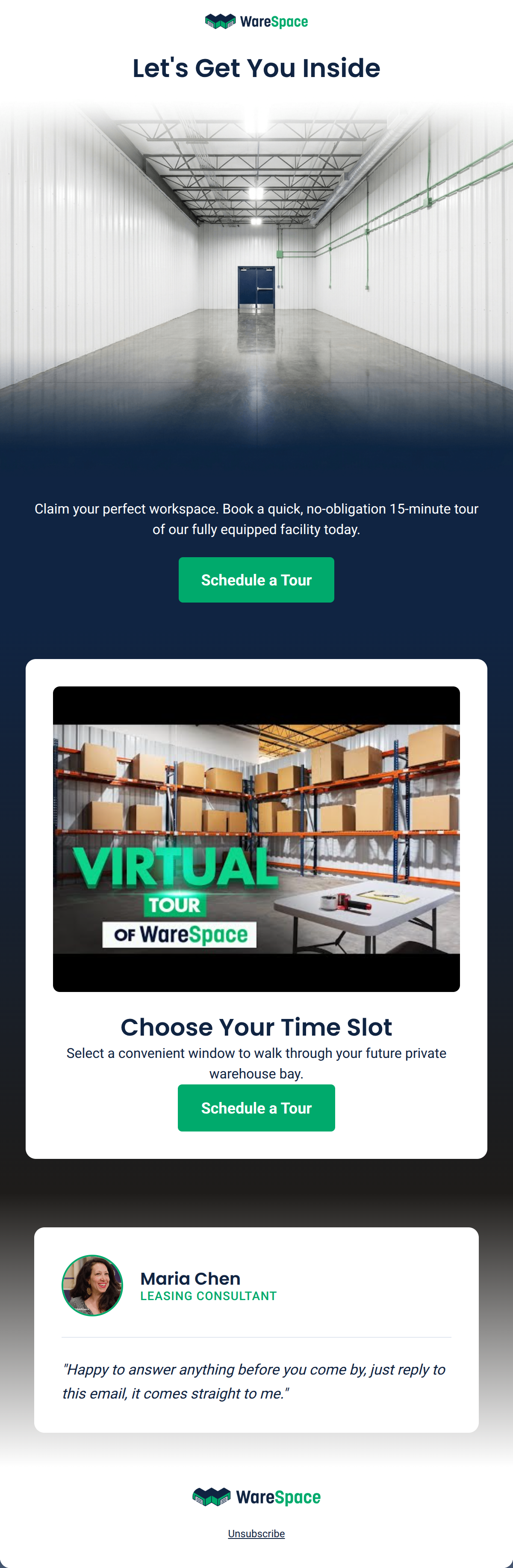
84/100This email effectively leverages the WareSpace brand identity with a high-intent, minimalist design that prioritizes the 'Schedule a Tour' conversion. The visual hierarchy is strong, using the brand's navy and white contrast to create a clear 'card' structure that guides the eye. While the copy is concise and the CTA strategy is textbook-perfect, the value proposition leans heavily on the physical facility while missing an opportunity to highlight the unique 'all-inclusive/no hidden fees' pricing model that differentiates WareSpace from traditional leases.
Create Your Own
Generate professional email designs like this one in seconds with Kopi AI.
Email Details
- Subject Line
- Let's get you in the door
- Brand
- WareSpace
- Industry
- Other
- Email Type
- Promotional
- Created
- August 24, 2026
Brand Colors
Email Copy
Let's Get You Inside
Claim your perfect workspace. Book a quick, no-obligation 15-minute tour of our fully equipped facility today.
→ Schedule a Tour
Unsubscribe
Why This Email Works
This email effectively leverages the WareSpace brand identity with a high-intent, minimalist design that prioritizes the 'Schedule a Tour' conversion. The visual hierarchy is strong, using the brand's navy and white contrast to create a clear 'card' structure that guides the eye. While the copy is concise and the CTA strategy is textbook-perfect, the value proposition leans heavily on the physical facility while missing an opportunity to highlight the unique 'all-inclusive/no hidden fees' pricing model that differentiates WareSpace from traditional leases.
Hero (top/initial part) Impact
85/100- High-quality imagery that matches the 'modern, clean' brand aesthetic.
- Clear, centered sub-copy that sets expectations for a '15-minute' time commitment.
Content Structure & Flow
88/100- Logical 'Inverted Pyramid' flow from headline to CTA.
- The use of white cards against the navy canvas creates clear mental breaks between sections.
Visual Hierarchy & Layout
90/100- Perfect use of brand color tokens for high-contrast accessibility.
- Clean, uncluttered layout that minimizes cognitive load.
Call-to-Action Strength
95/100- High-contrast color usage ensures buttons are unmissable.
- Repetition of the primary action ('Schedule a Tour') reinforces the goal without being distracting.
Message Clarity & Tone
82/100- Transparent and approachable tone in the personal sign-off section.
- Actionable language that respects the reader's time ('15-minute tour').
Readability & Scannability
92/100- Minimalist copy blocks.
- Strong use of bold headings and distinct sectioning.
Offer & Value Proposition
74/100- Low-friction offer ('no-obligation', 'quick').
Personalization & Audience Fit
70/100- The Maria Chen section personalizes the B2B experience, moving it from 'corporate' to 'consultant-led'.
Copy Conciseness & Word Economy
98/100- Extremely distilled messaging that respects the fast-paced lifestyle of an entrepreneur.
Quick Wins
- Mention 'Flat-rate pricing' or 'No hidden fees' in the sub-hero text to address a top-tier customer pain point.
- Add a small 'Call or Text' link near the sign-off to provide an alternative, lower-barrier way to engage.
- Ensure the 'Virtual Tour' image is actually a link to a video if it uses that specific thumbnail style.



Create Professional Email Designs
Generate beautiful, on-brand email designs in seconds. Just enter your brand URL and let AI do the rest.