Finance & Fintech Promotional Email Template
“Strategy: Turning Vision into Reality”
Design Score
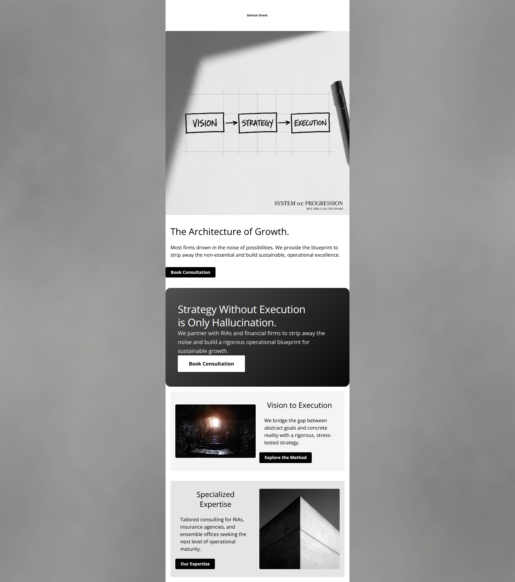
76/100This email executes the brand's "Anti-Design" aesthetic flawlessly, creating a visual experience that feels premium, rigorous, and distinct from standard B2B noise. However, for a high-ticket consulting offer targeting skeptical financial professionals, the content relies too heavily on abstract claims ("Architecture of Growth") without providing the necessary social proof or authority markers (e.g., book mentions, client logos) to validate the "Book Consultation" request.
Create Your Own
Generate professional email designs like this one in seconds with Kopi AI.
Email Details
- Subject Line
- Strategy: Turning Vision into Reality
- Brand
- Derrick Girard
- Industry
- Finance & Fintech
- Email Type
- Promotional
- Created
- February 12, 2026
Brand Colors
Email Copy
The Architecture of Growth.
Most firms drown in the noise of possibilities. We provide the blueprint to strip away the non-essential and build sustainable, operational excellence.
→ Book Consultation
Vision to Execution
We bridge the gap between abstract goals and concrete reality with a rigorous, stress-tested strategy.
→ Explore the Method
Specialized Expertise
Tailored consulting for RIAs, insurance agencies, and ensemble offices seeking the next level of operational maturity.
→ Our Expertise
Why This Email Works
This email executes the brand's "Anti-Design" aesthetic flawlessly, creating a visual experience that feels premium, rigorous, and distinct from standard B2B noise. However, for a high-ticket consulting offer targeting skeptical financial professionals, the content relies too heavily on abstract claims ("Architecture of Growth") without providing the necessary social proof or authority markers (e.g., book mentions, client logos) to validate the "Book Consultation" request.
Hero (top/initial part) Impact
80/100- The "Vision → Strategy → Execution" diagram is an excellent visual hook that communicates the value proposition faster than text could.
- The stark black-on-white layout immediately conveys the "no-nonsense" brand personality.
Content Structure & Flow
70/100- The Z-pattern layout (alternating image/text) effectively guides the eye down the page.
- Section distinctness is handled well with subtle changes in background grey values (#F4F4F4 vs #E5E5E5).
Visual Hierarchy & Layout
90/100- High-contrast elements make scanning effortless.
- Generous whitespace around headings prevents the content from feeling cramped.
Call-to-Action Strength
72/100- Primary button styles (Black background, White text) pass the squint test perfectly against the light grey backgrounds.
- There is a clear primary CTA in the hero.
Message Clarity & Tone
85/100- The copy "strip away the non-essential" aligns perfectly with the visual design, creating a coherent brand experience.
- Avoids fake urgency or salesy exclamation points, which builds trust with this senior audience.
Readability & Scannability
88/100- Paragraphs are kept to 2-3 sentences, preventing walls of text.
- Headings are distinct from body copy in both size and weight.
Offer & Value Proposition
65/100- The distinction between "Vision" and "Execution" effectively targets the pain point of leaders who have ideas but can't implement them.
Personalization & Audience Fit
75/100- Explicitly naming "RIAs" and "ensemble offices" demonstrates that this is not generic generalist consulting.
Quick Wins
- Change the "Our Expertise" button text to "View Industry Focus" or "See Who We Serve" to make it actionable.
- Add a sub-headline to the Hero section that explicitly names the target audience: "Strategic Consulting for RIAs & Insurance Leaders."
- Increase the font size of the body text by 1-2px to improve readability for the 40+ demographic.


Create Professional Email Designs
Generate beautiful, on-brand email designs in seconds. Just enter your brand URL and let AI do the rest.