Travel & Hospitality Promotional Email Template
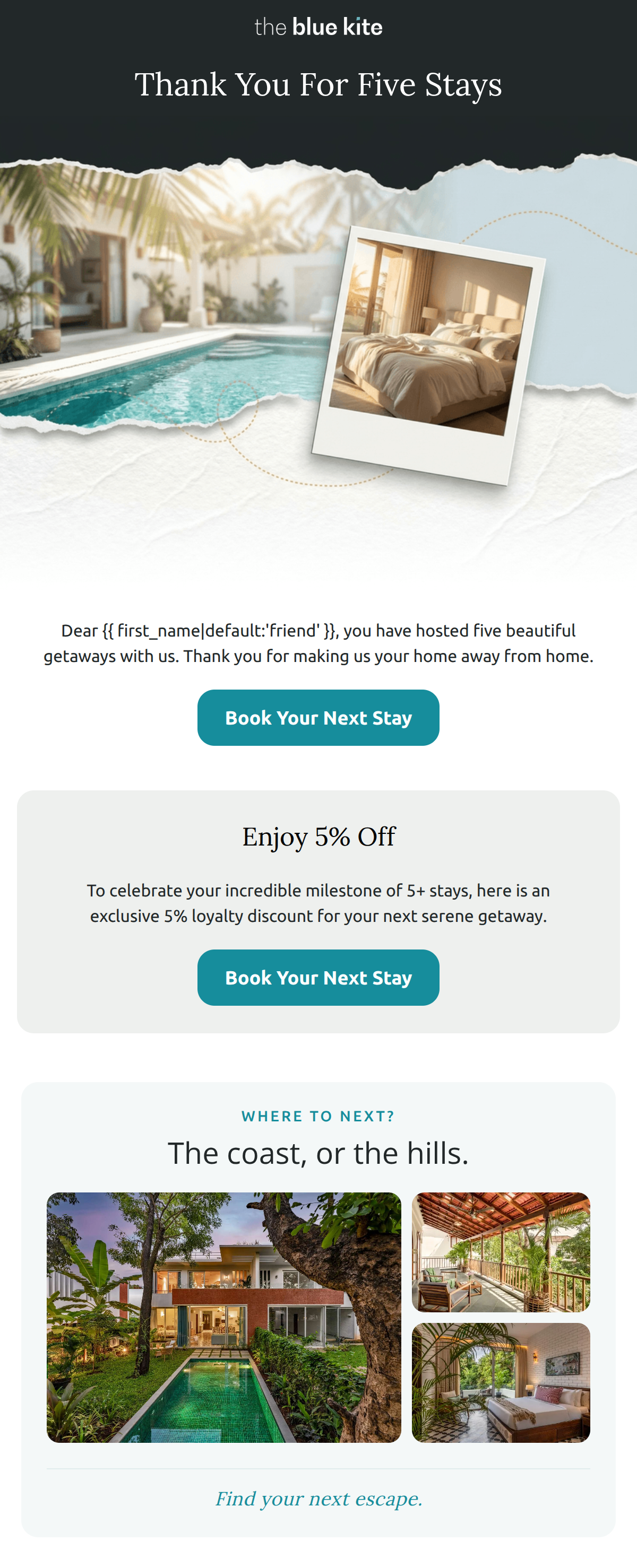
“Five stays with us deserves a little something back”
Design Score
87/100This is a sophisticated, highly personalized loyalty email that perfectly aligns with 'The Blue Kite' brand identity. The visual flow from an evocative illustrated hero to curated property cards and a trust-building 'Standard' section creates a seamless conversion bridge. While the execution is premium, the actual value proposition (5% discount for a guest who has stayed five times) feels slightly underwhelming for a luxury audience and may limit the ultimate conversion rate despite the excellent design.
Create Your Own
Generate professional email designs like this one in seconds with Kopi AI.
Email Details
- Subject Line
- Five stays with us deserves a little something back
- Brand
- The Blue Kite
- Industry
- Travel & Hospitality
- Email Type
- Promotional
- Created
- August 21, 2026
Brand Colors
Email Copy
Preview text: Enjoy 5% off your next Blue Kite escape.
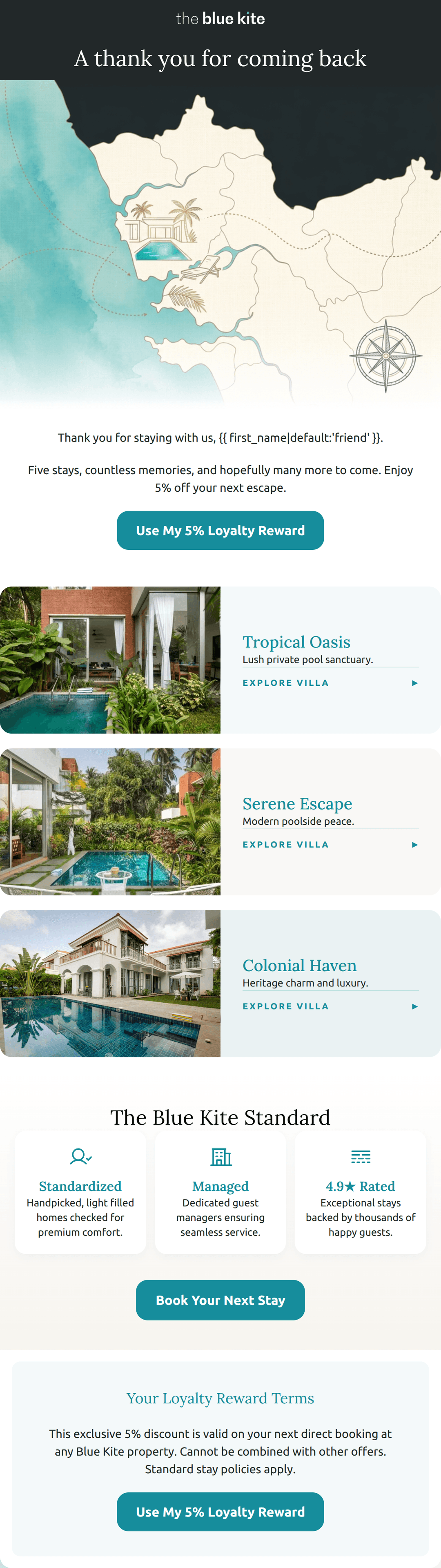
A thank you for coming back
Thank you for staying with us, friend.
Five stays, countless memories, and hopefully many more to come. Enjoy 5% off your next escape.
→ Use My 5% Loyalty Reward
Your Loyalty Reward Terms
This exclusive 5% discount is valid on your next direct booking at any Blue Kite property. Cannot be combined with other offers. Standard stay policies apply.
→ Use My 5% Loyalty Reward
Why This Email Works
This is a sophisticated, highly personalized loyalty email that perfectly aligns with 'The Blue Kite' brand identity. The visual flow from an evocative illustrated hero to curated property cards and a trust-building 'Standard' section creates a seamless conversion bridge. While the execution is premium, the actual value proposition (5% discount for a guest who has stayed five times) feels slightly underwhelming for a luxury audience and may limit the ultimate conversion rate despite the excellent design.
Hero (top/initial part) Impact
85/100- Unique, brand-aligned map illustration.
- Clean, high-contrast typography in the header.
- Clear, sophisticated greeting.
Content Structure & Flow
92/100- Logical transition between sections.
- Ends on a strong trust-building block.
Visual Hierarchy & Layout
88/100- Excellent use of white space.
- Consistent use of the ocean teal accent color.
- Professional card-based design for property listings.
Call-to-Action Strength
90/100- High-contrast CTA buttons that pass the 'squint test'.
- Appropriate repetition of the primary goal.
- Action-oriented button copy.
Message Clarity & Tone
82/100- Direct and respectful language.
- Avoids 'salesy' jargon.
Readability & Scannability
95/100- Iconography helps break up text in the 'Standard' section.
- Short, punchy property descriptions.
- Clear hierarchy of headings.
Offer & Value Proposition
65/100- Clear, unambiguous offer terms.
Personalization & Audience Fit
94/100- Specific stay count acknowledgment.
- First name personalization.
Copy Conciseness & Word Economy
96/100- Minimalist approach to text blocks.
- Each section has a distinct, non-repetitive purpose.
Quick Wins
- Increase the font size of the '5% off' in the second text block to make the benefit pop visually.
- Change the secondary CTA 'Explore Villa' arrows to a slightly bolder teal to ensure they are high-contrast links.
Create Professional Email Designs
Generate beautiful, on-brand email designs in seconds. Just enter your brand URL and let AI do the rest.