SaaS & Software Promotional Email Template
“Stop guessing, Start building”
Design Score
84/100This is a high-performing promotional email with a crystal-clear value proposition and strong visual hierarchy. The offer (a free course) is immediately understood, and the layout effectively guides the eye. The primary weakness lies in the repetitive use of social proof statistics and potentially friction-inducing secondary CTA copy.
Create Your Own
Generate professional email designs like this one in seconds with Kopi AI.
Email Details
- Subject Line
- Stop guessing, Start building
- Brand
- Income Stream Pro
- Industry
- SaaS & Software
- Email Type
- Promotional
- Created
- February 20, 2026
Brand Colors
Email Copy
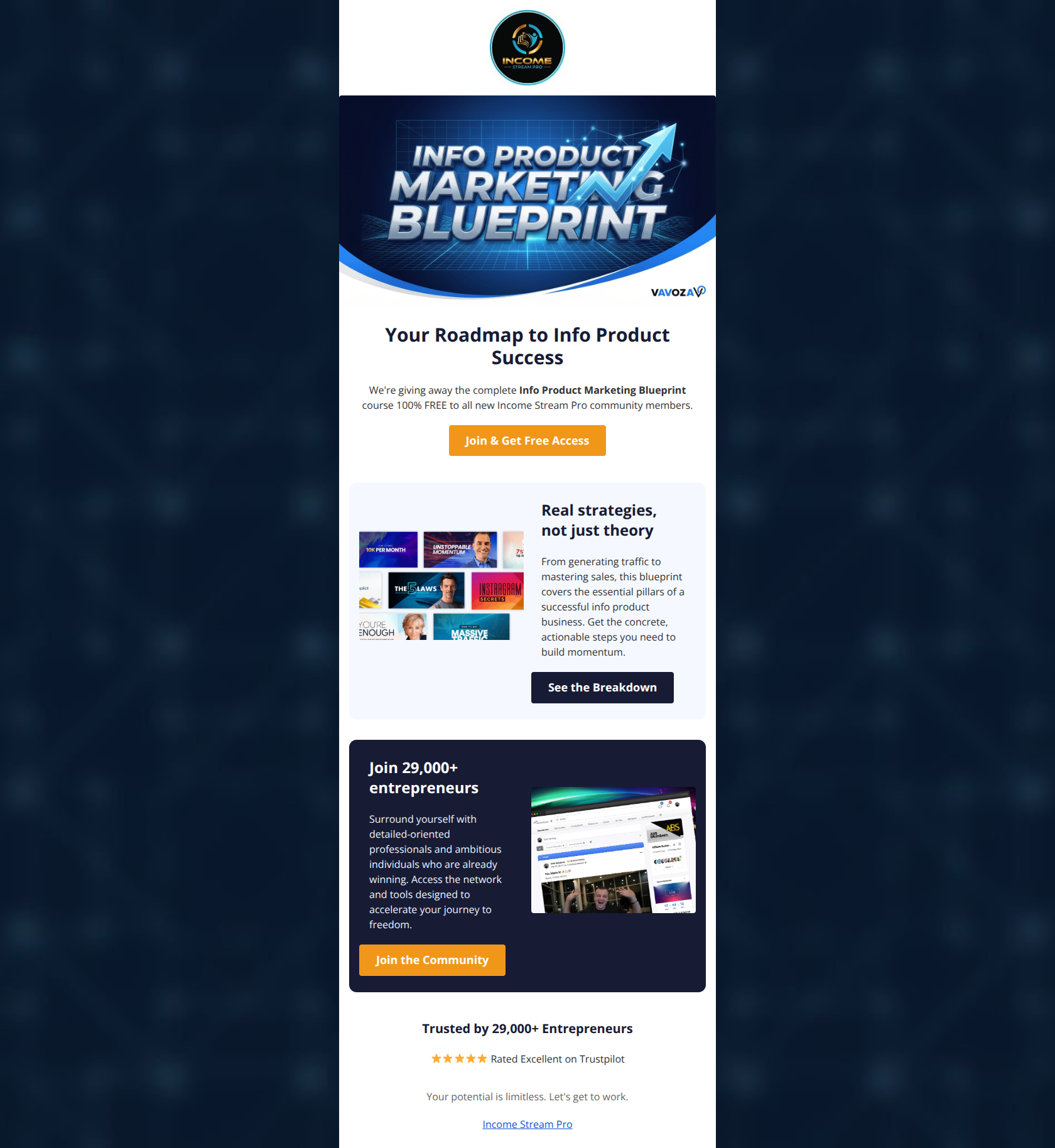
Your Roadmap to Info Product Success
We're giving away the complete Info Product Marketing Blueprint course 100% FREE to all new Income Stream Pro community members.
→ Join & Get Free Access
Real strategies, not just theory
From generating traffic to mastering sales, this blueprint covers the essential pillars of a successful info product business. Get the concrete, actionable steps you need to build momentum.
→ See the Breakdown
Join 29,000+ entrepreneurs
Surround yourself with detailed-oriented professionals and ambitious individuals who are already winning. Access the network and tools designed to accelerate your journey to freedom.
→ Join the Community
Trusted by 29,000+ Entrepreneurs
⭐⭐⭐⭐⭐ Rated Excellent on Trustpilot
Your potential is limitless. Let's get to work.
Income Stream Pro
Why This Email Works
This is a high-performing promotional email with a crystal-clear value proposition and strong visual hierarchy. The offer (a free course) is immediately understood, and the layout effectively guides the eye. The primary weakness lies in the repetitive use of social proof statistics and potentially friction-inducing secondary CTA copy.
Hero Impact
90/100- Headline and hero image are perfectly synchronized.
- The word 'FREE' is bolded and positioned for maximum scanning impact.
Content Structure & Flow
85/100- Clear Z-pattern layout guides the eye down the page.
- Distinct separation between the 'Course' offer and the 'Community' benefit.
Visual Hierarchy & Layout
88/100- Primary CTAs in Orange stand out vividly against both white and navy backgrounds.
- Section spacing allows for easy scanning without clutter.
Call-to-Action Strength
78/100- Primary button copy 'Join & Get Free Access' is benefit-driven and specific.
- Visual distinction between primary (Orange) and secondary (Navy) buttons is handled well.
Message Clarity & Tone
90/100- No jargon; the value proposition is accessible to beginners.
- Tone is aspirational but grounded in a tangible offer.
Readability & Scannability
85/100- Short paragraphs prevent 'wall of text' syndrome.
- Headlines are distinct and scan-friendly.
Offer & Value Proposition
92/100- High perceived value of the 'Blueprint'.
- The offer is the hero, not buried in the footer.
Personalization & Audience Fit
60/100- The 'You-centric' language ('Your Roadmap', 'Your journey') is present.
Quick Wins
- Change the secondary CTA text from 'See the Breakdown' to 'Get the Blueprint' to unify the conversion goal.
- Add a dollar value (e.g., '$297 Value') next to the word 'FREE' in the hero text to quantify the benefit.
- Rename the footer headline to 'What Members Are Saying' to differentiate it from the previous section's 'Join 29,000+...' headline.



Create Professional Email Designs
Generate beautiful, on-brand email designs in seconds. Just enter your brand URL and let AI do the rest.