Health & Wellness Promotional Email Template
“Stop Guessing. Fix Your Sh!t.”
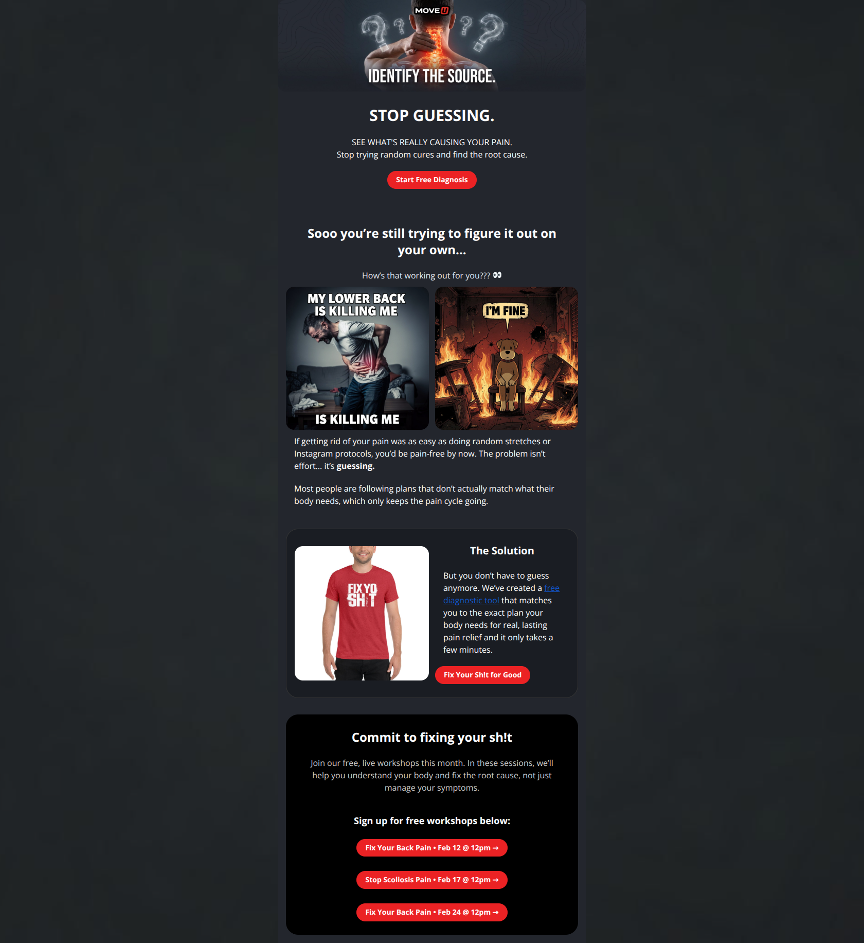
Design Score
79/100This is a strong, on-brand email that effectively leverages MoveU's 'tough love' voice and dark aesthetic to drive engagement. However, the visual hierarchy falters at the bottom with CTA flooding (three identical primary buttons), and the 'meme' section risks diluting the premium medical authority established in the hero.
Create Your Own
Generate professional email designs like this one in seconds with Kopi AI.
Email Details
- Subject Line
- Stop Guessing. Fix Your Sh!t.
- Brand
- MoveU
- Industry
- Health & Wellness
- Email Type
- Promotional
- Created
- February 3, 2026
Brand Colors
Email Copy
STOP GUESSING.
SEE WHAT'S REALLY CAUSING YOUR PAIN. Stop trying random cures and find the root cause.
→ Start Free Diagnosis
Sooo you’re still trying to figure it out on your own...
How’s that working out for you??? 👀
If getting rid of your pain was as easy as doing random stretches or Instagram protocols, you’d be pain-free by now. The problem isn’t effort... it’s guessing.
Most people are following plans that don’t actually match what their body needs, which only keeps the pain cycle going.
The Solution
But you don’t have to guess anymore. We’ve created a free diagnostic tool that matches you to the exact plan your body needs for real, lasting pain relief and it only takes a few minutes.
→ Fix Your Sh!t for Good
Commit to fixing your sh!t
Join our free, live workshops this month. In these sessions, we’ll help you understand your body and fix the root cause, not just manage your symptoms.
Sign up for free workshops below:
→ Fix Your Back Pain • Feb 12 @ 12pm →
→ Stop Scoliosis Pain • Feb 17 @ 12pm →
→ Fix Your Back Pain • Feb 24 @ 12pm →
Why This Email Works
This is a strong, on-brand email that effectively leverages MoveU's 'tough love' voice and dark aesthetic to drive engagement. However, the visual hierarchy falters at the bottom with CTA flooding (three identical primary buttons), and the 'meme' section risks diluting the premium medical authority established in the hero.
Hero (top/initial part) Impact
85/100- High-quality, relevant imagery (glowing spine with question marks) that communicates the problem instantly.
- Strong, imperative headline ('STOP GUESSING') that commands attention.
Content Structure & Flow
80/100- Clear progression from problem agitation to a specific solution.
- Effective use of a 'card' layout to distinguish the solution section from the rest of the content.
Visual Hierarchy & Layout
70/100- Strong use of the brand's dark mode aesthetic with high-contrast red accents.
- The 'Solution' card visually pops against the background, drawing focus to the key offer.
Call-to-Action Strength
75/100- Button copy is on-brand and specific ('Fix Your Sh!t for Good').
- Primary buttons are visually distinct and easy to tap.
Message Clarity & Tone
85/100- Distinctive voice that separates the brand from generic medical advice.
- Headlines are direct and cut through the noise.
Readability & Scannability
78/100- Short, punchy paragraphs that respect the reader's time.
- Good use of bold text ('guessing') to guide skimming.
Offer & Value Proposition
80/100- Low-friction entry point (Free Diagnosis) is highly relevant to a pain-focused audience.
- The promise of finding the 'root cause' directly addresses the frustration of failed treatments.
Personalization & Audience Fit
75/100- Deep understanding of the customer's psychology (frustration, skepticism of random cures).
- Imagery reflects the 'medical + tough' aesthetic well.
Quick Wins
- Change the blue text link color in the 'Solution' card to white or light cyan to pass contrast checks.
- Consolidate the three red workshop buttons at the bottom into one primary button or a list of text links to reduce visual clutter.
- Add a bold sub-headline to the 'Solution' card (e.g., 'Get your custom plan in 2 mins') to clarify the payoff.
- Center-align the text in the meme section to improve readability and visual balance.

Create Professional Email Designs
Generate beautiful, on-brand email designs in seconds. Just enter your brand URL and let AI do the rest.