Media & Entertainment Newsletter Email Template
“Step Inside Our Galleries Now 🖼️”
Design Score
83/100This email successfully translates the Bauhaus ethos—form follows function—into a digital layout. The visual hierarchy is crisp, using zigzag layouts and distinct background shades to guide the user through a content-rich journey without feeling cluttered. While visually stunning, the email could drive higher engagement by standardizing CTA treatments in the mid-section and adding more context to the single-product commerce block.
Create Your Own
Generate professional email designs like this one in seconds with Kopi AI.
Email Details
- Subject Line
- Step Inside Our Galleries Now 🖼️
- Brand
- Bauhaus-Archiv / Museum für Gestaltung
- Industry
- Media & Entertainment
- Email Type
- Newsletter
- Created
- November 22, 2025
Brand Colors
Email Copy
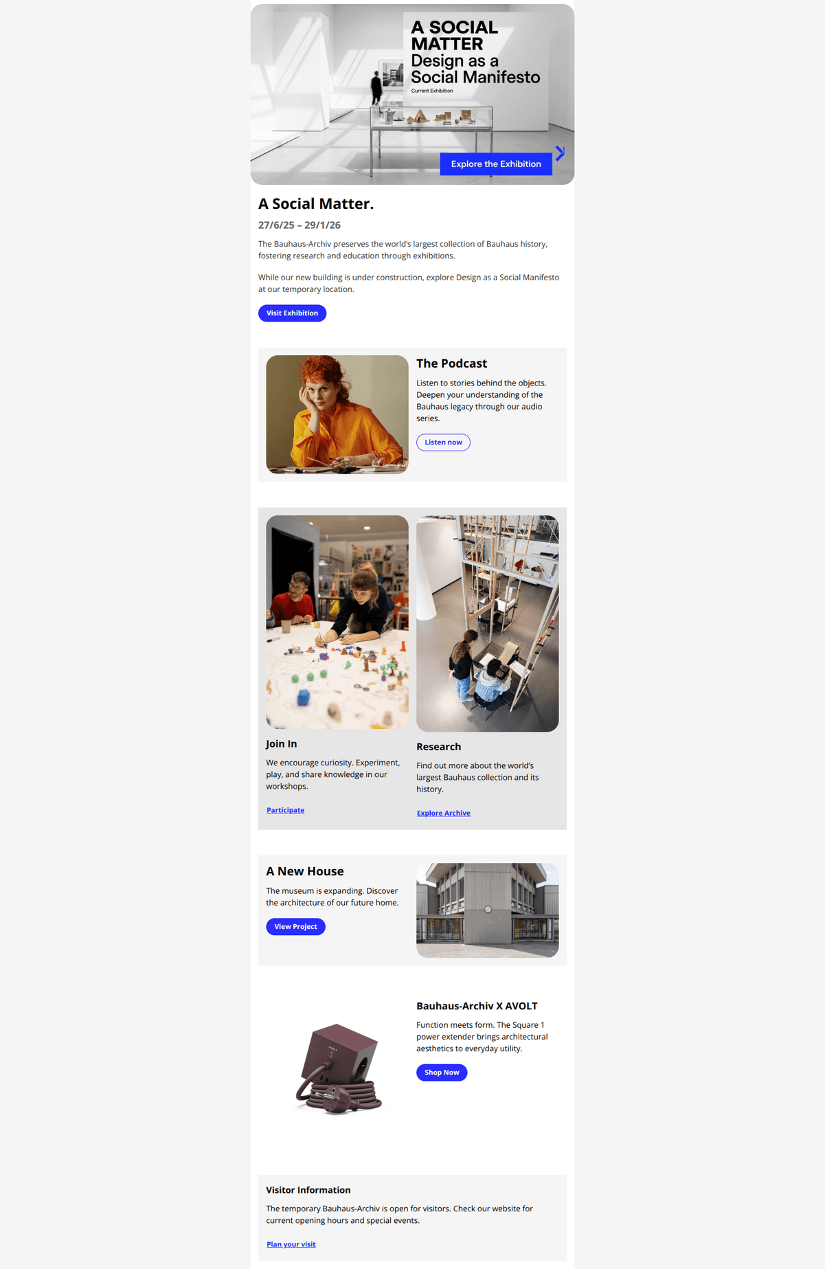
A Social Matter.
27/6/25 – 29/1/26
The Bauhaus-Archiv preserves the world’s largest collection of Bauhaus history, fostering research and education through exhibitions.
While our new building is under construction, explore Design as a Social Manifesto at our temporary location.
→ Visit Exhibition
The Podcast
Listen to stories behind the objects. Deepen your understanding of the Bauhaus legacy through our audio series.
→ Listen now
Join In
We encourage curiosity. Experiment, play, and share knowledge in our workshops.
Participate
Research
Find out more about the world’s largest Bauhaus collection and its history.
Explore Archive
A New House
The museum is expanding. Discover the architecture of our future home.
→ View Project
Bauhaus-Archiv X AVOLT
Function meets form. The Square 1 power extender brings architectural aesthetics to everyday utility.
→ Shop Now
Visitor Information
The temporary Bauhaus-Archiv is open for visitors. Check our website for current opening hours and special events.
Plan your visit
Why This Email Works
This email successfully translates the Bauhaus ethos—form follows function—into a digital layout. The visual hierarchy is crisp, using zigzag layouts and distinct background shades to guide the user through a content-rich journey without feeling cluttered. While visually stunning, the email could drive higher engagement by standardizing CTA treatments in the mid-section and adding more context to the single-product commerce block.
Hero (top/initial part) Impact
90/100- Excellent use of the specific brand blue (#292eff) for the CTA, creating a focal point.
- The hero image is high quality and explicitly references the exhibition content.
Content Structure & Flow
85/100- The zigzag (alternating left/right) layout keeps the reader engaged and prevents visual fatigue.
- Distinct background colors (#f5f5f5, #e6e6e6) effectively group related content blocks.
Visual Hierarchy & Layout
95/100- Consistent use of aspect ratios for images prevents the layout from feeling chaotic.
- Typography hierarchy (H1 vs H2 vs Body) is strictly maintained.
Call-to-Action Strength
75/100- The #292eff color is exclusively reserved for interactive elements, teaching the user exactly where to click.
- Button labels are generally descriptive ('Visit Exhibition', 'Listen now').
Message Clarity & Tone
90/100- Short, punchy sentences make the content easy to digest.
- Consistent use of 'We' and active verbs invites the user into the community.
Readability & Scannability
95/100- Ample line-height in paragraph text improves reading comprehension.
- Headings clearly signpost what each section is about.
Offer & Value Proposition
70/100- The 'Free' nature of the podcast and research is implied, offering value without cost.
- The exhibition dates create a subtle urgency.
Personalization & Audience Fit
65/100- The design language is perfectly tailored to design-conscious subscribers.
- Includes options for both local (Visit) and remote (Podcast/Shop) audiences.
Quick Wins
- Update the 'Participate' and 'Explore Archive' text links to outline buttons to improve mobile click-through rates.
- Bold the exhibition dates in the hero section to improve visibility against the white background.
- Add a 'View all' link to the Shop section to provide an alternative path for users who don't want the power strip.
- Shorten the alt text for decorative images (e.g., just 'Bauhaus Podcast' instead of detailed visual descriptions) to keep screen readers focused on the content.

Create Professional Email Designs
Generate beautiful, on-brand email designs in seconds. Just enter your brand URL and let AI do the rest.