SaaS & Software Product Launch Email Template
“Something new just dropped 👀”
Design Score
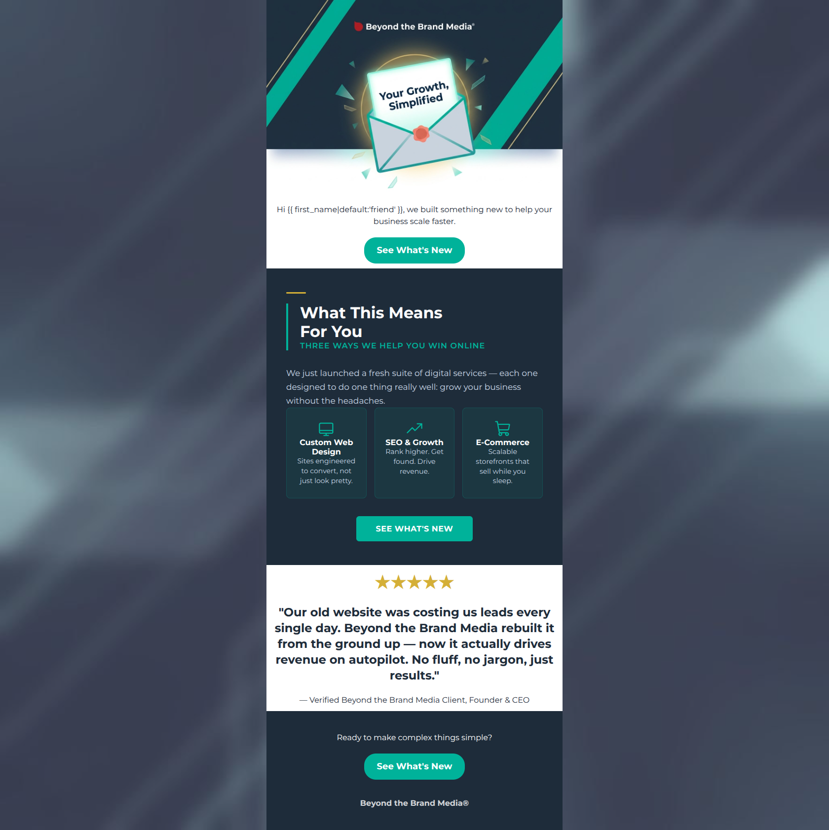
83/100This is a strong, professionally executed promotional email that clearly understands its target audience. It successfully employs the brand's 'no jargon' philosophy, delivering tight, benefit-driven copy. The structure follows a logical conversion path from hook to value proposition to social proof. However, the email relies a bit too heavily on a curiosity gap in the hero section and suffers from some localized legibility issues in the service grid. Addressing these minor flaws will elevate this from a good launch email to a highly converting one.
Create Your Own
Generate professional email designs like this one in seconds with Kopi AI.
Email Details
- Subject Line
- Something new just dropped 👀
- Brand
- Beyond the Brand Media®
- Industry
- SaaS & Software
- Email Type
- Product Launch
- Created
- April 22, 2026
Brand Colors
Email Copy
Hi friend, we built something new to help your business scale faster.
→ See What's New
★★★★★
"Our old website was costing us leads every single day. Beyond the Brand Media rebuilt it from the ground up — now it actually drives revenue on autopilot. No fluff, no jargon, just results."
— Verified Beyond the Brand Media Client, Founder & CEO
Ready to make complex things simple?
→ See What's New
Beyond the Brand Media®
Why This Email Works
This is a strong, professionally executed promotional email that clearly understands its target audience. It successfully employs the brand's 'no jargon' philosophy, delivering tight, benefit-driven copy. The structure follows a logical conversion path from hook to value proposition to social proof. However, the email relies a bit too heavily on a curiosity gap in the hero section and suffers from some localized legibility issues in the service grid. Addressing these minor flaws will elevate this from a good launch email to a highly converting one.
1. Hero (top/initial part) Impact
75/100- Clear statement of the primary brand value proposition in the graphic.
- Use of personalization tag creates an immediate conversational entry point.
2. Content Structure & Flow
85/100- Excellent use of a dark contrast block to segment the core value propositions.
- Logical progression from introduction to detail to social proof to final CTA.
3. Visual Hierarchy & Layout
80/100- Strong use of brand colors to guide the eye toward conversion points.
- Clean, grid-based layout conveys the agency's technical competence.
4. Call-to-Action Strength
95/100- Perfect repetition of the same primary CTA wording.
- Excellent color contrast makes the buttons unmissable.
- Clear singular focus; no competing secondary actions.
5. Message Clarity & Tone
88/100- Masterful translation of features into tangible business benefits.
- Testimonial selection perfectly mirrors the brand's core positioning.
6. Readability & Scannability
75/100- Use of icons helps anchor the scannability of the middle section.
- Short, punchy headings make the email easy to parse at a glance.
7. Offer & Value Proposition
78/100- Strong articulation of the long-term value the agency provides.
- Clear alignment with the target audience's desire for automated revenue and simplified processes.
8. Personalization & Audience Fit
85/100- Deep understanding of audience psychographics reflected in the copy.
- Strategic use of peer-level social proof.
9. Copy Conciseness & Word Economy
90/100- Extremely tight, punchy copy that respects the reader's time.
- Effective use of bullet-style formats to reduce cognitive load.
Quick Wins
- Increase the font size and brighten the color of the descriptive text inside the three service cards to fix legibility issues.
- Trim the intro sentence in the dark section to remove repetitive messaging about 'growing your business' that was already established in the hero.


Create Professional Email Designs
Generate beautiful, on-brand email designs in seconds. Just enter your brand URL and let AI do the rest.