Fitness Promotional Email Template
“Skip the egg hunt. Hit the iron.”
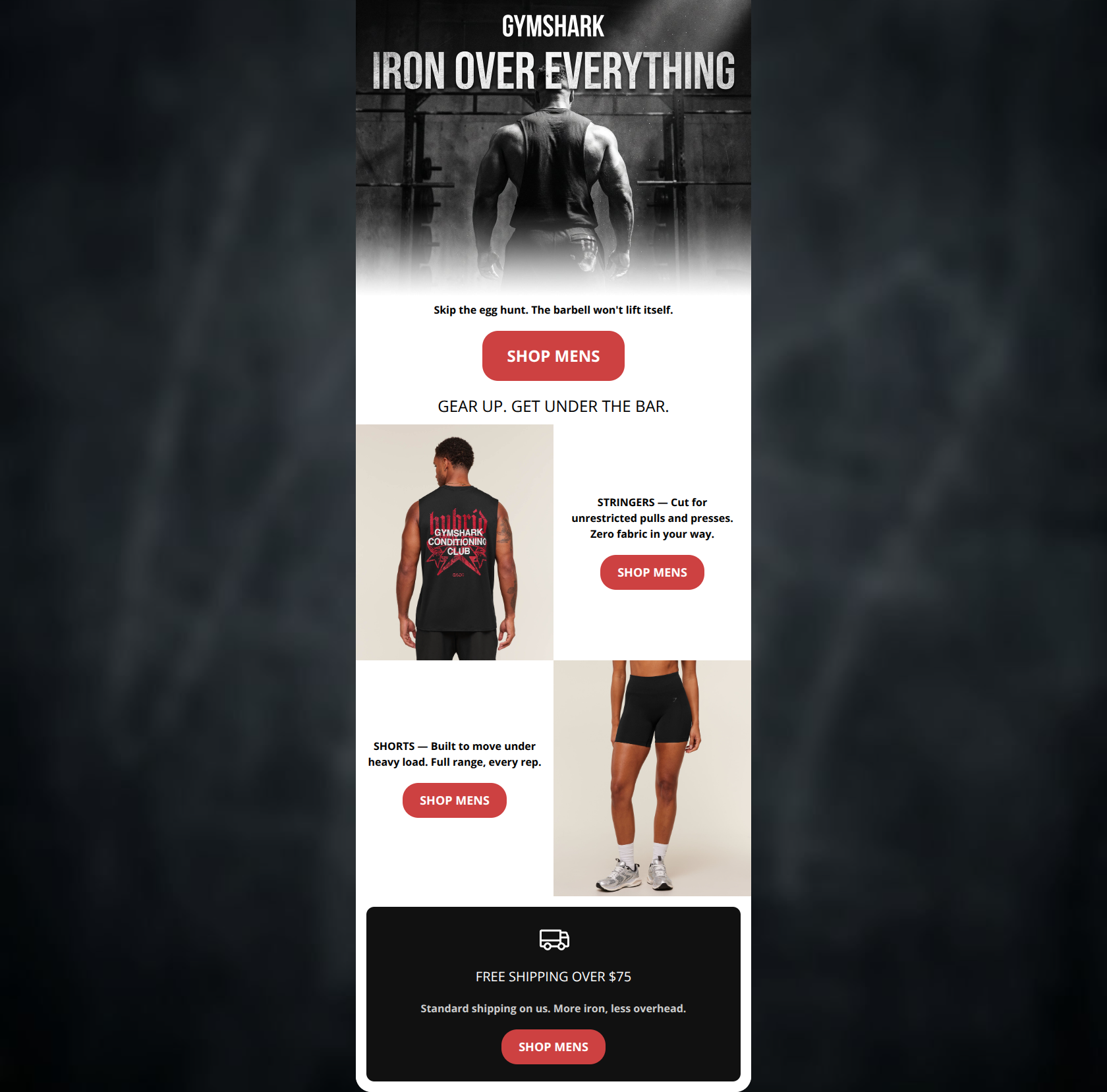
Design Score
68/100This email captures the gritty, utilitarian tone of Gymshark perfectly, but suffers from a significant execution error that disrupts the conversion path. While the copy is incredibly tight and the visual contrast is strong, the inclusion of a female product image in a strictly 'Mens' targeted email creates confusion. Coupled with repetitive, generic CTA copy across all sections, the email leaves significant click-through potential on the table.
Create Your Own
Generate professional email designs like this one in seconds with Kopi AI.
Email Details
- Subject Line
- Skip the egg hunt. Hit the iron.
- Brand
- Gymshark
- Industry
- Fitness
- Email Type
- Promotional
- Created
- April 2, 2026
Brand Colors
Email Copy
Skip the egg hunt. The barbell won't lift itself.
→ SHOP MENS
GEAR UP. GET UNDER THE BAR.
STRINGERS — Cut for unrestricted pulls and presses. Zero fabric in your way.
→ SHOP MENS
SHORTS — Built to move under heavy load. Full range, every rep.
→ SHOP MENS
FREE SHIPPING OVER $75
Standard shipping on us. More iron, less overhead.
→ SHOP MENS
Why This Email Works
This email captures the gritty, utilitarian tone of Gymshark perfectly, but suffers from a significant execution error that disrupts the conversion path. While the copy is incredibly tight and the visual contrast is strong, the inclusion of a female product image in a strictly 'Mens' targeted email creates confusion. Coupled with repetitive, generic CTA copy across all sections, the email leaves significant click-through potential on the table.
Hero (top/initial part) Impact
80/100- Striking, brand-aligned imagery that instantly communicates who the email is from.
- Strong use of contrast with the red CTA button standing out perfectly.
Content Structure & Flow
75/100- Logical progression from brand branding to specific products to shipping utility.
- The alternating checkerboard layout creates a predictable scanning rhythm.
Visual Hierarchy & Layout
75/100- Excellent use of the brand's signature high-contrast black, white, and red palette.
- Clear delineation between different product sections.
Call-to-Action Strength
40/100- High-contrast background color (#CD4141) makes the buttons pop perfectly against the white background.
- Appropriate button sizing for easy tapping/clicking.
Message Clarity & Tone
65/100- Excellent use of brand-specific vernacular ('More iron, less overhead').
- Direct and commanding tone fits the 'conditioning' ethos.
Readability & Scannability
85/100- Short, punchy paragraphs that respect the reader's time.
- High contrast text (black on white, white on dark grey) ensures perfect legibility.
Offer & Value Proposition
70/100- Product copy focuses heavily on performance benefits ('unrestricted pulls', 'built to move under heavy load').
- The free shipping threshold is clearly stated at the bottom.
Personalization & Audience Fit
60/100- Deep understanding of the target audience's pain points (e.g., fabric getting in the way of a lift).
Copy Conciseness & Word Economy
95/100- Zero fluff. Every word serves the 'Industrial Athlete' aesthetic.
- Benefits are distilled into impactful, memorable phrases ('Zero fabric in your way').
Quick Wins
- Replace the image of the female model in the shorts section with a male model to align with the 'SHOP MENS' CTA.
- Update the repetitive 'SHOP MENS' CTA copy to be product-specific (e.g., 'SHOP STRINGERS', 'SHOP SHORTS').
- Remove the unformatted 'GEAR UP. GET UNDER THE BAR.' text to tighten the gap between the hero and the product showcase.


Create Professional Email Designs
Generate beautiful, on-brand email designs in seconds. Just enter your brand URL and let AI do the rest.