Electronics & Tech Promotional Email Template
“Sihexexpo: Your Gateway to Innovation”
Design Score
81/100This is a structurally sound, highly functional B2B conversion email that excels in driving a single, clear action. The inverted pyramid flow, scannability, and exceptional use of repeating a primary CTA make it an effective conversion bridge. However, it leaves money on the table aesthetically. The heavy use of a maroon/burgundy color palette contradicts the stated 'corporate blues and slate grays' brand identity, and the abstract hero image fails to visually communicate the premium, bustling nature of a top-tier trade show. It converts well on logic, but misses the mark on premium brand emotion.
Create Your Own
Generate professional email designs like this one in seconds with Kopi AI.
Email Details
- Subject Line
- Sihexexpo: Your Gateway to Innovation
- Brand
- Sihexexpo
- Industry
- Electronics & Tech
- Email Type
- Promotional
- Created
- June 30, 2026
Brand Colors
Email Copy
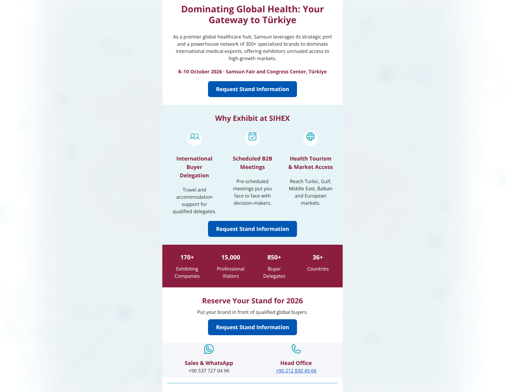
Global Health Leaders: Your Gateway to Türkiye
As a premier global healthcare hub, Samsun leverages its strategic port and a powerhouse network of 300+ specialized brands to dominate international medical exports, offering exhibitors unrivaled access to high-growth markets.
8–10 October 2026 · Samsun Fair and Congress Center, Türkiye
→ Stand Information
Grow Your Business at SIHEX 2026
International Buyer Delegation
Travel and accommodation support for qualified delegates.
Scheduled B2B Meetings
Pre-scheduled meetings put you face to face with decision-makers.
Health Tourism & Market Access
Reach Turkic, Gulf, Middle East, Balkan and European markets.
→ VIP Buyer Program
170+
Exhibiting Companies
15,000
Professional Visitors
850+
Buyer Delegates
36+
Countries
Reserve Your Stand for 2026
Put your brand in front of qualified global buyers.
→ Request Stand Information
Sales & WhatsApp
+90 537 727 04 96
Head Office
+90 212 830 49 66
Why This Email Works
This is a structurally sound, highly functional B2B conversion email that excels in driving a single, clear action. The inverted pyramid flow, scannability, and exceptional use of repeating a primary CTA make it an effective conversion bridge. However, it leaves money on the table aesthetically. The heavy use of a maroon/burgundy color palette contradicts the stated 'corporate blues and slate grays' brand identity, and the abstract hero image fails to visually communicate the premium, bustling nature of a top-tier trade show. It converts well on logic, but misses the mark on premium brand emotion.
Hero (top/initial part) Impact
72/100- Headline is benefit-driven ('Exhibit Where Global Buyers Meet') rather than just stating the event name.
- Primary CTA is immediately visible high up in the layout.
Content Structure & Flow
88/100- Logical progression of information from macro (event purpose) to micro (specific benefits and stats).
- Excellent use of varied section backgrounds to clearly delineate different types of information.
Visual Hierarchy & Layout
68/100- The stats bar uses a dark background to create a strong visual interrupt, naturally drawing the eye to the social proof.
- The 3-column icon layout successfully breaks up text and makes the benefits feel digestible.
Call-to-Action Strength
96/100- Flawless repetition of a single, unified primary action.
- Excellent color contrast makes the buttons the most dominant interactive elements on the page.
Message Clarity & Tone
78/100- Unambiguous messaging; the reader immediately understands this is a pitch to exhibit.
- Tone is professional and devoid of unnecessary hype or exclamation points.
Readability & Scannability
90/100- Excellent use of chunking; no long, intimidating blocks of text.
- Headings immediately summarize the content below them.
Offer & Value Proposition
85/100- Focuses on outcomes (scheduled meetings, market access) rather than just features (booth size, wifi).
- The stats section acts as a powerful, scannable proof-point for the claims made in the 'Why Exhibit' section.
Personalization & Audience Fit
80/100- Highlights features that high-level B2B buyers actually care about (efficiency via pre-scheduled meetings).
- Provides clear contact options (WhatsApp) catering to international business communication norms.
Copy Conciseness & Word Economy
88/100- Zero filler paragraphs; respects the reader's limited time.
- Stats section uses zero extraneous words, relying entirely on the numbers to tell the story.
Quick Wins
- Left-align the brief paragraph text under the 'Why Exhibit' icons to improve readability in the column format.
- Trim minor redundant phrasing in the value prop descriptions to make them even punchier.
- Move the date and location details directly beneath the main H1 headline to group critical event info together before the image.


Create Professional Email Designs
Generate beautiful, on-brand email designs in seconds. Just enter your brand URL and let AI do the rest.