Other Newsletter Email Template
“Seit, vor или ab? Разбираем предлоги времени”
Design Score
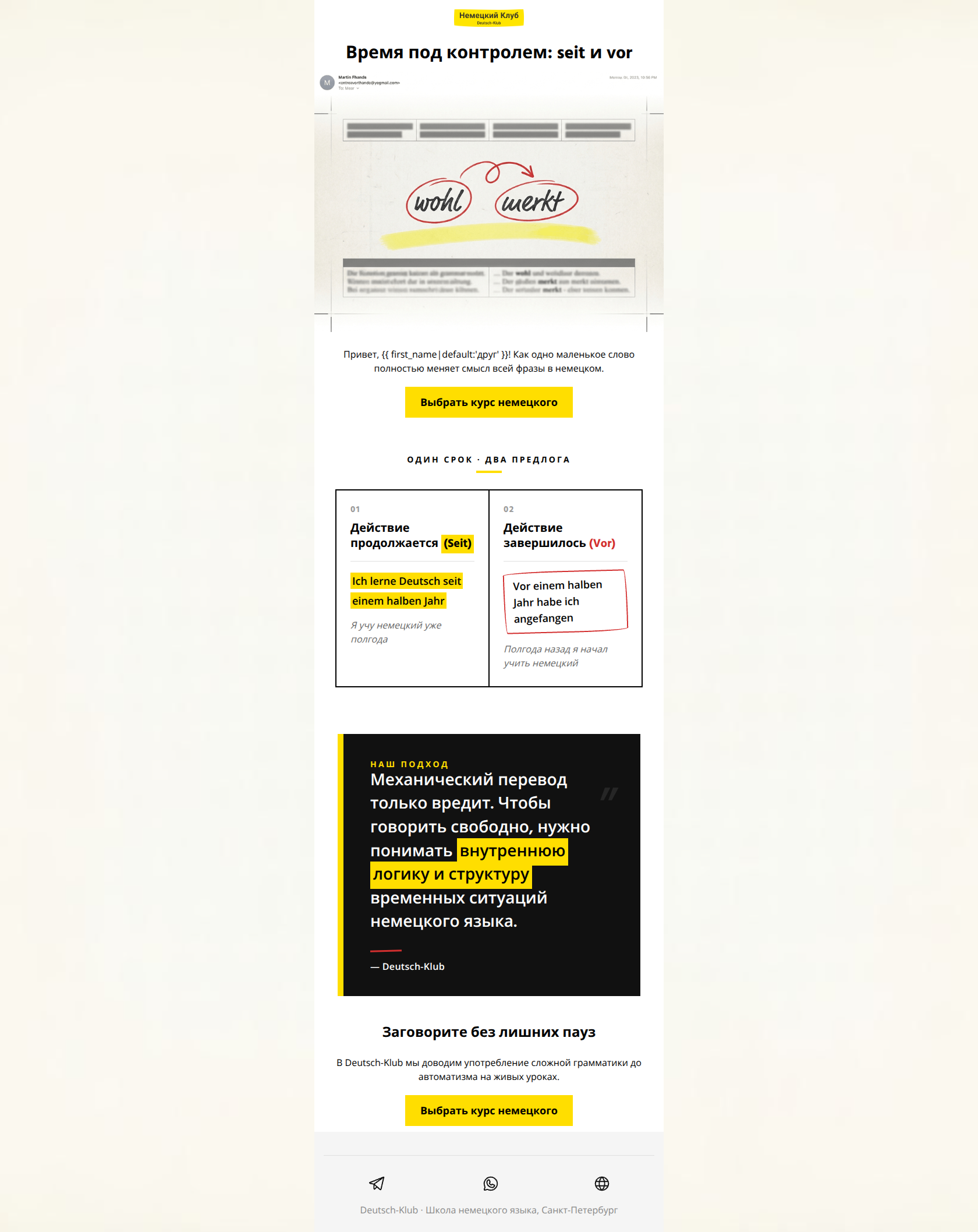
89/100This is a high-performance educational nurture email that perfectly embodies the brand's 'academic yet witty' persona. It leads with genuine value (a grammar tip) to establish authority before pivoting to the sales objective. The visual hierarchy is sharp, utilizing the brand's high-contrast palette and 'teacher's red pen' motifs to guide the eye through the instructional content to the primary CTAs.
Create Your Own
Generate professional email designs like this one in seconds with Kopi AI.
Email Details
- Subject Line
- Seit, vor или ab? Разбираем предлоги времени
- Brand
- Deutsch-Klub
- Industry
- Other
- Email Type
- Newsletter
- Created
- July 10, 2026
Brand Colors
Email Copy
Preview text: Одинаковые временные отрезки, но абсолютно разный смысл в немецком. Инструкция от Deutsch-Klub.
Время под контролем: seit и vor
Привет, друг! Как одно маленькое слово полностью меняет смысл всей фразы в немецком.
→ Выбрать курс немецкого
Заговорите без лишних пауз
В Deutsch-Klub мы доводим употребление сложной грамматики до автоматизма на живых уроках.
→ Выбрать курс немецкого
Deutsch-Klub · Школа немецкого языка, Санкт-Петербург
Why This Email Works
This is a high-performance educational nurture email that perfectly embodies the brand's 'academic yet witty' persona. It leads with genuine value (a grammar tip) to establish authority before pivoting to the sales objective. The visual hierarchy is sharp, utilizing the brand's high-contrast palette and 'teacher's red pen' motifs to guide the eye through the instructional content to the primary CTAs.
Hero Impact
92/100- Clear, benefit-oriented headline.
- Visual style perfectly aligns with the 'textbook' brand aesthetic.
- High-contrast branding makes the topic pop immediately.
Content Structure & Flow
88/100- Inverted pyramid structure is well-executed.
- Logical progression from informational to promotional.
Visual Hierarchy & Layout
90/100- Consistent use of brand colors for emphasis.
- Strong use of negative space around key information.
Call-to-Action Strength
95/100- Perfect CTA repetition reinforces the goal.
- High-contrast button design passes the squint test easily.
Message Clarity & Tone
90/100- Honest and expert brand voice.
- Clear focus on 'logical structure' over 'mechanical translation'.
Readability & Scannability
92/100- Excellent use of table structure for comparison.
- Bulleted or blocked content prevents 'wall of text' fatigue.
Offer & Value Proposition
84/100- Expertise is the primary offer, which is highly effective for this audience.
- Positions the school as a methodology-first institution.
Personalization & Audience Fit
80/100- Content choice reflects the needs of serious learners (doctors, engineers).
Copy Conciseness & Word Economy
90/100- No filler adjectives.
- Every section introduces a new thought or value.
Quick Wins
- Make the hero image and comparison table clickable, leading to the same course registration page.
- Tighten the intro sentence to specify that the 'small word' refers to time prepositions.
- Add a small 'Next group starts [Date]' under the final CTA to add subtle urgency.


Create Professional Email Designs
Generate beautiful, on-brand email designs in seconds. Just enter your brand URL and let AI do the rest.