Design Score
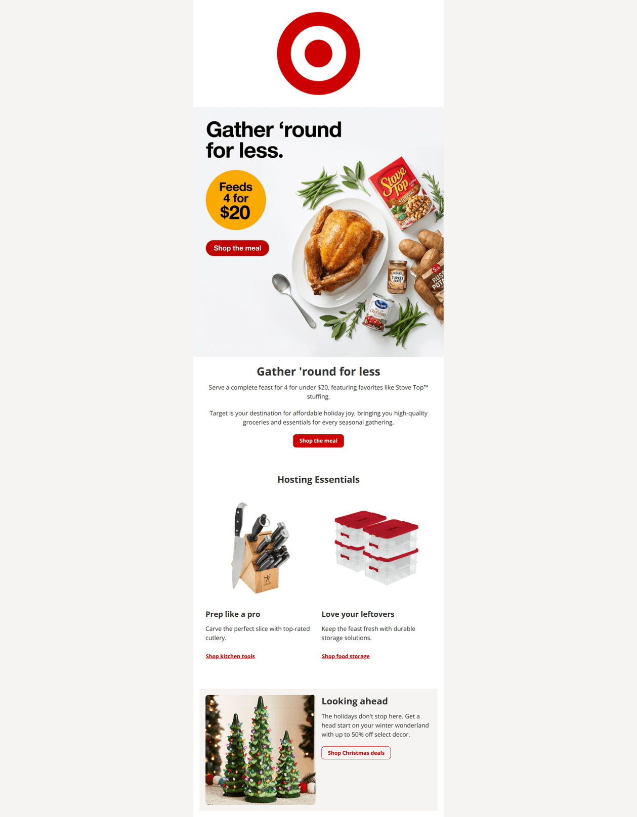
78/100This email features a strong, timely value proposition ("Feast for 4 under $20") and maintains excellent brand consistency with Target's distinct visual identity. However, the hero section suffers from significant visual redundancy where the image text duplicates the HTML text immediately below it, creating a cluttered experience. By cleaning up the duplication and tightening the copy, the email can drive higher engagement with its compelling offer.
Create Your Own
Generate professional email designs like this one in seconds with Kopi AI.
Email Details
- Subject Line
- Restored Email
- Brand
- Target
- Industry
- Other
- Email Type
- Promotional
- Created
- November 24, 2025
Brand Colors
Email Copy
Gather 'round for less
Serve a complete feast for 4 for under $20, featuring favorites like Stove Top™ stuffing.
Target is your destination for affordable holiday joy, bringing you high-quality groceries and essentials for every seasonal gathering.
→ Shop the meal
Hosting Essentials
Prep like a pro
Carve the perfect slice with top-rated cutlery.
Shop kitchen tools
Love your leftovers
Keep the feast fresh with durable storage solutions.
Shop food storage
Looking ahead
The holidays don't stop here. Get a head start on your winter wonderland with up to 50% off select decor.
→ Shop Christmas deals
Why This Email Works
This email features a strong, timely value proposition ("Feast for 4 under $20") and maintains excellent brand consistency with Target's distinct visual identity. However, the hero section suffers from significant visual redundancy where the image text duplicates the HTML text immediately below it, creating a cluttered experience. By cleaning up the duplication and tightening the copy, the email can drive higher engagement with its compelling offer.
Hero (top/initial part) Impact
70/100- High-quality photography of the meal effectively stimulates appetite.
- The "Feeds 4 for $20" yellow badge in the image is a fantastic, high-contrast attention grabber.
Content Structure & Flow
85/100- Logical progression from the main event (Thanksgiving) to supporting needs (prep/storage) to the next season (Christmas).
- Clear distinction between the primary offer and secondary upsells.
Visual Hierarchy & Layout
75/100- Consistent use of the brand color palette (Red #CC0000, White #FFFFFF, Dark Grey #333333).
- The 50/50 split layout in the footer section effectively breaks up the vertical rhythm.
Call-to-Action Strength
90/100- High contrast on the primary "Shop the meal" button (#CC0000 background against white).
- Action-oriented copy ("Shop the meal", "Shop Christmas deals") tells the user exactly what to expect.
Message Clarity & Tone
80/100- The "Feeds 4 for $20" offer is specific, tangible, and addresses a core customer pain point (inflation/cost).
- Headlines like "Love your leftovers" add a warm, human touch to utilitarian products like storage bins.
Readability & Scannability
90/100- Excellent contrast ratios throughout the email.
- Short, punchy paragraphs in the secondary sections make for quick reading.
Offer & Value Proposition
95/100- The $20 price point is front and center (visually).
- The "Up to 50% off" on decor provides a compelling reason to scroll to the bottom.
Personalization & Audience Fit
40/100- The content is perfectly timed for the seasonal calendar.
- The product mix appeals to the broad "family manager" demographic Target serves.
Quick Wins
- Remove the generic paragraph ("Target is your destination...") in the hero section to reduce friction.
- Remove the duplicate "Gather 'round for less" text and button from the image file so it doesn't clash with the HTML text below.
- Underline the secondary link CTAs ("Shop kitchen tools") to make them look more clickable.


Create Professional Email Designs
Generate beautiful, on-brand email designs in seconds. Just enter your brand URL and let AI do the rest.