SaaS & Software Promotional Email Template
“Replit lifted conversions 410%. Here's how.”
Design Score
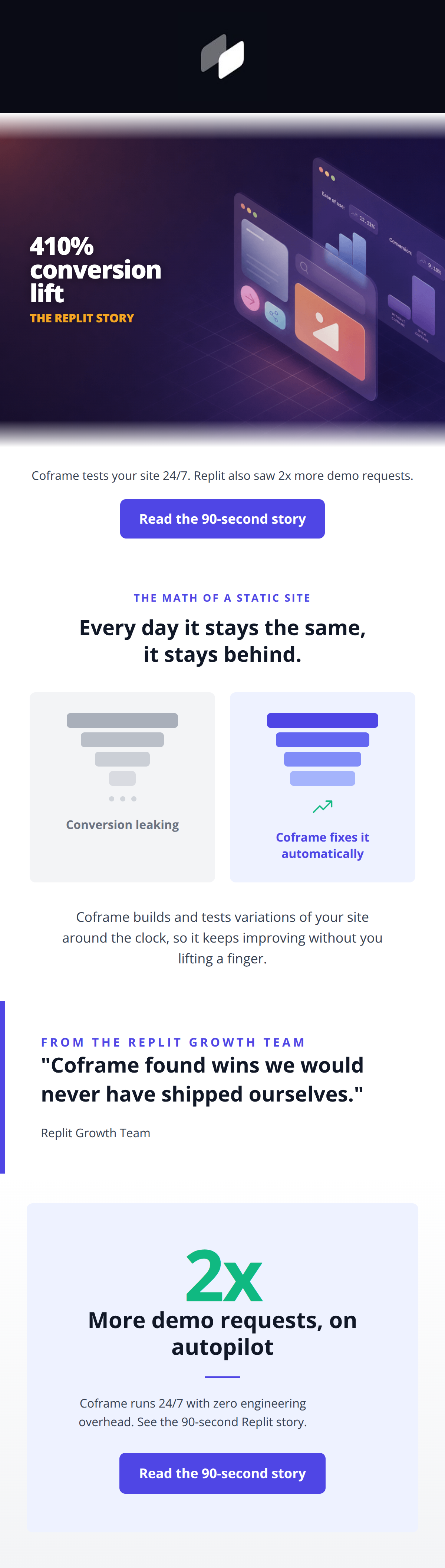
86/100This is a strong, highly scannable case study email that effectively uses massive metrics to hook the reader. It aligns perfectly with the brand's 'AI growth engineer' positioning by emphasizing automated optimization and zero engineering overhead. The visual funnel comparison is a standout element that clearly articulates the core pain point and solution. While the copy is generally tight and compelling, minor refinements to the opening hook and reducing repetitive CTA phrasing in the body text will elevate the narrative flow and push conversion even higher.
Create Your Own
Generate professional email designs like this one in seconds with Kopi AI.
Email Details
- Subject Line
- Replit lifted conversions 410%. Here's how.
- Brand
- Coframe
- Industry
- SaaS & Software
- Email Type
- Promotional
- Created
- July 23, 2026
Brand Colors
Email Copy
Preview text: An AI growth engineer tests your site 24/7. See the 90-second Replit story.
Coframe tests your site 24/7. Replit also saw 2x more demo requests.
→ Read the 90-second story
Why This Email Works
This is a strong, highly scannable case study email that effectively uses massive metrics to hook the reader. It aligns perfectly with the brand's 'AI growth engineer' positioning by emphasizing automated optimization and zero engineering overhead. The visual funnel comparison is a standout element that clearly articulates the core pain point and solution. While the copy is generally tight and compelling, minor refinements to the opening hook and reducing repetitive CTA phrasing in the body text will elevate the narrative flow and push conversion even higher.
Hero (top/initial part) Impact
84/100- Immediate delivery of a jaw-dropping metric that demands attention.
- High-quality, tech-forward abstract visual that perfectly fits the brand's premium identity.
- Excellent color contrast with the yellow kicker text against the dark background.
Content Structure & Flow
88/100- Excellent 'inverted pyramid' approach tailored for a case study.
- Clear visual breaks between sections keep the momentum going.
- The testimonial acts as a perfect, credible bridge to the final pitch and CTA.
Visual Hierarchy & Layout
82/100- The side-by-side funnel graphic is an excellent, instantly readable visualization of the value prop.
- The massive '2x' at the bottom creates a strong visual anchor that pulls the eye down to the final action.
Call-to-Action Strength
92/100- 'Read the 90-second story' is brilliant copy that completely removes the friction of an unknown time commitment.
- Both buttons share the exact same goal, phrasing, and implied destination, reinforcing the desired action.
- High-contrast indigo button design pops perfectly against the white background.
Message Clarity & Tone
85/100- Phrases like 'without lifting a finger' and 'zero engineering overhead' directly attack the audience's primary pain points.
- The quote from the Replit Growth Team adds massive credibility and peer validation.
Readability & Scannability
88/100- Excellent use of bolding and varied font sizes to establish a clear, descending scan path.
- The quote section uses a left border to draw the eye perfectly and frame the text.
- Minimal reliance on dense body copy.
Offer & Value Proposition
86/100- The funnel graphic perfectly illustrates the 'static vs dynamic' argument without needing paragraphs of text.
- The emphasis on continuous (24/7) improvement is a strong differentiator against traditional, manual A/B testing tools.
Personalization & Audience Fit
85/100- Highlighting a deeply respected, tech-forward brand like Replit serves as excellent social proof for this specific cohort.
- Focuses on high-level strategy and outcomes (growth, overhead reduction) rather than just tactical UI features.
Copy Conciseness & Word Economy
85/100- Zero filler adjectives; the language is direct and objective.
- The headline 'Every day it stays the same, it stays behind' is incredibly sharp, compelling, and distills the entire problem into one sentence.
Quick Wins
- Rewrite the opening text to bridge the hero metric more smoothly: 'See how Replit achieved a 410% conversion lift and 2x more demo requests with Coframe.'
- Delete the sentence 'See the 90-second Replit story' from the final text block to avoid duplicating the button text immediately below it.
- Adjust the layout of the first text/CTA block to group it closer to the hero image, perhaps enclosing it in a subtle borderless card to anchor it.



Create Professional Email Designs
Generate beautiful, on-brand email designs in seconds. Just enter your brand URL and let AI do the rest.