Other Promotional Email Template
“Redefining building envelopes: 3 sustainable concr”
Design Score
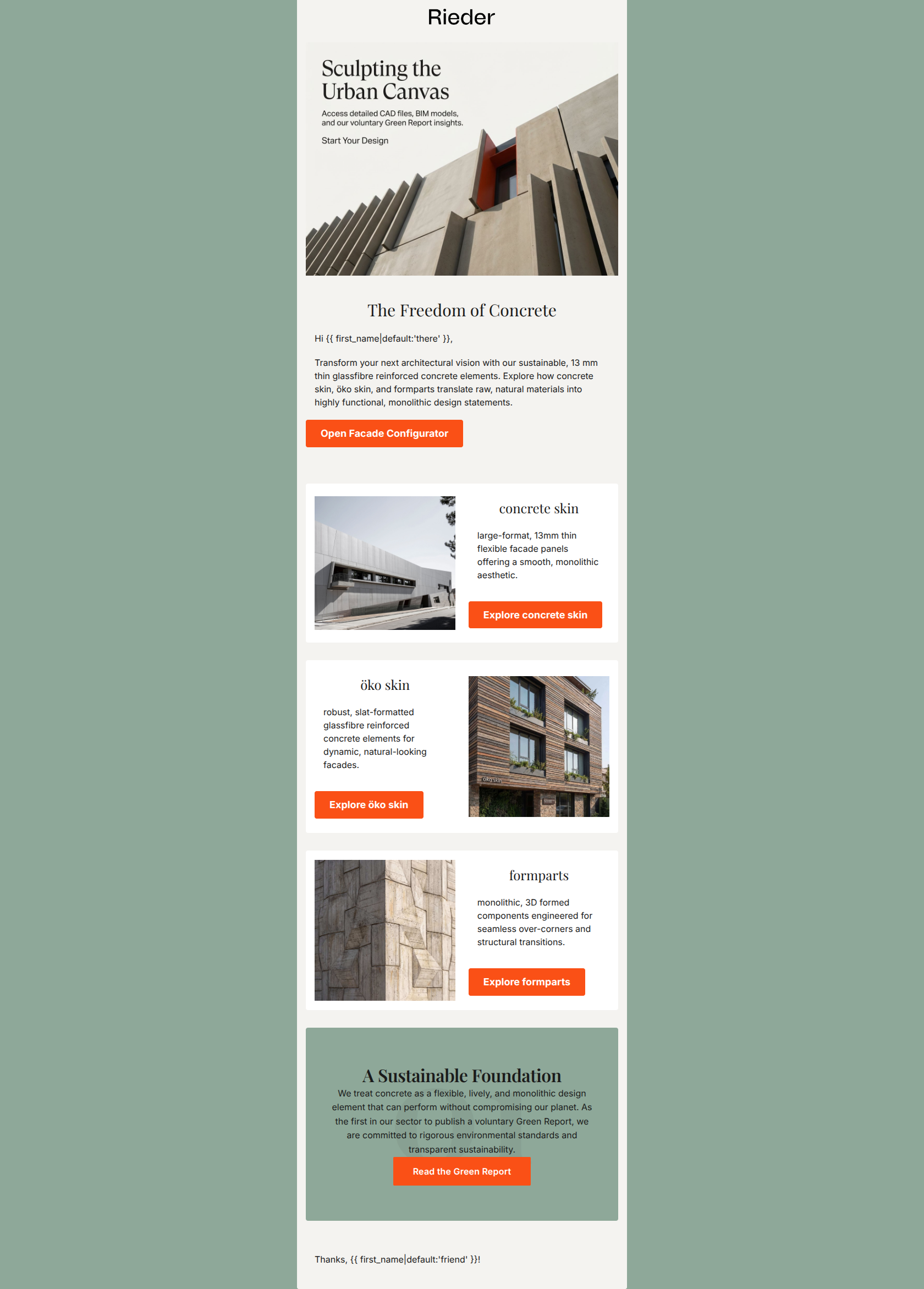
70/100This email visually establishes the premium, architectural gallery aesthetic expected of the Rieder brand, effectively utilizing whitespace and high-contrast vermillion CTAs. Its biggest strength is the minimalist visual structure that appeals directly to architects, while its single biggest weakness is a schizophrenic tone that mixes highly sophisticated B2B copy with inappropriately casual, D2C-style greetings ('Hi there', 'Thanks, friend!'). Color & Contrast Notes: The palette coherence is strong, utilizing the off-white background (#F4F3F0) to create a minimalist gallery feel. The vermillion orange (#FA5016) buttons pop beautifully against the muted slate grey and off-white backgrounds, passing the 'squint test' perfectly. Contrast for text is generally excellent, using deep dark text (#1A1A1A) on light backgrounds.
Create Your Own
Generate professional email designs like this one in seconds with Kopi AI.
Email Details
- Subject Line
- Redefining building envelopes: 3 sustainable concr
- Brand
- Rieder
- Industry
- Other
- Email Type
- Promotional
- Created
- March 10, 2026
Brand Colors
Email Copy
The Freedom of Concrete
Hi there,
Transform your next architectural vision with our sustainable, 13 mm thin glassfibre reinforced concrete elements. Explore how concrete skin, öko skin, and formparts translate raw, natural materials into highly functional, monolithic design statements.
→ Open Facade Configurator
concrete skin
large-format, 13mm thin flexible facade panels offering a smooth, monolithic aesthetic.
→ Explore concrete skin
öko skin
robust, slat-formatted glassfibre reinforced concrete elements for dynamic, natural-looking facades.
→ Explore öko skin
formparts
monolithic, 3D formed components engineered for seamless over-corners and structural transitions.
→ Explore formparts
Thanks, friend!
Why This Email Works
This email visually establishes the premium, architectural gallery aesthetic expected of the Rieder brand, effectively utilizing whitespace and high-contrast vermillion CTAs. Its biggest strength is the minimalist visual structure that appeals directly to architects, while its single biggest weakness is a schizophrenic tone that mixes highly sophisticated B2B copy with inappropriately casual, D2C-style greetings ('Hi there', 'Thanks, friend!'). Color & Contrast Notes: The palette coherence is strong, utilizing the off-white background (#F4F3F0) to create a minimalist gallery feel. The vermillion orange (#FA5016) buttons pop beautifully against the muted slate grey and off-white backgrounds, passing the 'squint test' perfectly. Contrast for text is generally excellent, using deep dark text (#1A1A1A) on light backgrounds.
Hero Impact
70/100- The hero image immediately establishes a premium, structural aesthetic that appeals to architects.
- The transition from the image to the 'Freedom of Concrete' H1 creates a strong, inspiring opening statement.
Content Structure & Flow
80/100- The email follows a logical 'inverted pyramid' for the overarching narrative: starting with high-level vision, diving into specific product lines, and closing with sustainability proof.
- Alternating layouts (full width intro -> 50/50 card -> asymmetric collage -> centered card) keep the visual rhythm engaging.
Visual Hierarchy & Layout
65/100- The generous use of the off-white background (#F4F3F0) creates the spacious, high-end gallery feel requested in the brand guidelines.
- The bright vermillion orange buttons easily dominate the visual hierarchy, making the primary conversion path obvious.
Call-to-Action Strength
70/100- The buttons are visually unmistakable; the sharp #FA5016 color pops aggressively against the muted background palette.
- 'Open Facade Configurator' is a highly specific, action-oriented phrase rather than a generic 'Click Here'.
Message Clarity & Tone
65/100- Vocabulary choices like 'monolithic design statements' and 'raw, natural materials' perfectly match the sophisticated, authoritative tone required for architects.
- The distinction between the two product lines (panels vs. 3D shapes) is communicated concisely.
Readability & Scannability
75/100- Paragraphs are kept to 1-2 sentences, preventing the cognitive overload that plagues many B2B emails.
- The typography strategy effectively uses the serif font for poetic/impactful headings and clean sans-serif for functional descriptions.
Offer & Value Proposition
75/100- The core differentiators—13mm thinness, natural materials, and sustainability—are explicitly called out in the opening paragraph and the final card.
- The email clearly connects the product features to the architect's ultimate outcome ('Transform your next architectural vision').
Personalization & Audience Fit
60/100- The imagery and terminology (CAD, BIM, Facade) are highly tailored to the specific professional needs of architectural designers.
Quick Wins
- Remove the casual 'Hi {{ first_name|default:'there' }}' and 'Thanks, {{ first_name|default:'friend' }}!' greetings to maintain a premium B2B editorial tone.
- Capitalize the sentence 'large-format, 13mm thin flexible facade panels.' in the concrete skin section to fix the typo-like appearance.
- Change the CTA on the bottom sustainability card from 'Open Facade Configurator' to 'Read the Green Report'.


Create Professional Email Designs
Generate beautiful, on-brand email designs in seconds. Just enter your brand URL and let AI do the rest.