Other Promotional Email Template
“Ready for Your Next Moleskine Project?”
Design Score
82/100This is a strong retention email that effectively uses past project data ('recent Moleskine project') to drive relevant upsells. The 'companion' narrative is logical and persuasive. However, the visual execution is hampered by significant accessibility issues in the secondary buttons (low contrast) and repetitive imagery that diminishes the premium feel of the brand.
Create Your Own
Generate professional email designs like this one in seconds with Kopi AI.
Email Details
- Subject Line
- Ready for Your Next Moleskine Project?
- Brand
- Drive Marketing Group
- Industry
- Other
- Email Type
- Promotional
- Created
- November 20, 2025
Brand Colors
Email Copy
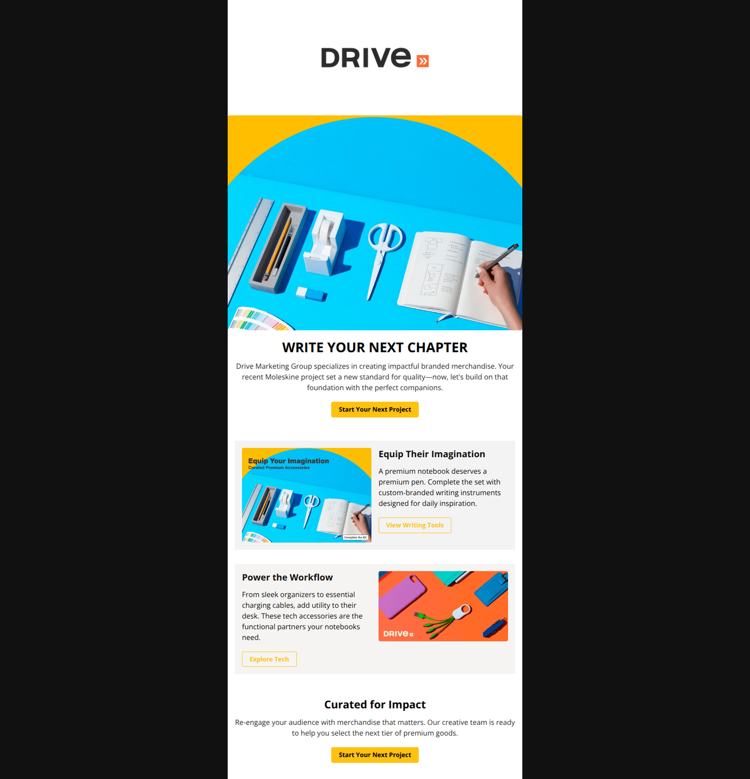
WRITE YOUR NEXT CHAPTER
Drive Marketing Group specializes in creating impactful branded merchandise. Your recent Moleskine project set a new standard for quality—now, let's build on that foundation with the perfect companions.
→ Start Your Next Project
Equip Their Imagination
A premium notebook deserves a premium pen. Complete the set with custom-branded writing instruments designed for daily inspiration.
→ View Writing Tools
Power the Workflow
From sleek organizers to essential charging cables, add utility to their desk. These tech accessories are the functional partners your notebooks need.
→ Explore Tech
Curated for Impact
Re-engage your audience with merchandise that matters. Our creative team is ready to help you select the next tier of premium goods.
→ Start Your Next Project
Why This Email Works
This is a strong retention email that effectively uses past project data ('recent Moleskine project') to drive relevant upsells. The 'companion' narrative is logical and persuasive. However, the visual execution is hampered by significant accessibility issues in the secondary buttons (low contrast) and repetitive imagery that diminishes the premium feel of the brand.
Hero (top/initial part) Impact
85/100- Strong conceptual link between the headline and the previous purchase context.
- Clear, centrally aligned visual hierarchy.
Content Structure & Flow
90/100- Logical product progression (Notebook -> Pens -> Tech).
- Effective use of the zig-zag layout pattern to break up text.
Visual Hierarchy & Layout
75/100- Clean use of white/light gray space.
- Clear distinction between primary and secondary content blocks.
Call-to-Action Strength
65/100- Primary CTA ('Start Your Next Project') uses the brand color effectively with high-contrast black text.
- Action-oriented verbs used throughout.
Message Clarity & Tone
90/100- The 'companion' framing nicely justifies the upsell without feeling pushy.
- Professional, elevated tone matches the B2B audience.
Readability & Scannability
85/100- Good use of typography hierarchy (H1, H3, p).
- Short, digestible paragraphs.
Offer & Value Proposition
88/100- Contextual relevance makes the offer feel tailored.
- Focuses on the 'end-user experience' (the client's audience) rather than just the product features.
Personalization & Audience Fit
95/100- Direct reference to past purchase history.
- Tailored copy that speaks to the specific 'quality' standard set by that previous project.
Quick Wins
- Delete the first sentence of the hero body copy to remove generic boilerplate.
- Change the text color of the secondary outline buttons to Black (#111111) to fix the readability issue.
- Remove the text overlay from the image in the first product card to avoid redundancy.



Create Professional Email Designs
Generate beautiful, on-brand email designs in seconds. Just enter your brand URL and let AI do the rest.