Beauty & Skincare Promotional Email Template
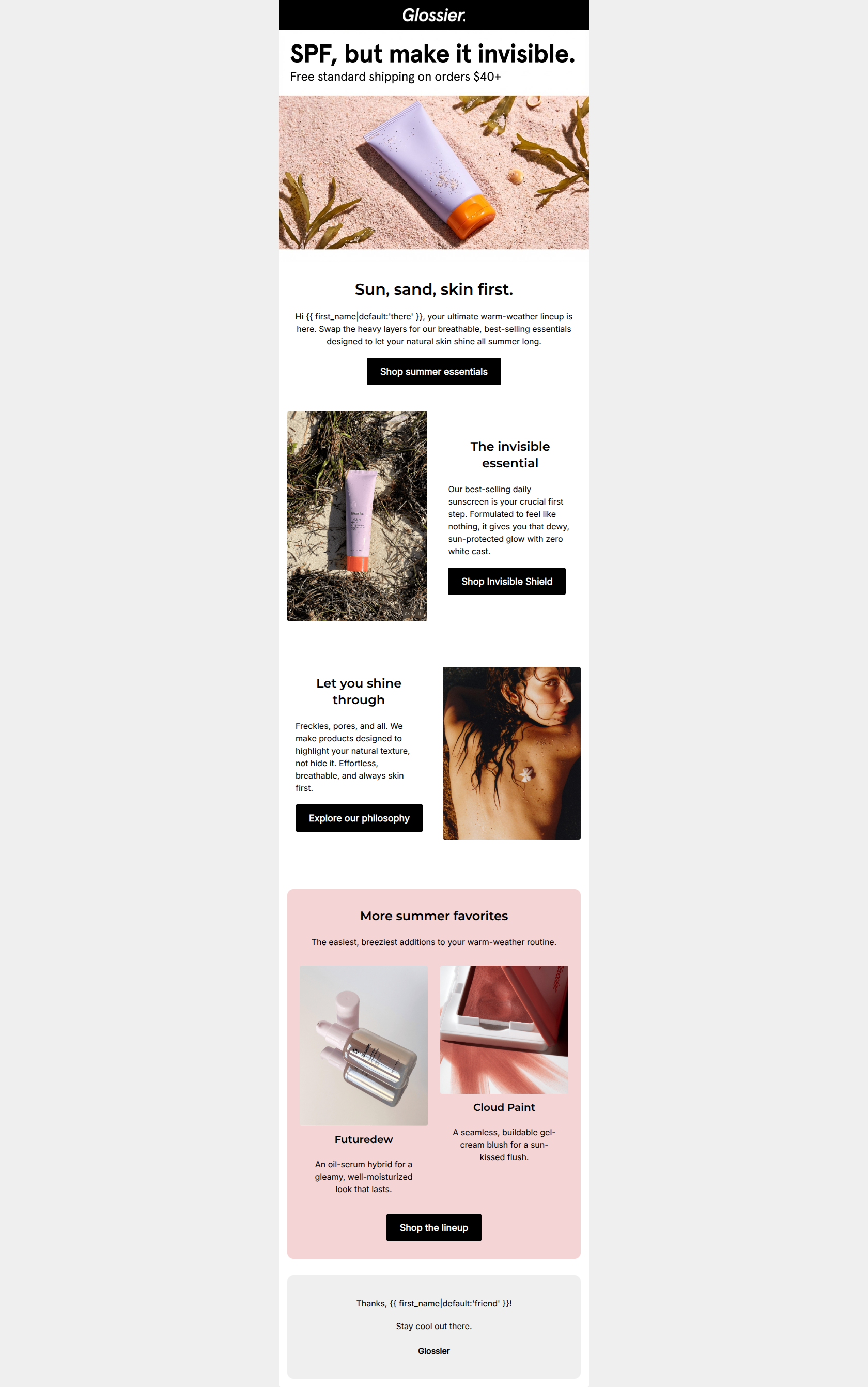
“Ready for a skin first summer?”
Design Score
76/100This email is a visually appealing, highly on-brand execution that successfully captures Glossier's 'cool older sister' tone and minimalist aesthetic. It effectively highlights a major customer pain point (sunscreen white cast) right at the top. However, the email suffers from a 'leaky funnel' problem. By introducing too many competing narratives—a specific hero product, a general summer collection, and an educational brand philosophy page—it dilutes the primary conversion path. The layout is clean and scannable, but tightening the focus onto a single primary objective would significantly lift click-through rates.
Create Your Own
Generate professional email designs like this one in seconds with Kopi AI.
Email Details
- Subject Line
- Ready for a skin first summer?
- Brand
- Glossier [eval 2026-03-21]
- Industry
- Beauty & Skincare
- Email Type
- Promotional
- Created
- March 21, 2026
Brand Colors
Email Copy
Sun, sand, skin first.
Hi there, your ultimate warm-weather lineup is here. Swap the heavy layers for our breathable, best-selling essentials designed to let your natural skin shine all summer long.
→ Shop summer essentials
The invisible essential
Our best-selling daily sunscreen is your crucial first step. Formulated to feel like nothing, it gives you that dewy, sun-protected glow with zero white cast.
→ Shop Invisible Shield
Let you shine through
Freckles, pores, and all. We make products designed to highlight your natural texture, not hide it. Effortless, breathable, and always skin first.
→ Explore our philosophy
More summer favorites
The easiest, breeziest additions to your warm-weather routine.
Futuredew
An oil-serum hybrid for a gleamy, well-moisturized look that lasts.
Cloud Paint
A seamless, buildable gel-cream blush for a sun-kissed flush.
→ Shop the lineup
Thanks, friend!
Stay cool out there. Glossier
Why This Email Works
This email is a visually appealing, highly on-brand execution that successfully captures Glossier's 'cool older sister' tone and minimalist aesthetic. It effectively highlights a major customer pain point (sunscreen white cast) right at the top. However, the email suffers from a 'leaky funnel' problem. By introducing too many competing narratives—a specific hero product, a general summer collection, and an educational brand philosophy page—it dilutes the primary conversion path. The layout is clean and scannable, but tightening the focus onto a single primary objective would significantly lift click-through rates.
Hero Impact
75/100- Addresses a major consumer pain point (white cast) in the very first line of text.
- Immediate visibility of the $40+ free shipping threshold.
- Unretouched, raw photography instantly establishes brand identity.
Content Structure & Flow
72/100- Alternating left/right image and text blocks create a pleasing, scannable rhythm.
- The dedicated pink bounding box effectively separates the 'More summer favorites' cross-sell section from the main narrative.
Visual Hierarchy & Layout
80/100- Immaculate use of whitespace reduces cognitive load and feels premium.
- Clear demarcation of sections using subtle background color shifts (white to pink to grey).
- Photography is cohesive and authentic to the brand's visual identity.
Call-to-Action Strength
65/100- Excellent visual contrast: the solid black buttons on light backgrounds are impossible to miss.
- Action-oriented verbs ('Shop', 'Explore') are used consistently.
Message Clarity & Tone
88/100- Masterful use of benefit-driven copy that directly addresses specific audience pain points.
- Tone is consistently approachable, reading like advice from a cool, knowledgeable friend.
- Short, punchy sentences make the copy highly digestible.
Readability & Scannability
85/100- Strong typographic hierarchy; headings clearly dominate the body text.
- Excellent contrast ratio between the black text and the white/pastel backgrounds.
- Paragraphs are kept brief, preventing a 'wall of text' feeling.
Offer & Value Proposition
82/100- Free shipping threshold is prominent and impossible to miss.
- The core value prop of 'Invisible Shield' is communicated immediately and clearly.
Personalization & Audience Fit
78/100- The 'no-makeup makeup' philosophy resonates deeply with the core demographic.
- Casual, friendly personalization ('Hi {{ first_name }}', 'Thanks, {{ first_name }}!') fits the intimate brand voice.
Quick Wins
- Remove the 'Explore our philosophy' button to close a major leak in the conversion funnel.
- Change the hero button copy from 'Shop summer essentials' to 'Shop Invisible Shield' to align with the 'SPF, but make it invisible' hook.
- Add a reminder of the '$40+ Free Shipping' threshold below the 'More summer favorites' section to encourage cart building.

Create Professional Email Designs
Generate beautiful, on-brand email designs in seconds. Just enter your brand URL and let AI do the rest.