Health & Wellness Announcement Email Template
“Our mission: Hydration for all”

Design Score
67/100This email effectively communicates Liquid I.V.'s core social mission with strong, emotional imagery and a clear layout. However, it suffers from a one-dimensional approach to conversion. By exclusively using repetitive, informational CTAs ('Discover Our Impact') and omitting any direct path to purchase, the email successfully builds brand affinity but fails to capture the revenue that should naturally follow that goodwill. The copy is also highly repetitive, stating the same overarching mission across three different sections rather than building a compelling narrative.
Create Your Own
Generate professional email designs like this one in seconds with Kopi AI.
Email Details
- Subject Line
- Our mission: Hydration for all
- Brand
- Liquid IV [eval 2026-03-26]
- Industry
- Health & Wellness
- Email Type
- Announcement
- Created
- March 26, 2026
Brand Colors
Email Copy
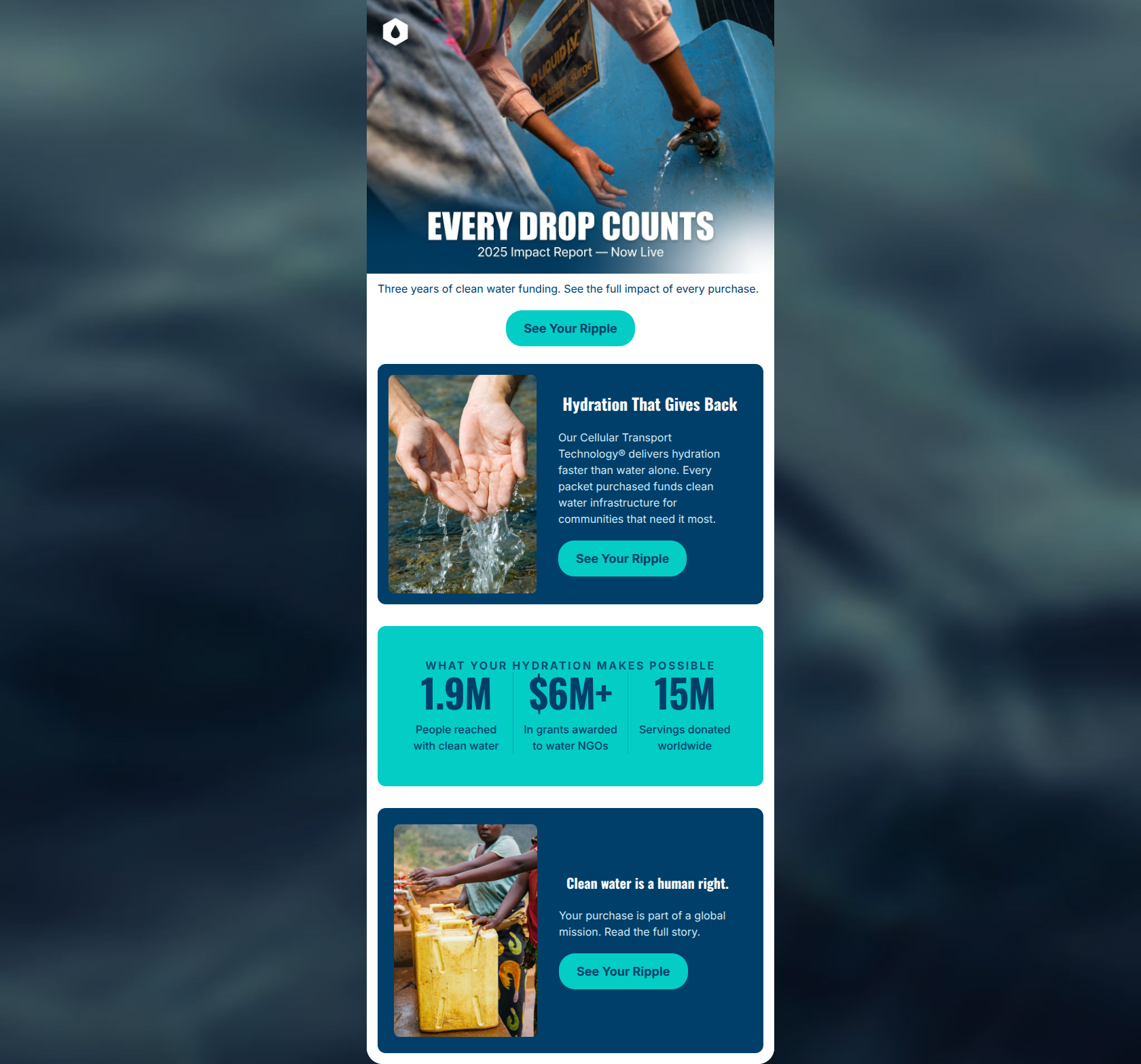
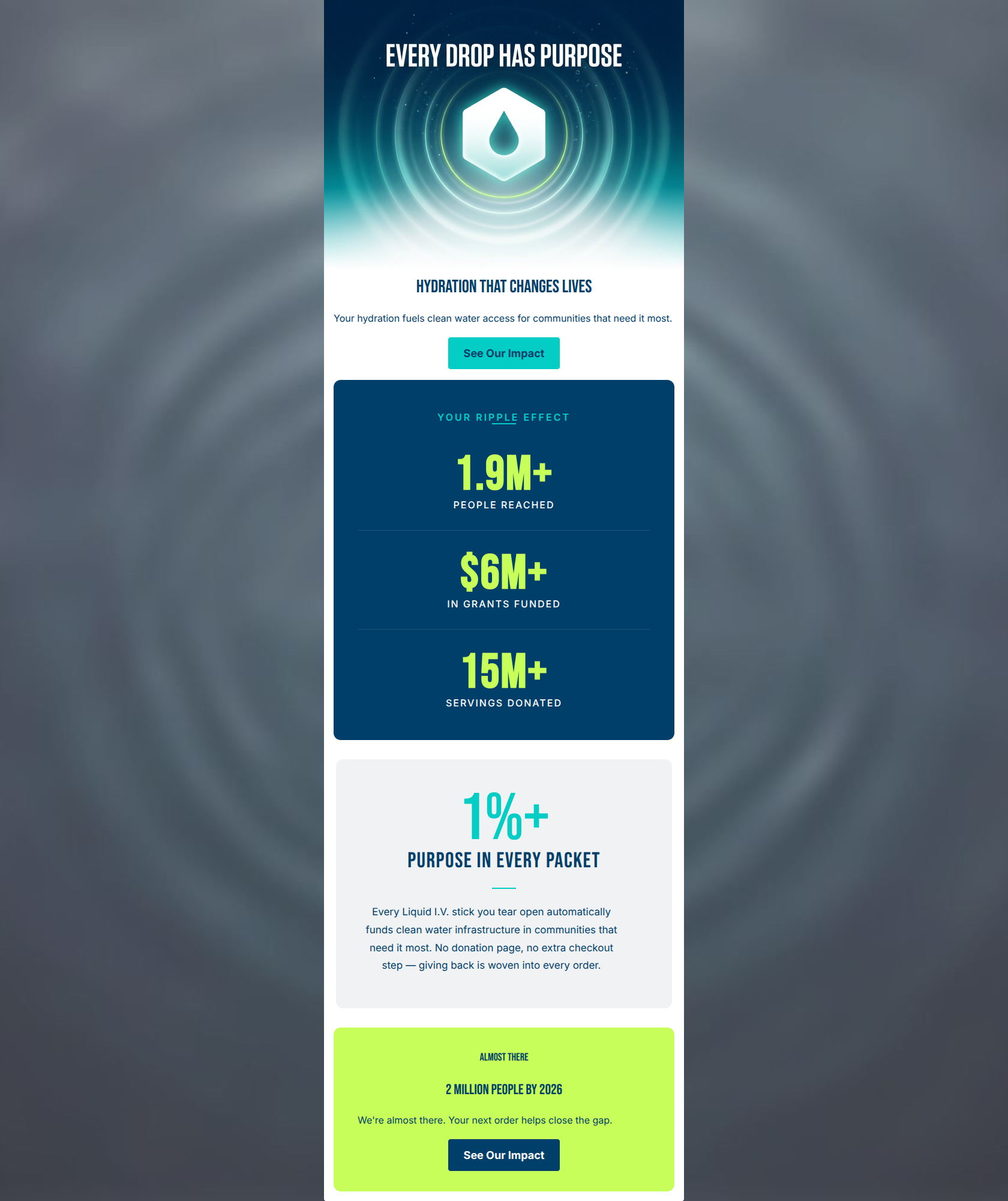
Hydration With A Purpose
Every stick you mix helps bring sustainable hydration where it's needed most.
→ Discover Our Impact
Your purchase directly funds global clean water access.
We partner with impact organizations so your daily wellness fuels real-world solutions.
→ Discover Our Impact
Millions of hydration servings donated to communities worldwide.
From emergency relief to daily access, we deliver vital hydration across the globe.
→ Discover Our Impact
Why This Email Works
This email effectively communicates Liquid I.V.'s core social mission with strong, emotional imagery and a clear layout. However, it suffers from a one-dimensional approach to conversion. By exclusively using repetitive, informational CTAs ('Discover Our Impact') and omitting any direct path to purchase, the email successfully builds brand affinity but fails to capture the revenue that should naturally follow that goodwill. The copy is also highly repetitive, stating the same overarching mission across three different sections rather than building a compelling narrative.
Hero (top/initial part) Impact
70/100- Strong, authentic photography that avoids feeling like a stock image.
- Clear, bold primary headline that sets the theme immediately.
Content Structure & Flow
65/100- Distinct color blocking helps separate the email into easily digestible chunks.
- Alternating background colors prevents visual fatigue as the user scrolls.
Visual Hierarchy & Layout
75/100- Good use of negative space inside the colored cards.
- Icons and images are sized appropriately so they don't overpower the text.
Call-to-Action Strength
50/100- CTAs are rendered as solid, easily tappable buttons rather than inline text links.
- The button placement consistently follows the inverted pyramid structure within each block.
Message Clarity & Tone
70/100- Maintains a positive, empowering tone without veering into guilt-trip marketing.
- The connection between the product ('Every stick you mix') and the outcome is clearly established early on.
Readability & Scannability
80/100- Excellent constraint with word counts; no walls of text.
- High contrast between the white text and dark blue backgrounds.
Offer & Value Proposition
60/100- Clearly communicates the brand's unique differentiator (social impact) which separates it from generic sports drinks.
Personalization & Audience Fit
75/100- Perfectly targets the psychographic profile of a consumer who wants their purchases to have a 'purpose'.
- Aesthetic matches the active, vibrant lifestyle of the target demographic.
Copy Conciseness & Word Economy
60/100- Avoids long, drawn-out paragraphs.
- Headings are punchy and direct.
Quick Wins
- Change the second and third CTA copy to something distinct (e.g., 'Read the Report', 'Shop to Support') to break banner blindness.
- Add a 'Shop Best Sellers' or 'Stock Up' button at the very bottom of the email to capture high-intent buyers.
- Change the cyan button in the bottom electric blue section to white for better visual contrast.
- Move the 'Free Shipping' text out of the hero image text block and into a dedicated, visually distinct promo bar at the top.
Create Professional Email Designs
Generate beautiful, on-brand email designs in seconds. Just enter your brand URL and let AI do the rest.