SaaS & Software Promotional Email Template
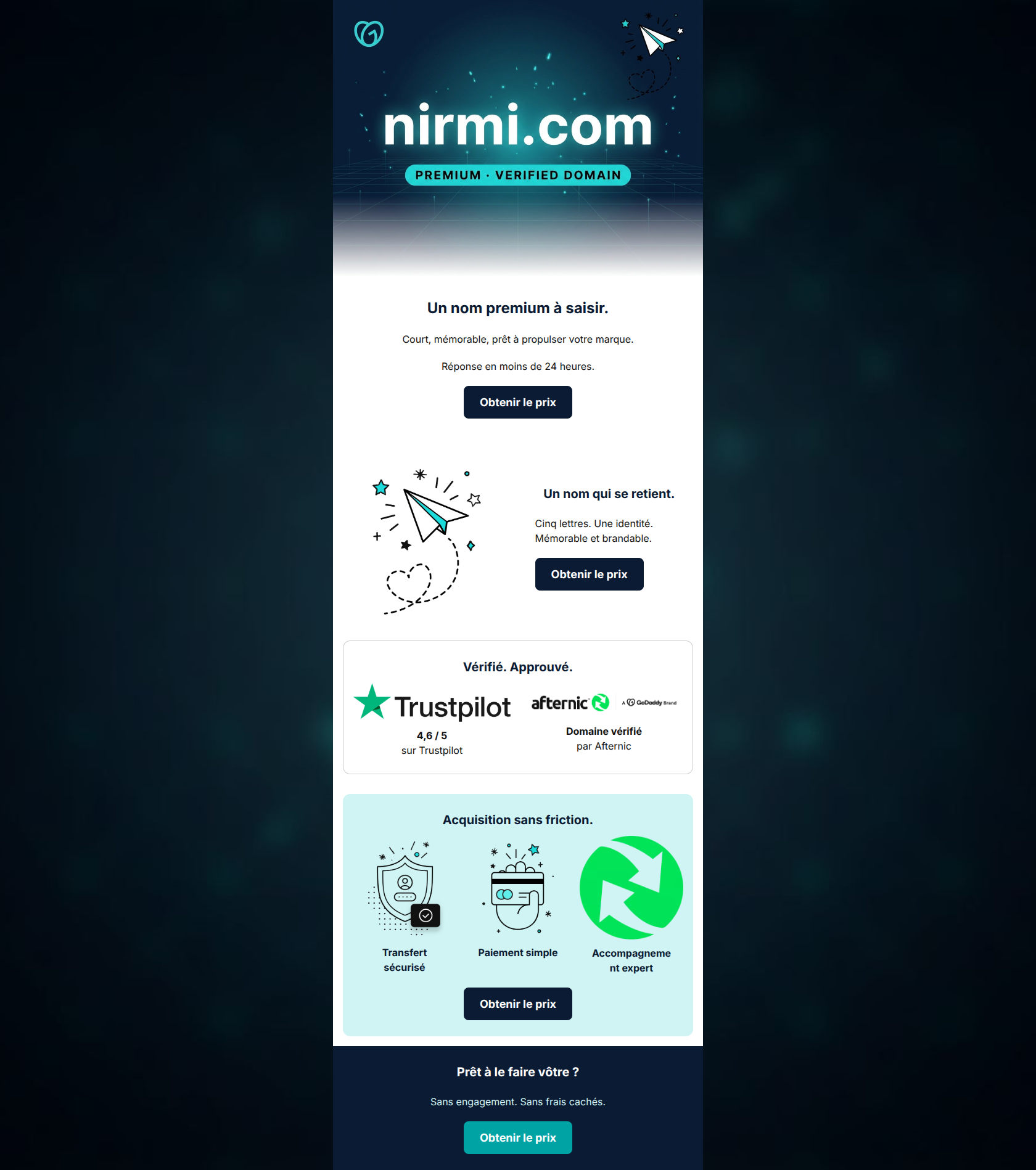
“nirmi.com — un nom premium à saisir”
Design Score
85/100This is a highly effective, conversion-focused promotional email. It aggressively tackles the primary friction points of aftermarket domain purchasing—trust, security, and hidden fees—using well-structured visual cards and authoritative trust badges (Trustpilot, Afternic). The email rigidly adheres to a single conversion goal, repeating the exact same call-to-action 'Obtenir le prix' four times, which creates a flawless, unambiguous path for the user. The main opportunities for improvement lie in visual hierarchy—specifically, making the primary CTA buttons 'pop' more against the layout—and slightly tightening the copy to remove redundant messaging between the hero and the second section.
Create Your Own
Generate professional email designs like this one in seconds with Kopi AI.
Email Details
- Subject Line
- nirmi.com — un nom premium à saisir
- Brand
- GoDaddy
- Industry
- SaaS & Software
- Email Type
- Promotional
- Created
- May 18, 2026
Brand Colors
Email Copy
Un nom premium à saisir.
Court, mémorable, prêt à propulser votre marque.
Réponse en moins de 24 heures.
→ Obtenir le prix
Un nom qui se retient.
Cinq lettres. Une identité. Mémorable et brandable.
→ Obtenir le prix
Vérifié. Approuvé.
4,6 / 5 sur Trustpilot
Domaine vérifié par Afternic
Acquisition sans friction.
Transfert sécurisé
Paiement simple
Accompagnement expert
→ Obtenir le prix
Prêt à le faire vôtre ?
Sans engagement. Sans frais cachés.
→ Obtenir le prix
Why This Email Works
This is a highly effective, conversion-focused promotional email. It aggressively tackles the primary friction points of aftermarket domain purchasing—trust, security, and hidden fees—using well-structured visual cards and authoritative trust badges (Trustpilot, Afternic). The email rigidly adheres to a single conversion goal, repeating the exact same call-to-action 'Obtenir le prix' four times, which creates a flawless, unambiguous path for the user. The main opportunities for improvement lie in visual hierarchy—specifically, making the primary CTA buttons 'pop' more against the layout—and slightly tightening the copy to remove redundant messaging between the hero and the second section.
Hero (top/initial part) Impact
82/100- Highly visual and immediate product identification.
- Clear expectation setting for the next step (response within 24 hours).
- The 'Verified Domain' badge instantly adds perceived value.
Content Structure & Flow
85/100- Excellent use of the inverted pyramid within individual sections.
- Perfect rhythm of value proposition followed immediately by a conversion opportunity.
- Trust signals are placed prominently in the middle of the flow, exactly where skepticism might arise.
Visual Hierarchy & Layout
78/100- Distinct visual cards separate different types of information (Trust vs. Process).
- The use of the mint background (#D0F4F4) effectively draws the eye to the key selling points.
- Generous padding prevents cognitive overload.
Call-to-Action Strength
88/100- Flawless adherence to a single primary conversion goal.
- Clear, action-oriented, and expectation-setting copy ('Obtenir le prix').
- Strategic repetition throughout the email layout.
Message Clarity & Tone
85/100- Directly addresses common anxieties (hidden fees, security).
- Confident and concise phrasing.
- Strong use of bolding to highlight key benefits.
Readability & Scannability
90/100- Excellent use of bullet-style layouts with supporting iconography.
- Short, punchy sentences.
- High contrast text on light backgrounds.
Offer & Value Proposition
85/100- Strong, explicit trust signals validate the safety of the transaction.
- Clear delineation between the value of the product (the domain) and the value of the service (the secure transfer).
Personalization & Audience Fit
80/100- Speaks directly to the target audience's desires ('brandable', 'propulser').
- Addresses specific SMB pain points regarding technical setups.
Copy Conciseness & Word Economy
88/100- Zero throat-clearing; gets straight to the point.
- Uses short fragments for punchy delivery.
- Every text block serves a distinct purpose.
Quick Wins
- Update the background color of the first three 'Obtenir le prix' buttons to #00A3A3 to match the footer button, ensuring they stand out visually against the dark text.
- Remove the repetition of the word 'mémorable' between the Hero and the second section.



Create Professional Email Designs
Generate beautiful, on-brand email designs in seconds. Just enter your brand URL and let AI do the rest.