Beauty & Skincare Product Launch Email Template
“New: Targeted Volume. Early Bird Access.”
Design Score
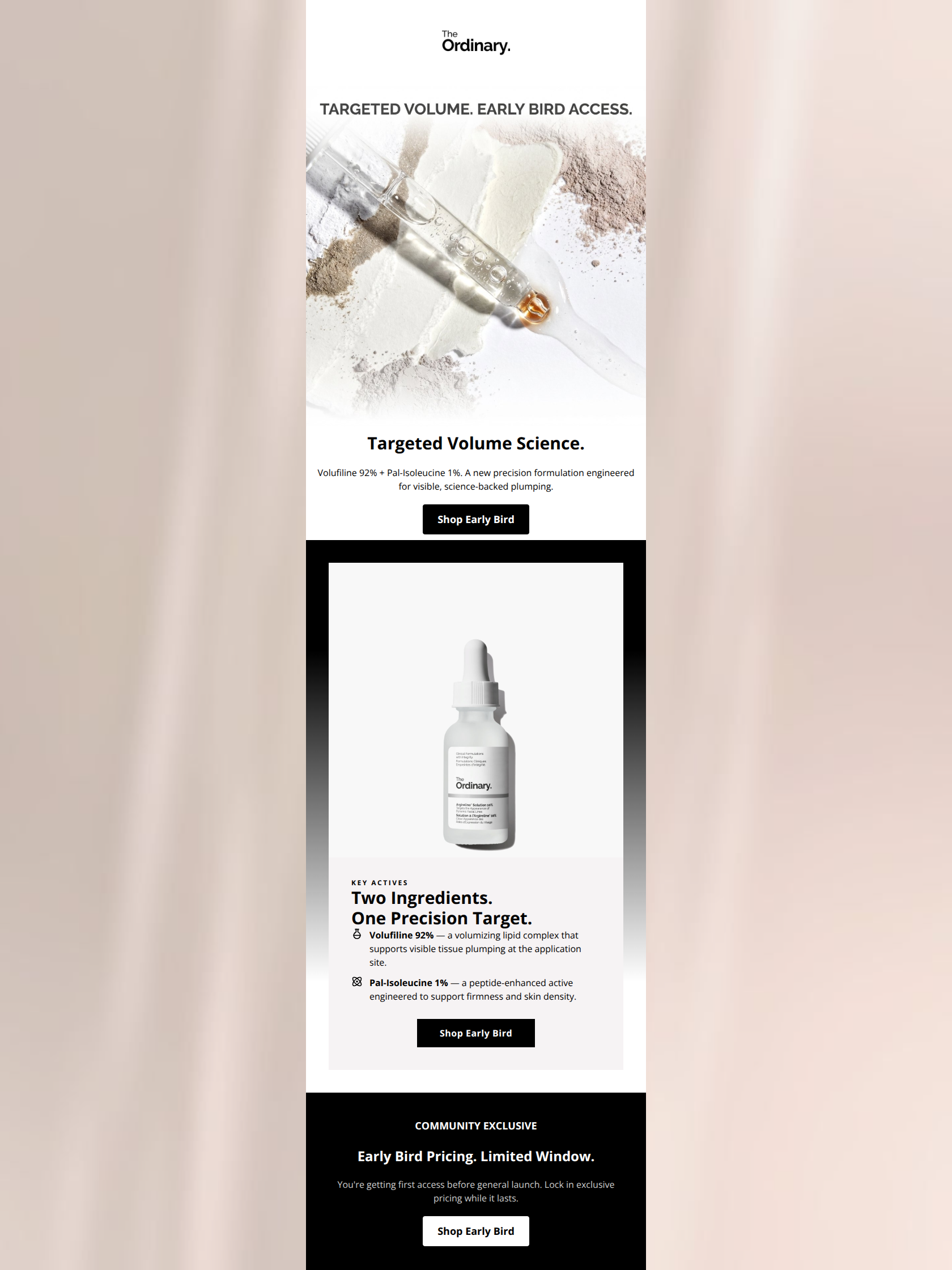
84/100This is a strong, highly brand-aligned email that effectively leverages The Ordinary's clinical, no-nonsense aesthetic. It clearly communicates the introduction of a new product, highlights the active ingredients, and creates urgency through a 'Community Exclusive' early bird offer. The design is clean, scannable, and the typography is excellent. However, the email suffers slightly from repetitive copywriting (overusing the phrase 'Early Bird') and a lack of clarity regarding the actual mechanics of the 'exclusive pricing' offer, which introduces unnecessary friction.
Create Your Own
Generate professional email designs like this one in seconds with Kopi AI.
Email Details
- Subject Line
- New: Targeted Volume. Early Bird Access.
- Brand
- The Ordinary
- Industry
- Beauty & Skincare
- Email Type
- Product Launch
- Created
- March 26, 2026
Brand Colors
Email Copy
Targeted Volume Science.
Volufiline 92% + Pal-Isoleucine 1%. A new precision formulation engineered for visible, science-backed plumping.
→ Shop Early Bird
COMMUNITY EXCLUSIVE
Early Bird Pricing. Limited Window.
You're getting first access before general launch. Lock in exclusive pricing while it lasts.
→ Shop Early Bird
Why This Email Works
This is a strong, highly brand-aligned email that effectively leverages The Ordinary's clinical, no-nonsense aesthetic. It clearly communicates the introduction of a new product, highlights the active ingredients, and creates urgency through a 'Community Exclusive' early bird offer. The design is clean, scannable, and the typography is excellent. However, the email suffers slightly from repetitive copywriting (overusing the phrase 'Early Bird') and a lack of clarity regarding the actual mechanics of the 'exclusive pricing' offer, which introduces unnecessary friction.
Hero (top/initial part) Impact
85/100- Immediate communication of the new product and its primary benefit (volume).
- Strong, brand-authentic imagery that highlights the raw ingredients.
- Clear, high-contrast CTA placed above the fold.
Content Structure & Flow
82/100- Logical progression from product introduction to technical details to urgency.
- Clear delineation between the educational content and the promotional offer.
- Good use of whitespace to separate distinct thoughts.
Visual Hierarchy & Layout
88/100- Exceptional use of negative space to drive focus to the copy and CTAs.
- Strong visual anchor at the bottom to highlight the limited-time offer.
- Consistent and legible typography hierarchy.
Call-to-Action Strength
75/100- Perfect color contrast for the buttons against their respective backgrounds.
- Buttons are adequately sized and centrally aligned for easy tapping.
- Action-oriented verb ('Shop') used.
Message Clarity & Tone
90/100- Highly authentic, scientific, and no-nonsense brand voice.
- Focus on specific ingredient names and percentages builds trust.
- Avoidance of hyperbole reinforces the brand's commitment to honesty.
Readability & Scannability
92/100- Excellent use of bullet points for product features.
- Bite-sized copy blocks prevent cognitive overload.
- Clear distinction between headings and body text.
Offer & Value Proposition
78/100- Creates a strong sense of exclusivity for subscribers.
- Leverages urgency effectively without resorting to aggressive countdown timers.
- Connects the value of the product to its precise formulation.
Personalization & Audience Fit
88/100- Perfect alignment with the target audience's desire for ingredient transparency.
- Frames the subscriber as part of an exclusive 'community'.
- Respects the reader's intelligence by not dumbing down the science.
Copy Conciseness & Word Economy
85/100- Zero filler words or throat-clearing openers.
- Sentences are punchy and direct.
- High information density per word.
Quick Wins
- Vary the copy on the three Call-To-Action buttons to avoid repetitive 'Shop Early Bird' phrasing.
- Clarify the specific nature of the 'exclusive pricing' in the bottom section to remove ambiguity.
- Lighten the gray body text in the bottom black section slightly for better contrast and readability.



Create Professional Email Designs
Generate beautiful, on-brand email designs in seconds. Just enter your brand URL and let AI do the rest.