Electronics & Tech Product Launch Email Template
“NEW DROP The Creatures Mystery Box Is Here”
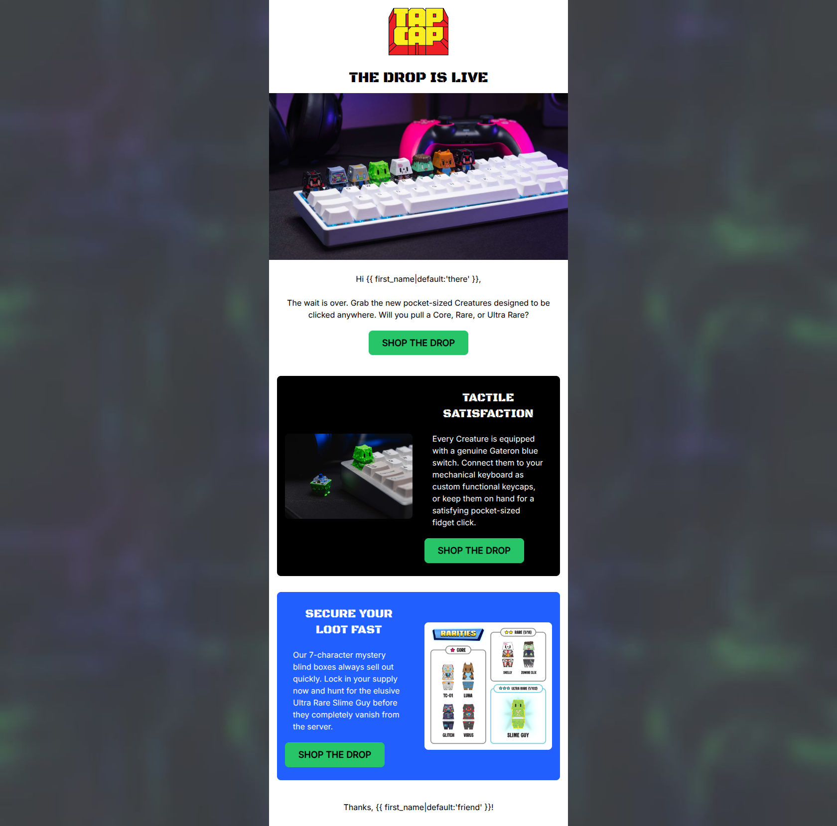
Design Score
80/100This email does an excellent job establishing the brand's gamified, high-energy tone and clearly communicating the unique dual-purpose nature of the product. However, by omitting the accessible price point and multi-pack offers, it misses a crucial lever for driving impulse clicks.
Create Your Own
Generate professional email designs like this one in seconds with Kopi AI.
Email Details
- Subject Line
- NEW DROP The Creatures Mystery Box Is Here
- Brand
- TapCap
- Industry
- Electronics & Tech
- Email Type
- Product Launch
- Created
- March 3, 2026
Brand Colors
Email Copy
THE DROP IS LIVE
Hi there, The wait is over. Grab the new pocket-sized Creatures designed to be clicked anywhere. Will you pull a Core, Rare, or Ultra Rare?
→ SHOP THE DROP
TACTILE SATISFACTION
Every Creature is equipped with a genuine Gateron blue switch. Connect them to your mechanical keyboard as custom functional keycaps, or keep them on hand for a satisfying pocket-sized fidget click.
→ SHOP THE DROP
SECURE YOUR LOOT FAST
Our 7-character mystery blind boxes always sell out quickly. Lock in your supply now and hunt for the elusive Ultra Rare Slime Guy before they completely vanish from the server.
→ SHOP THE DROP
Thanks, friend!
Why This Email Works
This email does an excellent job establishing the brand's gamified, high-energy tone and clearly communicating the unique dual-purpose nature of the product. However, by omitting the accessible price point and multi-pack offers, it misses a crucial lever for driving impulse clicks.
Hero Impact
85/100- The hero image effectively shows the product in its native environment (on a mechanical keyboard), instantly communicating its dual use.
- The embedded 'Unbox your loot' faux-button within the graphic perfectly sets the gamified expectation.
Content Structure & Flow
88/100- The narrative flows logically from an exciting announcement to a functional value proposition (tactile satisfaction), ending with scarcity and gamification (secure your loot).
- The use of alternating colored cards naturally breaks up the reading experience and pulls the user down the page.
Visual Hierarchy & Layout
80/100- The contrast between the stark white background, the pitch-black card, and the electric blue card creates a highly scannable, engaging rhythm.
- The toxic green CTA buttons dominate the visual hierarchy, making the click path obvious.
Call-to-Action Strength
75/100- The button color (#28C468) provides fantastic contrast against all three background colors (white, black, blue), easily passing the squint test.
- The button shape and sizing are distinctly clickable.
Message Clarity & Tone
82/100- The copy perfectly nails the intended Y2K-cyberpunk/gamer voice with phrases like 'pull a Core,' 'blind boxes,' and 'vanish from the server.'
- The explanation of the Gateron blue switch functionality is concise and easy to understand.
Readability & Scannability
85/100- Paragraphs are kept short (1-2 sentences), making them easy to digest.
- High-contrast text pairings (white on black/blue) ensure excellent legibility without eye strain.
Offer & Value Proposition
72/100- The 'blind box' mystery mechanic is communicated exceptionally well through both copy and the included rarity chart graphic.
- The functional value (tactile satisfaction) is clearly highlighted alongside the aesthetic value.
Personalization & Audience Fit
78/100- The language style ('loot', 'server', 'squad') is highly tailored to the gaming and mechanical keyboard enthusiast demographic.
- The inclusion of a first-name variable adds a basic level of direct communication.
Quick Wins
- Update the secondary and tertiary CTAs from 'SHOP THE DROP' to context-specific phrases like 'FEEL THE CLICK' and 'HUNT FOR RARES'.
- Add the $11.99 price point to the hero copy to immediately frame the product as an accessible impulse buy.
- Fix the text alignment inconsistency by left-aligning the heading and body text inside the black 'TACTILE SATISFACTION' card.
- Replace the generic 'Thanks, {{ first_name }}!' footer with an on-brand sign-off like 'See you on the server, {{ first_name }}'.


Create Professional Email Designs
Generate beautiful, on-brand email designs in seconds. Just enter your brand URL and let AI do the rest.