Health & Wellness Announcement Email Template
“More than hydration.”
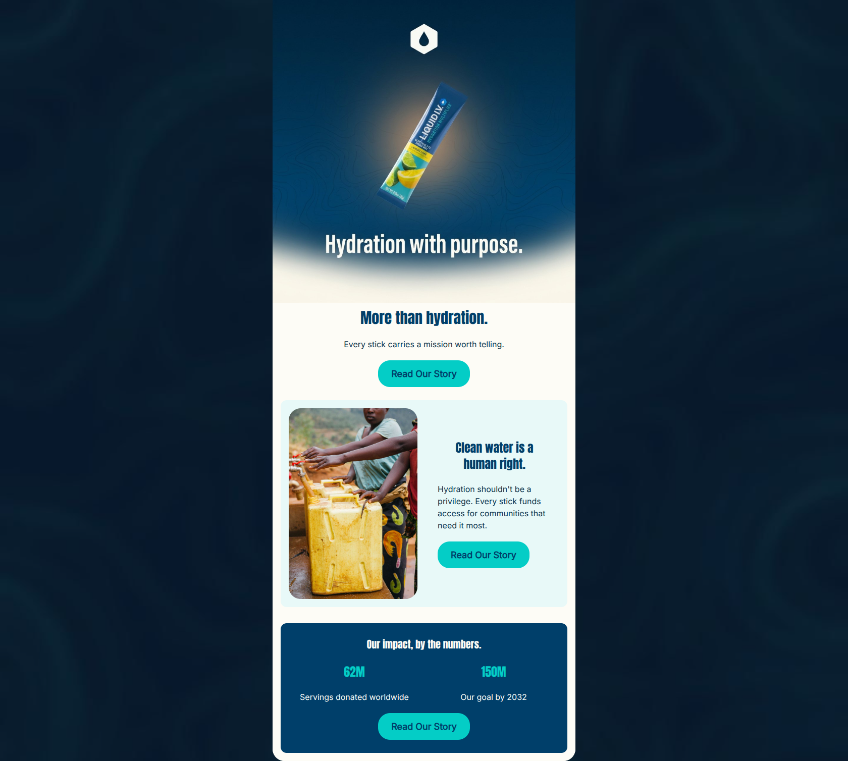
Design Score
87/100This is a highly effective, mission-driven email that perfectly aligns with Liquid I.V.'s brand values. The structure follows a clean inverted pyramid, moving from a high-level hook to specific impact pillars, and closing with concrete proof points. The visual design is striking, utilizing the brand's high-contrast nautical blues and electric teals to create an energetic, scannable layout. The strict repetition of the 'Read Our Story' CTA is a textbook example of best practice, ensuring the reader is never confused about the primary action. To push this from an 87 to a 90+, the hero copy needs to be slightly more explicit about the specific mission (clean water) rather than relying on a teaser, and the copy could shift to be slightly more 'you-centric' to make the reader feel like an active participant in the impact.
Create Your Own
Generate professional email designs like this one in seconds with Kopi AI.
Email Details
- Subject Line
- More than hydration.
- Brand
- Liquid IV [eval-prod 2026-05-06]
- Industry
- Health & Wellness
- Email Type
- Announcement
- Created
- May 6, 2026
Brand Colors
Email Copy
More than hydration.
Every stick carries a mission worth telling.
→ Read Our Story
Clean water is a human right.
Hydration shouldn't be a privilege. Every stick funds access for communities that need it most.
→ Read Our Story
Our impact, by the numbers.
62M
Servings donated worldwide
150M
Our goal by 2032
→ Read Our Story
Why This Email Works
This is a highly effective, mission-driven email that perfectly aligns with Liquid I.V.'s brand values. The structure follows a clean inverted pyramid, moving from a high-level hook to specific impact pillars, and closing with concrete proof points. The visual design is striking, utilizing the brand's high-contrast nautical blues and electric teals to create an energetic, scannable layout. The strict repetition of the 'Read Our Story' CTA is a textbook example of best practice, ensuring the reader is never confused about the primary action. To push this from an 87 to a 90+, the hero copy needs to be slightly more explicit about the specific mission (clean water) rather than relying on a teaser, and the copy could shift to be slightly more 'you-centric' to make the reader feel like an active participant in the impact.
Hero (top/initial part) Impact
82/100- Striking visual asset that instantly communicates the product and brand.
- Creates an immediate emotional hook.
- Clear, high-contrast button immediately visible above the fold.
Content Structure & Flow
90/100- Excellent use of the inverted pyramid framework.
- Each section serves a distinct purpose without repeating the exact same narrative angle.
- Ends on a strong, authoritative proof point that validates the preceding claims.
Visual Hierarchy & Layout
88/100- Strong use of color blocking to define sections.
- Photography and text are balanced well in the middle section.
- Headings visually dominate the body text, creating a clear scan path.
Call-to-Action Strength
98/100- Perfect consistency: all three buttons use the exact same copy and presumably point to the same destination.
- High-contrast electric teal (#04CDC6) ensures the buttons pop against all background colors.
- Strategic placement at the end of every distinct thought block.
Message Clarity & Tone
85/100- Confident, unapologetic tone ('Clean water is a human right.').
- Avoids overly dense or technical jargon regarding charitable logistics.
- Matches the brand's documented psychographics regarding values-driven consumption.
Readability & Scannability
92/100- Excellent use of large typography for key statistics.
- Short, punchy sentences reduce cognitive load.
- High contrast between text and background colors across all modules.
Offer & Value Proposition
84/100- Clearly communicates the brand's unique differentiator in a crowded market (global impact).
- Uses hard numbers (62M servings) to validate the value proposition.
Personalization & Audience Fit
80/100- Directly addresses the psychographic profile of the values-driven, active consumer.
- Imagery feels authentic and avoids looking like generic stock photography.
Copy Conciseness & Word Economy
88/100- Zero throat-clearing in the body copy.
- Relies on strong nouns and verbs rather than excessive adjectives.
- Data is used to replace what would otherwise require lengthy explanatory paragraphs.
Quick Wins
- Add the specific phrase 'clean water' to the hero section's subcopy so readers instantly know what the 'mission' is without needing to scroll.
- Change the wording in the middle section to be more you-centric: 'Every stick you drink funds access...' instead of just 'Every stick funds access...'
- Remove or alter the HTML H1 'More than hydration' if the image above it already includes the embedded text 'Hydration with purpose' to prevent the visually repetitive double-heading effect.

Create Professional Email Designs
Generate beautiful, on-brand email designs in seconds. Just enter your brand URL and let AI do the rest.