Health & Wellness Announcement Email Template
“More than hydration.”
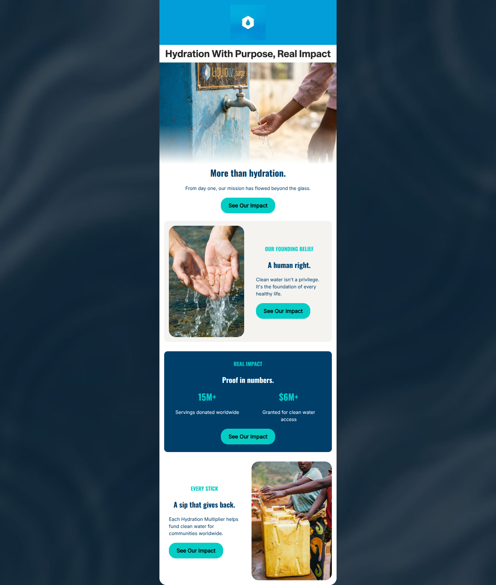
Design Score
86/100This is a highly effective, emotionally resonant email that successfully pivots from product marketing to brand purpose. It expertly leverages the inverted pyramid structure, moving the reader from an overarching philosophical statement down to hard, quantifiable proof, and finally tying it back to the customer's purchase behavior. The copy is exceptionally tight and punchy, avoiding corporate jargon in favor of clear, impactful statements. The primary weakness lies in a few visual execution details, notably poor color contrast on subheadings and a slight over-reliance on 'we/our' framing rather than making the customer the hero of the impact story.
Create Your Own
Generate professional email designs like this one in seconds with Kopi AI.
Email Details
- Subject Line
- More than hydration.
- Brand
- Liquid IV [eval 2026-03-26]
- Industry
- Health & Wellness
- Email Type
- Announcement
- Created
- April 24, 2026
Brand Colors
Email Copy
More than hydration.
From day one, our mission has flowed beyond the glass.
→ See Our Impact
OUR FOUNDING BELIEF
A human right.
Clean water isn't a privilege. It's the foundation of every healthy life.
→ See Our Impact
REAL IMPACT
Proof in numbers.
15M+
Servings donated worldwide
$6M+
Granted for clean water access
→ See Our Impact
EVERY STICK
A sip that gives back.
Each Hydration Multiplier helps fund clean water for communities worldwide.
→ See Our Impact
Why This Email Works
This is a highly effective, emotionally resonant email that successfully pivots from product marketing to brand purpose. It expertly leverages the inverted pyramid structure, moving the reader from an overarching philosophical statement down to hard, quantifiable proof, and finally tying it back to the customer's purchase behavior. The copy is exceptionally tight and punchy, avoiding corporate jargon in favor of clear, impactful statements. The primary weakness lies in a few visual execution details, notably poor color contrast on subheadings and a slight over-reliance on 'we/our' framing rather than making the customer the hero of the impact story.
Hero (top/initial part) Impact
88/100- Strong, context-setting top banner ('Hydration With Purpose...').
- Emotive, high-quality photography that clearly illustrates the mission.
- Headline ('More than hydration') creates immediate intrigue.
Content Structure & Flow
92/100- Perfect use of the inverted pyramid structure.
- Clear delineation between philosophical belief and concrete data.
- Ends by successfully tying the global mission back to the physical product.
Visual Hierarchy & Layout
75/100- The dark blue statistics section creates a strong focal point.
- Consistent use of rounded corners on images and layout blocks creates a cohesive feel.
- Good use of whitespace around the main copy blocks to let the text breathe.
Call-to-Action Strength
95/100- All four buttons point to the exact same destination with the exact same copy.
- The cyan buttons provide excellent contrast against both the white and dark blue backgrounds.
- Button text ('See Our Impact') is action-oriented and sets a clear expectation for the landing page.
Message Clarity & Tone
85/100- Highly emotive and confident tone.
- Avoids complex jargon regarding charitable giving.
- Maintains the energetic feel of a sports brand while discussing a serious humanitarian issue.
Readability & Scannability
82/100- Excellent use of large, bold typography for key statistics.
- No 'walls of text' anywhere in the email.
- Clear visual hierarchy between H2s and body text.
Offer & Value Proposition
88/100- Quantifies the impact with hard numbers rather than just vague promises.
- Clearly explains the mechanism of giving ('Each Hydration Multiplier helps fund...').
Personalization & Audience Fit
75/100- Directly addresses the audience's documented desire for impact and purposeful consumption.
- Matches the brand's premium, health-conscious positioning.
Copy Conciseness & Word Economy
98/100- Punchy, impactful sentences ('A human right.').
- Distills complex logistical charity operations into a simple 'Proof in numbers' block.
- Zero redundant messaging across the four sections.
Quick Wins
- Change the cyan 'OUR FOUNDING BELIEF' and 'EVERY STICK' subheadings to dark navy to fix severe contrast and legibility issues on the light backgrounds.
- Update at least one or two instances of 'Our Impact' to 'Your Impact' to make the customer feel responsible for the charitable success.

Create Professional Email Designs
Generate beautiful, on-brand email designs in seconds. Just enter your brand URL and let AI do the rest.