Health & Wellness Announcement Email Template
“More than hydration. A mission.”
Design Score
83/100This is a strong, purpose-driven email that effectively communicates Liquid I.V.'s social mission. The visual hierarchy is excellent, particularly the dark navy 'Impact by the numbers' card which perfectly anchors the email with concrete social proof. The primary weakness is narrative bloat in the top half: the second section merely restates the hero's message without adding new value, slowing down the reader's path to the most compelling information. By trimming redundant copy and shifting the perspective from brand-centric ('Our impact') to customer-centric ('Your impact'), this email could elevate from good to exceptional.
Create Your Own
Generate professional email designs like this one in seconds with Kopi AI.
Email Details
- Subject Line
- More than hydration. A mission.
- Brand
- Liquid IV [eval 2026-03-26]
- Industry
- Health & Wellness
- Email Type
- Announcement
- Created
- April 24, 2026
Brand Colors
Email Copy
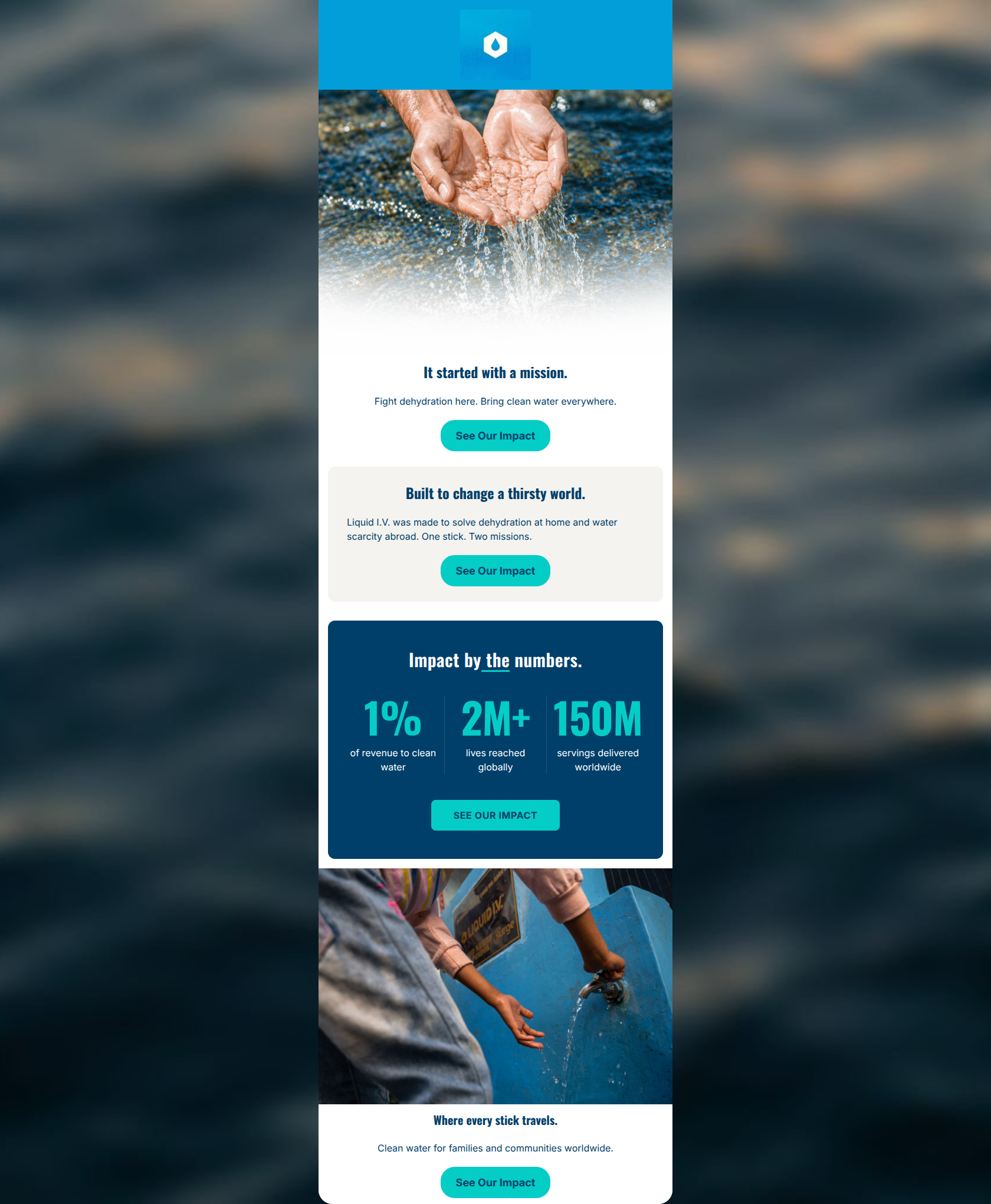
It started with a mission.
Fight dehydration here. Bring clean water everywhere.
→ See Our Impact
Built to change a thirsty world.
Liquid I.V. was made to solve dehydration at home and water scarcity abroad. One stick. Two missions.
→ See Our Impact
Where every stick travels.
Clean water for families and communities worldwide.
→ See Our Impact
Why This Email Works
This is a strong, purpose-driven email that effectively communicates Liquid I.V.'s social mission. The visual hierarchy is excellent, particularly the dark navy 'Impact by the numbers' card which perfectly anchors the email with concrete social proof. The primary weakness is narrative bloat in the top half: the second section merely restates the hero's message without adding new value, slowing down the reader's path to the most compelling information. By trimming redundant copy and shifting the perspective from brand-centric ('Our impact') to customer-centric ('Your impact'), this email could elevate from good to exceptional.
Hero (top/initial part) Impact
82/100- The imagery immediately establishes the theme of water and impact without feeling overly corporate.
- The subcopy ('Fight dehydration here. Bring clean water everywhere.') is a brilliant, concise distillation of the dual value proposition.
Content Structure & Flow
70/100- The dark navy stats card creates a highly effective visual break that naturally pauses the scroll.
- Ending with a concrete human image (the child at the spigot) grounds the abstract numbers in reality.
Visual Hierarchy & Layout
88/100- High-contrast color blocking (White -> Beige -> Navy) distinctly separates thoughts.
- Oversized typography on the '1%', '2M+', and '150M' stats perfectly matches how users scan emails.
Call-to-Action Strength
95/100- Unambiguous repetition: every button points to the exact same goal using the exact same phrasing.
- The bright teal (#04CDC6) buttons pop aggressively against both the white, beige, and navy backgrounds.
Message Clarity & Tone
85/100- Zero corporate jargon; the copy explains global water initiatives in simple, human terms.
- Strikes a great balance between serious global issues and brand optimism.
Readability & Scannability
90/100- Excellent use of numbers rather than adjectives to prove impact.
- Short, single-line text blocks prevent cognitive overload.
Offer & Value Proposition
82/100- The '1% of revenue' stat adds crucial credibility and transparency to the impact claims.
- The phrase 'One stick. Two missions.' is a highly effective way to frame the product's dual value.
Personalization & Audience Fit
85/100- Directly addresses the customer's desire to align their purchasing power with global corporate responsibility.
- Validates the customer's choice to prioritize premium hydration by attaching it to a higher purpose.
Copy Conciseness & Word Economy
72/100- The stats labels ('of revenue to clean water') are distilled down to the absolute essential words.
- No dense paragraphs or 'wall of text' layouts anywhere in the design.
Quick Wins
- Delete the beige 'Built to change a thirsty world' section entirely to remove redundancy and shorten the path to the stats card.
- Promote the sub-headline ('Fight dehydration here...') to be the main Hero headline.
- Change the CTA copy from 'See Our Impact' to 'See Your Impact' (if technically feasible to keep destinations identical) to make the reader the hero.

Create Professional Email Designs
Generate beautiful, on-brand email designs in seconds. Just enter your brand URL and let AI do the rest.