SaaS & Software Newsletter Email Template
“Monthly Insights: Design Trends & Dev News Simplif”
Design Score
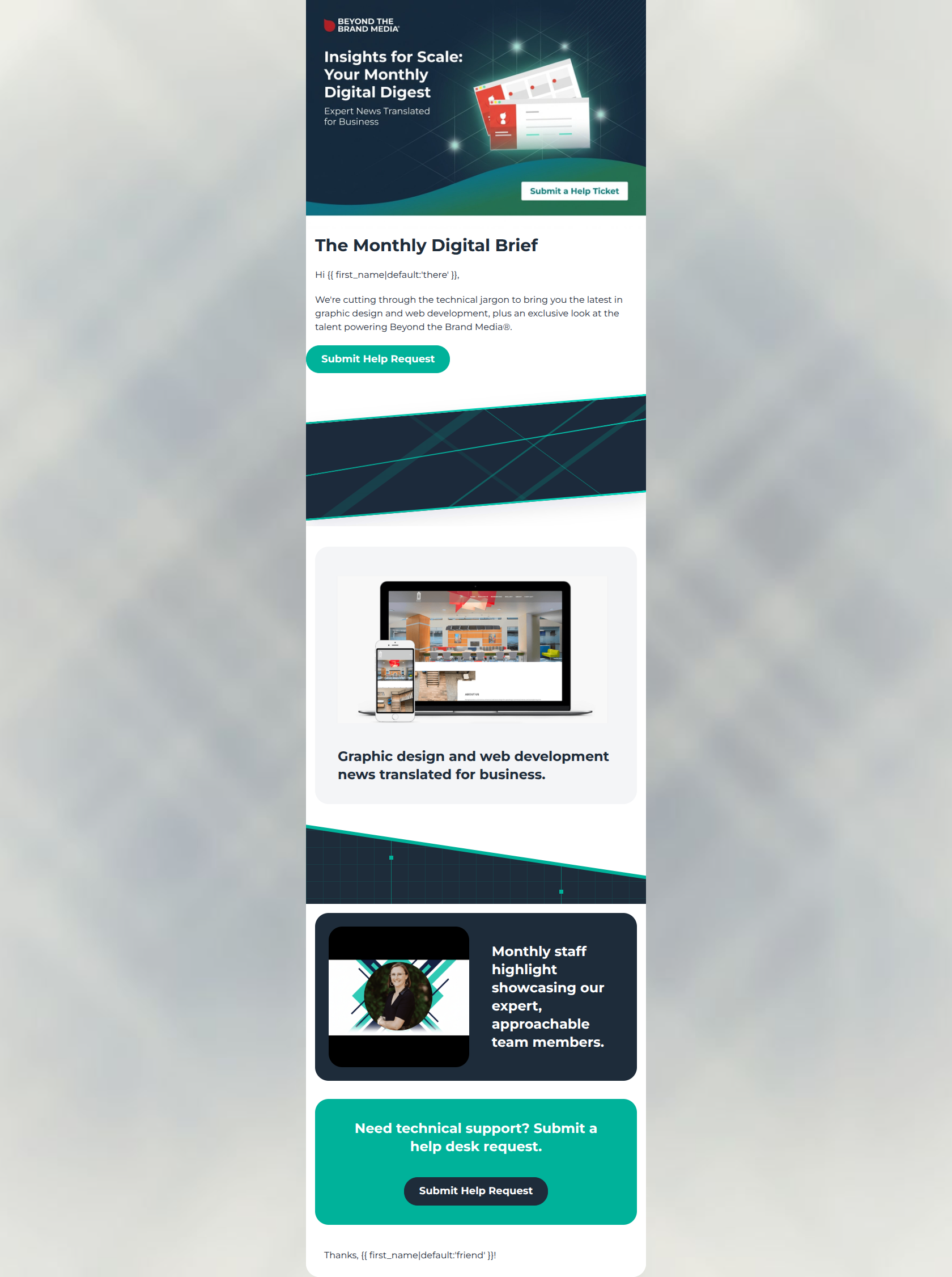
40/100CRITICAL FAILURE: The email functions more as a structural wireframe than a functional newsletter. It promises a 'Digital Digest' but features placeholder-style headings for the main content blocks without any actual snippets, articles, or relevant 'Read More' CTAs, instead aggressively pushing a 'Submit Help Request' action throughout.
Create Your Own
Generate professional email designs like this one in seconds with Kopi AI.
Email Details
- Subject Line
- Monthly Insights: Design Trends & Dev News Simplif
- Brand
- Beyond the Brand Media®
- Industry
- SaaS & Software
- Email Type
- Newsletter
- Created
- March 10, 2026
Brand Colors
Email Copy
The Monthly Digital Brief
Hi there,
We're cutting through the technical jargon to bring you the latest in graphic design and web development, plus an exclusive look at the talent powering Beyond the Brand Media®.
→ Submit Help Request
Graphic design and web development news translated for business.
Monthly staff highlight showcasing our expert, approachable team members.
Need technical support? Submit a help desk request.
→ Submit Help Request
Thanks, friend!
Why This Email Works
CRITICAL FAILURE: The email functions more as a structural wireframe than a functional newsletter. It promises a 'Digital Digest' but features placeholder-style headings for the main content blocks without any actual snippets, articles, or relevant 'Read More' CTAs, instead aggressively pushing a 'Submit Help Request' action throughout.
Hero (top/initial part) Impact
45/100- The hero image graphic is high-quality, on-brand, and clearly establishes the premise of a 'Digital Digest'.
- The introductory copy immediately speaks to the target audience's desire to 'cut through technical jargon'.
Content Structure & Flow
30/100- The use of distinct cards and alternating background colors visually separates the different intended modules well.
Visual Hierarchy & Layout
60/100- The alternating light gray, dark navy, and vibrant teal card backgrounds create a striking, modern aesthetic.
- The overall layout avoids clutter and utilizes generous whitespace within the cards.
Call-to-Action Strength
20/100- The bottom CTA button ('Submit Help Request') is visually distinct, using the dark navy against the bright teal background for excellent pop.
Message Clarity & Tone
40/100- The opening line effectively positions the brand as a helpful translator of complex technical concepts.
Readability & Scannability
55/100- Font sizes are appropriately large and legible across all sections.
- High contrast between text and card backgrounds (e.g., white text on navy) ensures easy reading.
Offer & Value Proposition
25/100- The 'Help Desk' value proposition is clear and direct for users who actually need support.
Personalization & Audience Fit
65/100- The sleek, technical aesthetic perfectly matches the psychographic profile of business owners wanting robust digital solutions.
- Basic liquid tag personalization is present in the greeting and sign-off.
Quick Wins
- Change the first CTA button copy from 'Submit Help Request' to 'Read the Blog' or 'See Latest Insights'.
- Add a 'Read More' text link or button inside the 'Graphic design and web development news' card.
- Delete the large decorative CUSTOMHTML separator banners to tighten the vertical layout and reduce friction between the intro and the content.
Create Professional Email Designs
Generate beautiful, on-brand email designs in seconds. Just enter your brand URL and let AI do the rest.