Home & Garden Promotional Email Template
“Memorial Day: 25% off cool sheets”
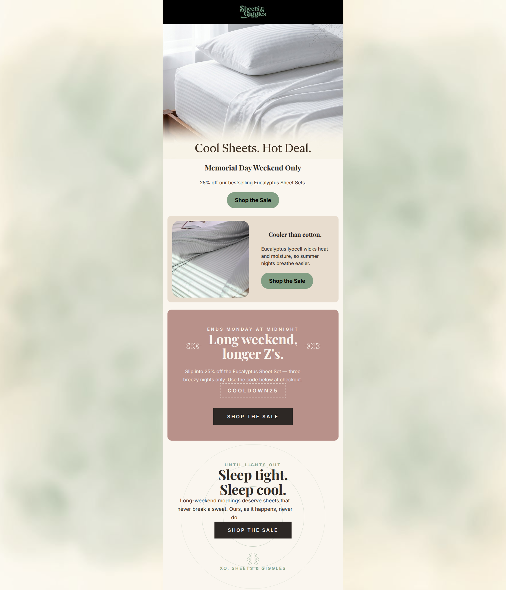
Design Score
84/100This is a strong, highly focused promotional email that effectively leverages the brand's aesthetic and voice. It successfully highlights the core product benefit (cooling) while pushing a clear Memorial Day offer. The structural flow is logical, and the strict adherence to a single primary CTA ('Shop the Sale') across all modules is excellent for driving clicks. The main friction point holding this back from a 90+ score is the introduction of a necessary promo code halfway down the email, which punishes users who click the top CTA too quickly.
Create Your Own
Generate professional email designs like this one in seconds with Kopi AI.
Email Details
- Subject Line
- Memorial Day: 25% off cool sheets
- Brand
- Sheets & Giggles
- Industry
- Home & Garden
- Email Type
- Promotional
- Created
- May 19, 2026
Brand Colors
Email Copy
Memorial Day Weekend Only
25% off our bestselling Eucalyptus Sheet Sets.
→ Shop the Sale
Cooler than cotton.
Eucalyptus lyocell wicks heat and moisture, so summer nights breathe easier.
→ Shop the Sale
Why This Email Works
This is a strong, highly focused promotional email that effectively leverages the brand's aesthetic and voice. It successfully highlights the core product benefit (cooling) while pushing a clear Memorial Day offer. The structural flow is logical, and the strict adherence to a single primary CTA ('Shop the Sale') across all modules is excellent for driving clicks. The main friction point holding this back from a 90+ score is the introduction of a necessary promo code halfway down the email, which punishes users who click the top CTA too quickly.
Hero (top/initial part) Impact
85/100- Clear, benefit-driven headline ('Cool Sheets. Hot Deal.') that fits the brand's playful tone.
- The CTA is prominently placed high up in the hierarchy.
- Soft, inviting photography sets the right mood without distracting from the copy.
Content Structure & Flow
82/100- Distinct visual blocks clearly separate the different messages (offer, benefit, urgency).
- Logical narrative progression that answers 'what is the sale', 'why do I want this', and 'when does it end'.
Visual Hierarchy & Layout
78/100- Excellent use of padding and margin; the content feels airy and breathable, matching the product.
- Centered alignments in the hero and footer bookend the email nicely, while the alternating left/right layout in the middle keeps the eye engaged.
Call-to-Action Strength
90/100- Flawless repetition of the 'Shop the Sale' phrasing eliminates any ambiguity about where the user is going.
- Four CTAs provided across the scroll depth ensures a button is always within reach.
- No competing secondary CTAs to distract from the primary conversion goal.
Message Clarity & Tone
88/100- Perfectly hits the brand voice: playful yet focused on tangible benefits ('Long weekend, longer Z's').
- Clearly connects the product feature (Eucalyptus lyocell) to the customer outcome (summer nights breathe easier).
Readability & Scannability
85/100- Short, punchy paragraphs—no walls of text.
- Headlines stand out clearly from body copy in both size and weight.
Offer & Value Proposition
75/100- The discount is substantial enough to drive action (25%).
- The value proposition ('Cooler than cotton') directly targets the summer seasonality.
Personalization & Audience Fit
85/100- Directly addresses 'hot sleepers', which is a core segment for this product.
- The relaxed, slightly witty tone ('longer Z's') fits the millennial/Gen Z demographic well.
Copy Conciseness & Word Economy
92/100- Zero throat-clearing or filler adjectives.
- Every sentence either establishes the offer, explains the benefit, or drives urgency.
Quick Wins
- Move the 'COOLDOWN25' promo code into the Hero section to prevent users from clicking through without it.
- Unify all CTA buttons to the same color (e.g., Espresso) so the user's brain quickly identifies the 'click target' pattern.
- Increase the visual prominence (contrast/weight) of the promo code text in the mauve section.



Create Professional Email Designs
Generate beautiful, on-brand email designs in seconds. Just enter your brand URL and let AI do the rest.