Kids & Baby Product Launch Email Template
“Meet Your Kid's New Favorite Snack 🧋”
Design Score
85/100This is a visually stunning and highly effective promotional email that perfectly captures the Joeydolls brand aesthetic. The photography is excellent, the minimalist layout allows the colorful products to shine, and the messaging is tight and on-brand. The email's primary weaknesses are a few conversion leaks—specifically, linking a prominent trust badge to an external website, and relying solely on image clicks in the product grid without providing explicit CTA buttons. Fixing these minor structural issues will maximize the click-through rate to the storefront.
Create Your Own
Generate professional email designs like this one in seconds with Kopi AI.
Email Details
- Subject Line
- Meet Your Kid's New Favorite Snack 🧋
- Brand
- Joeydolls
- Industry
- Kids & Baby
- Email Type
- Product Launch
- Created
- April 23, 2026
Brand Colors
Email Copy
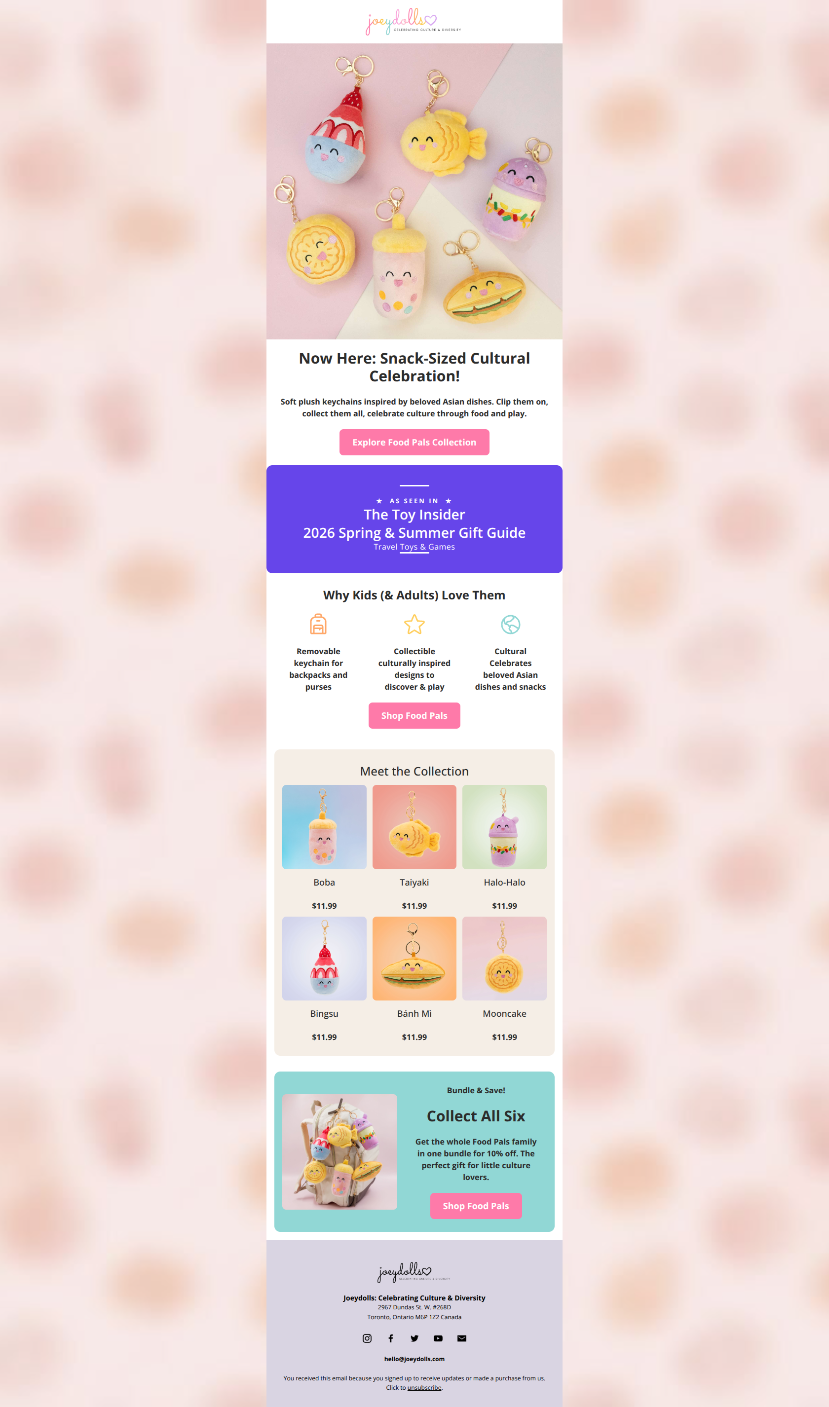
Now Here: Snack-Sized Cultural Celebration!
Soft plush keychains inspired by beloved Asian dishes. Clip them on, collect them all, celebrate culture through food and play.
→ Explore Food Pals Collection
Why Kids (& Adults) Love Them
Removable keychain for backpacks and purses
Collectible culturally inspired designs to discover & play
Cultural Celebrates beloved Asian dishes and snacks
→ Shop Food Pals
Meet the Collection
Boba
$11.99
Taiyaki
$11.99
Halo-Halo
$11.99
Bingsu
$11.99
Bánh Mì
$11.99
Mooncake
$11.99
Bundle & Save!
Collect All Six
Get the whole Food Pals family in one bundle for 10% off. The perfect gift for little culture lovers.
→ Shop Food Pals
Why This Email Works
This is a visually stunning and highly effective promotional email that perfectly captures the Joeydolls brand aesthetic. The photography is excellent, the minimalist layout allows the colorful products to shine, and the messaging is tight and on-brand. The email's primary weaknesses are a few conversion leaks—specifically, linking a prominent trust badge to an external website, and relying solely on image clicks in the product grid without providing explicit CTA buttons. Fixing these minor structural issues will maximize the click-through rate to the storefront.
Hero (top/initial part) Impact
92/100- Exceptional product photography that serves as a visual hook.
- Clever, highly concise headline that communicates the value proposition instantly.
- Immediate introduction of the primary CTA button above the fold.
Content Structure & Flow
75/100- Logical progression from high-level brand introduction to specific product details.
- Effective use of a 'bundle' section at the end to catch users who scrolled past individual items.
Visual Hierarchy & Layout
88/100- Excellent use of alternating background colors to create distinct, digestible sections.
- Generous whitespace allows the vibrant products to stand out.
- Clean, legible typography that aligns with the brand's premium positioning.
Call-to-Action Strength
78/100- Perfect adherence to the single primary action rule; all buttons point to the same destination.
- CTA text ('Shop Food Pals') is clear, specific, and action-oriented.
- Buttons have good contrast against their respective backgrounds.
Message Clarity & Tone
90/100- Tone perfectly matches the brand's sophisticated, nurturing persona.
- Messaging clearly articulates the dual value of play and cultural connection.
- Language is accessible but avoids feeling overly childish.
Readability & Scannability
92/100- Excellent use of icons to break up text and guide the eye.
- High contrast between dark text and light backgrounds ensures easy reading.
- Short, punchy sentences reduce cognitive load.
Offer & Value Proposition
85/100- Clear articulation of what makes the product unique (culturally inspired designs).
- Strategic inclusion of a bundled offer to drive higher cart values.
Personalization & Audience Fit
88/100- Visuals and tone are highly tailored to intentional, aesthetically-conscious parents.
- Avoids generic toy marketing cliches in favor of a premium, boutique feel.
Copy Conciseness & Word Economy
90/100- No wasted words; text acts as an efficient complement to the imagery.
- Avoids 'wall of text' fatigue entirely.
Quick Wins
- Change the link on the 'As Seen In' trust badge so it directs users to your own website rather than an external publication.
- Increase the font size of 'Save 10%' in the final section so the financial incentive is immediately obvious to skimmers.


Create Professional Email Designs
Generate beautiful, on-brand email designs in seconds. Just enter your brand URL and let AI do the rest.