Health & Wellness Promotional Email Template
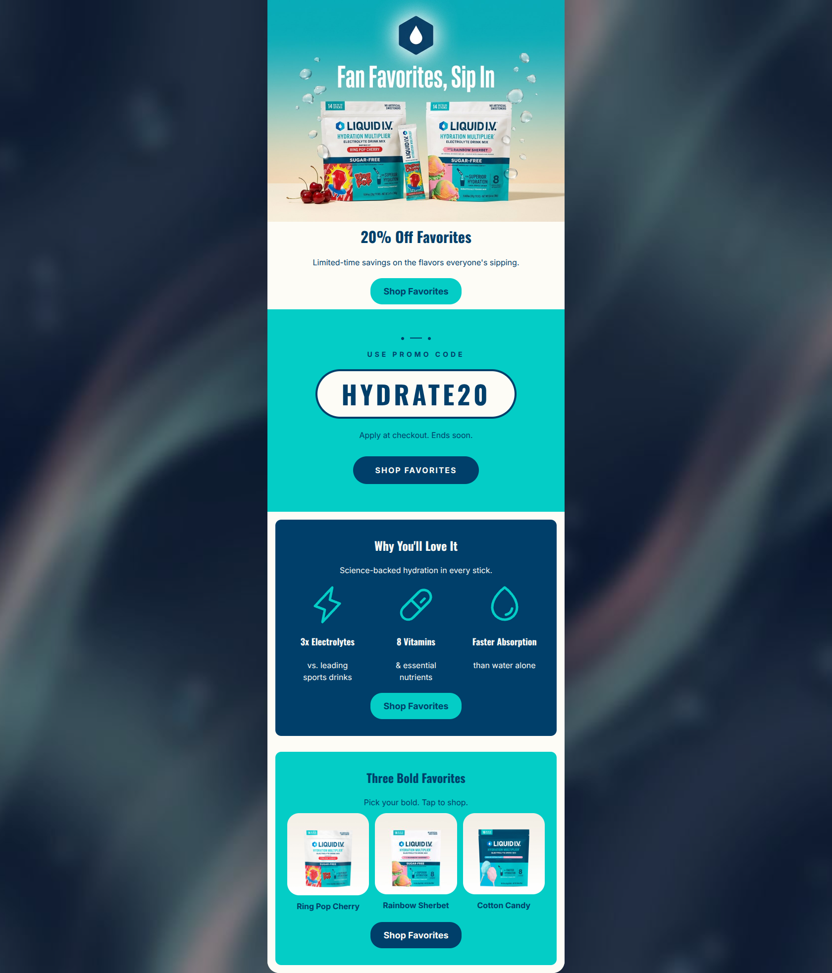
“Meet your hydration favorites”
Design Score
84/100A visually striking and highly effective promotional email that balances a strong offer with core product value propositions. The execution of brand colors, iconography, and Call-to-Action consistency is textbook. The email acts as a clear conversion bridge, though minor structural redundancies in the top sections and slightly repetitive opening copy hold it back from a perfect score.
Create Your Own
Generate professional email designs like this one in seconds with Kopi AI.
Email Details
- Subject Line
- Meet your hydration favorites
- Brand
- Liquid I.V.
- Industry
- Health & Wellness
- Email Type
- Promotional
- Created
- May 20, 2026
Brand Colors
Email Copy
20% Off Favorites
Limited-time savings on the flavors everyone's sipping.
→ Shop Favorites
Why You'll Love It
Science-backed hydration in every stick.
3x Electrolytes
vs. leading sports drinks
8 Vitamins
& essential nutrients
Faster Absorption
than water alone
→ Shop Favorites
Three Bold Favorites
Pick your bold. Tap to shop.
Ring Pop Cherry
Rainbow Sherbet
Cotton Candy
→ Shop Favorites
Why This Email Works
A visually striking and highly effective promotional email that balances a strong offer with core product value propositions. The execution of brand colors, iconography, and Call-to-Action consistency is textbook. The email acts as a clear conversion bridge, though minor structural redundancies in the top sections and slightly repetitive opening copy hold it back from a perfect score.
Hero (top/initial part) Impact
85/100- Immediate introduction of the primary 20% off offer.
- High-quality imagery that clearly showcases the premium packaging and flavor profiles.
Content Structure & Flow
75/100- Clear progression from the broad offer down to specific, shoppable flavor recommendations.
- The value prop section serves as an excellent mid-email reassurance before the final product push.
Visual Hierarchy & Layout
85/100- The oversized, cream-on-navy promo code pill commands attention instantly.
- The 3-column value prop layout is clean, symmetrical, and effortless to scan.
- Excellent use of contrasting full-width background colors (Teal vs. Navy) to delineate sections.
Call-to-Action Strength
95/100- Flawless consistency in button copy ('Shop Favorites').
- All primary buttons point toward the same overarching goal (Best Sellers).
- High-contrast button styling ensures they pop against any background color used.
Message Clarity & Tone
85/100- Confident, succinct framing like 'Pick your bold. Tap to shop.'
- Clear, quantified claims ('3x Electrolytes', '8 Vitamins') build immediate trust.
Readability & Scannability
90/100- Excellent pairing of icons with short, punchy benefit statements.
- High contrast typography (Cream on Navy, Navy on Cream) makes reading effortless.
Offer & Value Proposition
85/100- The offer is unambiguous and presented clearly in the promo badge.
- Value propositions are explicitly quantified, avoiding vague marketing fluff.
Personalization & Audience Fit
80/100- Features visually distinct, highly appealing flavor profiles that cater to the brand's demographic.
- Benefits listed are the exact pain points the target audience seeks to solve (hydration, nutrients).
Copy Conciseness & Word Economy
82/100- No wasted space in the value prop or product sections.
- Instructions are direct and action-oriented ('Apply at checkout').
Quick Wins
- Add a concrete deadline to the promo code banner (e.g., replace 'Ends soon' with 'Ends [Day] at Midnight') to drive immediate action.
- Remove the redundant 'Limited-time savings on the flavors everyone's sipping' text under the H1, as the image and H1 already establish this context clearly.

Create Professional Email Designs
Generate beautiful, on-brand email designs in seconds. Just enter your brand URL and let AI do the rest.