Health & Wellness Promotional Email Template
“Master your cellular health today”
Design Score
76/100This email is visually striking and effectively utilizes brand colors to create a premium, high-energy aesthetic. It successfully captures the 'clinical yet vibrant' brand identity. However, it leaves money on the table through repetitive, generic Call-to-Action copy and by burying the primary conversion lever—the 30% off promo code—within a block of standard body text. While the design grabs attention, the narrative structure fails to fully substantiate the 'Total Body Vitality' claim, focusing solely on gut/immunity before rushing to the sale.
Create Your Own
Generate professional email designs like this one in seconds with Kopi AI.
Email Details
- Subject Line
- Master your cellular health today
- Brand
- ARMRA [eval 2026-03-26]
- Industry
- Health & Wellness
- Email Type
- Promotional
- Created
- March 26, 2026
Brand Colors
Email Copy
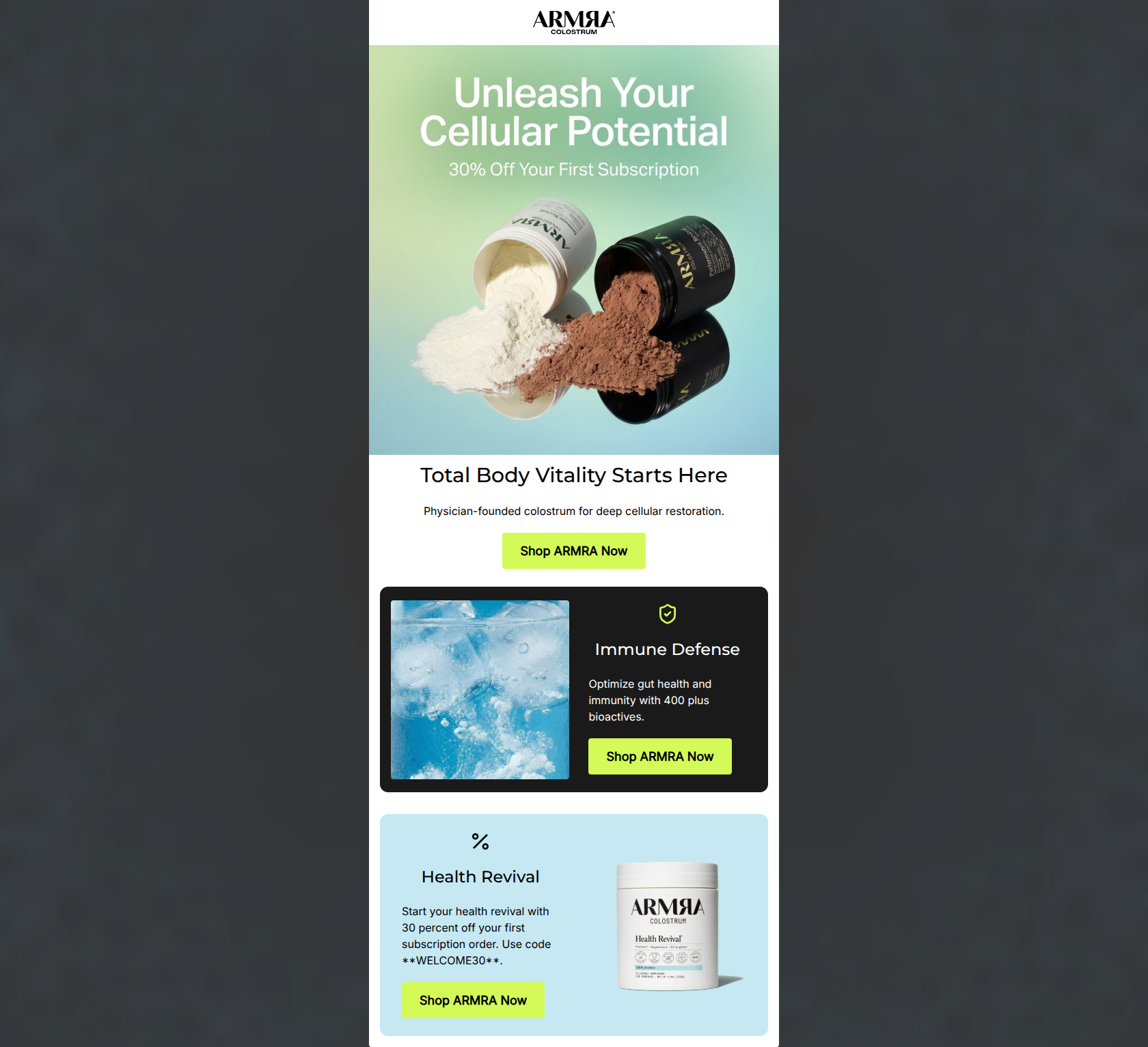
Total Body Vitality Starts Here
Physician-founded colostrum for deep cellular restoration.
→ Shop ARMRA Now
Immune Defense
Optimize gut health and immunity with 400 plus bioactives.
→ Shop ARMRA Now
Health Revival
Start your health revival with 30 percent off your first subscription order. Use code **WELCOME30**.
→ Shop ARMRA Now
Why This Email Works
This email is visually striking and effectively utilizes brand colors to create a premium, high-energy aesthetic. It successfully captures the 'clinical yet vibrant' brand identity. However, it leaves money on the table through repetitive, generic Call-to-Action copy and by burying the primary conversion lever—the 30% off promo code—within a block of standard body text. While the design grabs attention, the narrative structure fails to fully substantiate the 'Total Body Vitality' claim, focusing solely on gut/immunity before rushing to the sale.
Hero (top/initial part) Impact
78/100- Immediate presentation of the primary offer (30% off).
- Strong visual representation of the product texture.
- Clear establishment of authority with 'Physician-founded' copy.
Content Structure & Flow
72/100- Alternating zig-zag layout keeps the eye moving down the page.
- Clear demarcation of sections using distinct background colors.
- Logical progression from education to transaction.
Visual Hierarchy & Layout
85/100- Excellent use of the Chartreuse brand color to make CTAs visually dominant.
- Strong contrast between sections aids in scanning.
- Photography and background colors align perfectly with the 'clinical yet vibrant' brand identity.
Call-to-Action Strength
65/100- CTAs are impossible to miss due to high color contrast.
- Ample breathing room around the buttons.
Message Clarity & Tone
80/100- Strong use of brand-specific vocabulary (bioactives, cellular restoration).
- Tone is confident and premium, avoiding cheap sales tactics.
Readability & Scannability
82/100- Bite-sized copy blocks facilitate quick reading.
- High contrast typography throughout.
- Clear hierarchy between H1, H2s, and body text.
Offer & Value Proposition
70/100- Offer is generous and clearly stated early in the user journey.
- The value proposition centers on tangible outcomes (Immune Defense) rather than just features.
Personalization & Audience Fit
75/100- Matches the psychographic profile of users seeking sophisticated, science-backed solutions.
- Aesthetic feels appropriately premium for the target audience's income bracket.
Copy Conciseness & Word Economy
85/100- No unnecessary adjectives or bloated paragraphs.
- Respects the reader's time by getting straight to the point.
Quick Wins
- Vary the CTA button copy to be context-specific rather than repeating 'Shop ARMRA Now'.
- Visually isolate and emphasize the promo code 'WELCOME30' so it isn't lost in a block of text.
- Change '30 percent' to '30%' in the final body copy for faster scanning.

Create Professional Email Designs
Generate beautiful, on-brand email designs in seconds. Just enter your brand URL and let AI do the rest.