SaaS & Software Promotional Email Template
“Marketplace Infographics That Sell”
Design Score
81/100This is a strong, highly targeted promotional email that excels in copy conciseness and clearly articulating its value proposition. The structural flow logically guides the reader from the hook to the offer and finally to an urgency-driven close. However, the email's effectiveness is slightly hampered by a high-friction initial CTA, some jarring visual transitions in the hero section, and a critical contrast failure on one of the iconography blocks. Addressing these visual and friction points will elevate this from a good email to a high-converting one.
Create Your Own
Generate professional email designs like this one in seconds with Kopi AI.
Email Details
- Subject Line
- Marketplace Infographics That Sell
- Brand
- Wbfigma
- Industry
- SaaS & Software
- Email Type
- Promotional
- Created
- March 26, 2026
Brand Colors
Email Copy
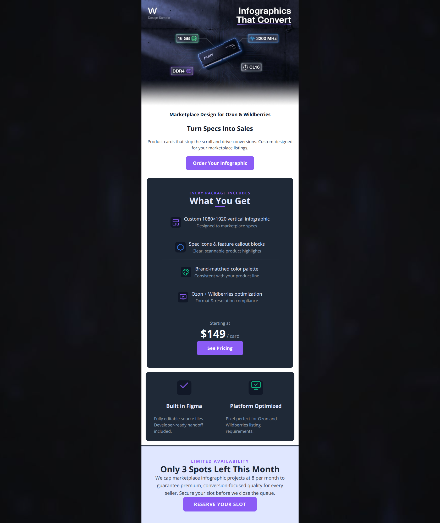
Marketplace Design for Ozon & Wildberries
Turn Specs Into Sales
Product cards that stop the scroll and drive conversions. Custom-designed for your marketplace listings.
→ Order Your Infographic
Built in Figma
Fully editable source files. Developer-ready handoff included.
Platform Optimized
Pixel-perfect for Ozon and Wildberries listing requirements.
Why This Email Works
This is a strong, highly targeted promotional email that excels in copy conciseness and clearly articulating its value proposition. The structural flow logically guides the reader from the hook to the offer and finally to an urgency-driven close. However, the email's effectiveness is slightly hampered by a high-friction initial CTA, some jarring visual transitions in the hero section, and a critical contrast failure on one of the iconography blocks. Addressing these visual and friction points will elevate this from a good email to a high-converting one.
Hero (top/initial part) Impact
75/100- Excellent, punchy headline that immediately communicates the ultimate benefit to the user.
- The hero image directly relates to the service being offered, establishing immediate context.
Content Structure & Flow
82/100- Logical 'AIDA' (Attention, Interest, Desire, Action) flow guides the reader effectively toward the conversion goal.
- Clear sectioning prevents the content from feeling like a wall of text.
Visual Hierarchy & Layout
72/100- Consistent use of the purple brand color for all primary CTAs makes the 'next steps' obvious.
- Good use of iconography in the pricing card to break up text and improve scannability.
Call-to-Action Strength
68/100- Buttons have excellent contrast against all background colors used in the email.
- Adequate whitespace around buttons makes them easy tap targets.
Message Clarity & Tone
85/100- Directly addresses the user's primary goal: stopping the scroll and driving conversions.
- Uses terminology ('developer-ready handoff', 'pixel-perfect') that resonates perfectly with the Wbfigma psychographics.
Readability & Scannability
88/100- Excellent use of list formatting in the main feature card.
- High contrast between text and background colors (excluding the noted icon issue) ensures high legibility.
Offer & Value Proposition
80/100- Clear price anchoring helps set expectations before the user clicks through.
- Tangible deliverables (1080x1920, color palette) are clearly listed.
Personalization & Audience Fit
85/100- Highlighting 'Built in Figma' is a massive draw for the target audience who values that specific ecosystem.
- The urgency play ('8 projects per month') feels authentic for a boutique agency rather than a fake marketing tactic.
Copy Conciseness & Word Economy
92/100- No throat-clearing openers. The email gets straight to the point.
- Headlines and bullet points are distilled to their most impactful essence.
Quick Wins
- Fix the invisible dark grey icon background in the 'Built in Figma' section to ensure it is visible against the dark card.
- Change the footer CTA from all-caps 'RESERVE YOUR SLOT' to title case 'Reserve Your Slot' to align with a premium, non-aggressive tone.
- Swap the visual hierarchy in the hero section so 'Turn Specs Into Sales' is read before 'Marketplace Design for...'

Create Professional Email Designs
Generate beautiful, on-brand email designs in seconds. Just enter your brand URL and let AI do the rest.