SaaS & Software Product Launch Email Template
“Manual A/B testing is officially obsolete.”
Design Score
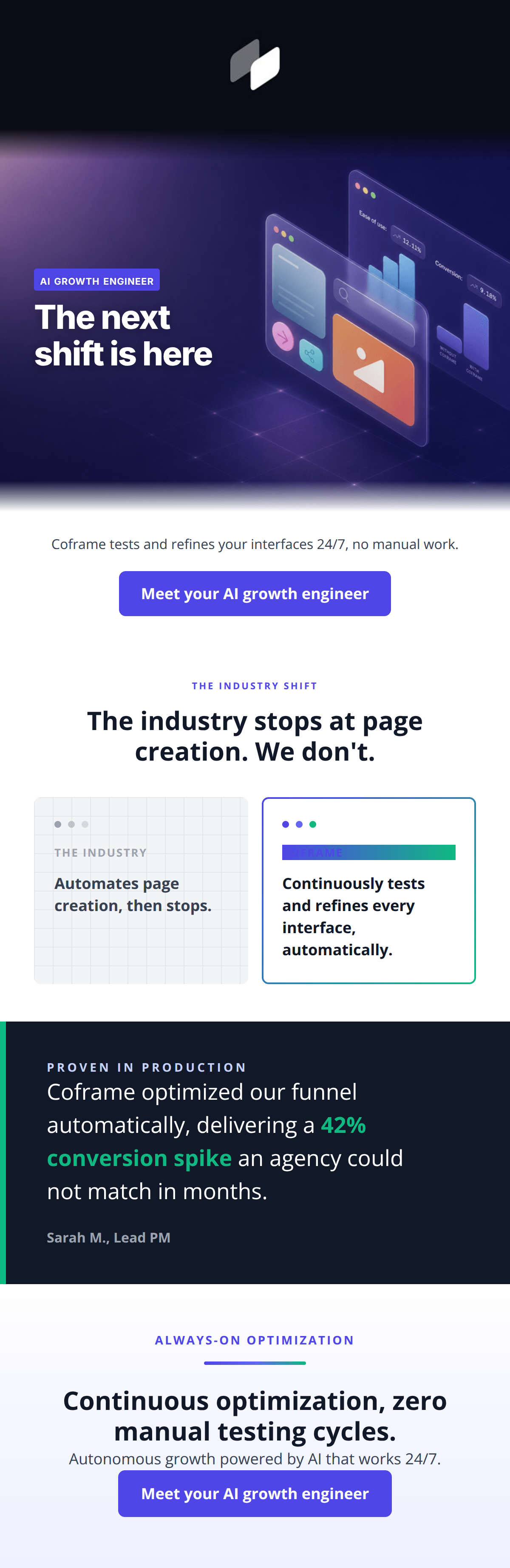
82/100The email is a visually striking, well-structured piece that effectively communicates Coframe's premium, AI-driven value proposition. The deep indigos, 3D assets, and structured layouts perfectly encapsulate a brand targeting tech-forward growth teams. The comparison section and testimonial are compelling conversion assets that build a strong logical case. However, a critical functional error with an unlinked CTA in the footer severely hampers the email's conversion potential. Additionally, a severe color-contrast failure renders the 'Coframe' label in the comparison card illegible, and some copy leans too heavily on repetitive phrasing. Fixing the broken link and refining the contrast will immediately elevate this from a competent email to an outstanding one.
Create Your Own
Generate professional email designs like this one in seconds with Kopi AI.
Email Details
- Subject Line
- Manual A/B testing is officially obsolete.
- Brand
- Coframe
- Industry
- SaaS & Software
- Email Type
- Product Launch
- Created
- July 22, 2026
Brand Colors
Email Copy
Preview text: The industry just automated page creation. We automated everything after it, 24/7.
Coframe tests and refines your interfaces 24/7, no manual work.
→ Meet your AI growth engineer
Why This Email Works
The email is a visually striking, well-structured piece that effectively communicates Coframe's premium, AI-driven value proposition. The deep indigos, 3D assets, and structured layouts perfectly encapsulate a brand targeting tech-forward growth teams. The comparison section and testimonial are compelling conversion assets that build a strong logical case. However, a critical functional error with an unlinked CTA in the footer severely hampers the email's conversion potential. Additionally, a severe color-contrast failure renders the 'Coframe' label in the comparison card illegible, and some copy leans too heavily on repetitive phrasing. Fixing the broken link and refining the contrast will immediately elevate this from a competent email to an outstanding one.
Hero Impact
82/100- High-tech 3D render perfectly aligns with the premium brand identity.
- The subcopy immediately and clearly states the core value proposition.
Content Structure & Flow
88/100- Logical, friction-free progression from hero to proof.
- Each section serves a distinct, singular purpose without overlapping intent.
Visual Hierarchy & Layout
75/100- Excellent use of distinct background treatments (grey grid vs. white card) to separate the 'old way' from the 'new way'.
- The dark mode testimonial card provides a strong visual break that captures attention.
Call-to-Action Strength
65/100- The CTA copy 'Meet your AI growth engineer' is compelling, unique, and directly tied to the brand proposition.
- Visually, the CTAs feature strong contrast against their respective backgrounds.
Message Clarity & Tone
85/100- Phrasing like 'The industry stops... We don't' projects bold leadership.
- Maintains a professional, jargon-light tone that appeals to intelligent professionals.
Readability & Scannability
84/100- Exceptional use of emerald green to highlight the '42% conversion spike' in the testimonial.
- Short, punchy sentences reduce cognitive load.
Offer & Value Proposition
90/100- The comparison cards brilliantly articulate the unique competitive advantage in seconds.
- The testimonial provides hard data (42% spike) to back up the conceptual claims.
Personalization & Audience Fit
85/100- Terms like 'funnel', 'conversion spike', and 'manual testing cycles' speak directly to PMs and growth engineers.
- The sleek, dark aesthetic perfectly aligns with the preferences of tech-forward professionals.
Copy Conciseness & Word Economy
88/100- The comparison section uses fewer than 15 words to perfectly contrast Coframe against legacy tools.
- Zero filler phrasing in the body paragraphs.
Quick Wins
- Convert the bottom CTA into a functional link sharing the exact same destination as the top CTA.
- Change the text color of the 'COFRAME' label on the comparison card to white for necessary legibility.
- Update the hero headline from 'The next shift is here' to a more concrete, benefit-driven statement.


Create Professional Email Designs
Generate beautiful, on-brand email designs in seconds. Just enter your brand URL and let AI do the rest.