Electronics & Tech Cart Abandonment Email Template
“Let us make this simple: Take 10% off”
Design Score
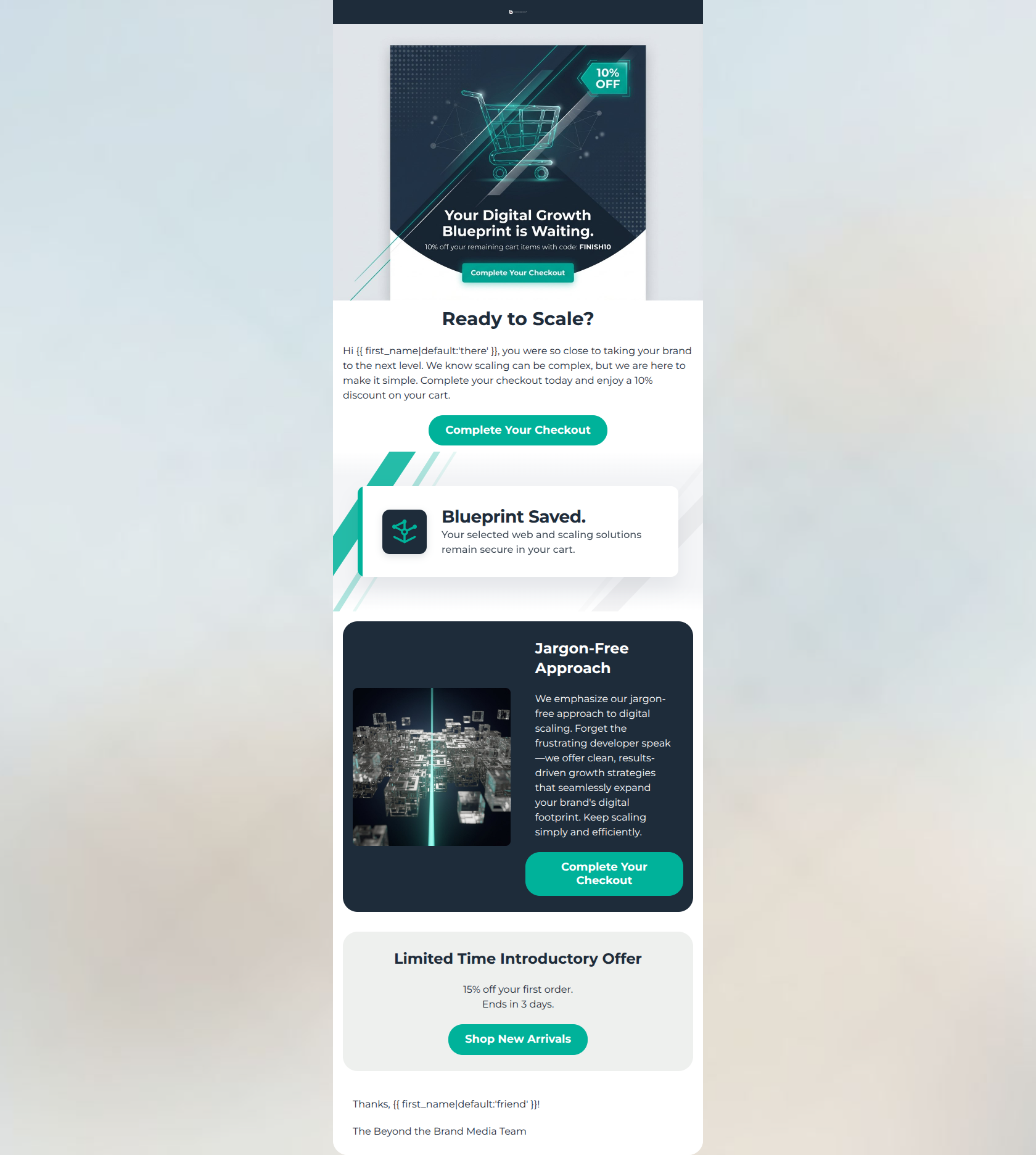
49/100This cart abandonment email suffers a critical failure due to wildly conflicting promotional offers (10% vs 15%) and completely inappropriate retail-style CTAs ('Shop New Arrivals') for a premium B2B digital agency. While visually striking and aligned with the brand's modern geometric aesthetic, the incoherent bottom section completely undermines trust, confuses the reader, and destroys the conversion path.
Create Your Own
Generate professional email designs like this one in seconds with Kopi AI.
Email Details
- Subject Line
- Let us make this simple: Take 10% off
- Brand
- Beyond the Brand Media®
- Industry
- Electronics & Tech
- Email Type
- Cart Abandonment
- Created
- March 10, 2026
Brand Colors
Email Copy
Ready to Scale?
Hi there, you were so close to taking your brand to the next level. We know scaling can be complex, but we are here to make it simple. Complete your checkout today and enjoy a 10% discount on your cart.
→ Complete Your Checkout
Jargon-Free Approach
We emphasize our jargon-free approach to digital scaling. Forget the frustrating developer speak—we offer clean, results-driven growth strategies that seamlessly expand your brand's digital footprint. Keep scaling simply and efficiently.
→ Complete Your Checkout
Limited Time Introductory Offer
15% off your first order. Ends in 3 days.
→ Shop New Arrivals
Thanks, friend!
The Beyond the Brand Media Team
Why This Email Works
This cart abandonment email suffers a critical failure due to wildly conflicting promotional offers (10% vs 15%) and completely inappropriate retail-style CTAs ('Shop New Arrivals') for a premium B2B digital agency. While visually striking and aligned with the brand's modern geometric aesthetic, the incoherent bottom section completely undermines trust, confuses the reader, and destroys the conversion path.
Hero (top/initial part) Impact
65/100- The vibrant teal text and accents contrast sharply against the dark navy background, creating an immediate, modern, tech-forward impression.
- The wireframe shopping cart graphic successfully communicates the 'abandoned cart' premise at a glance.
Content Structure & Flow
40/100- The 'Blueprint Saved' banner acts as an excellent psychological reassurance and provides a nice visual break between the hero and the value-prop card.
- The alternating dark and light background sections help guide the eye down the page efficiently.
Visual Hierarchy & Layout
60/100- The use of the dark navy card against the white background creates excellent contrast, drawing immediate attention to the 'Jargon-Free Approach' value proposition.
- Generous whitespace around text blocks prevents the layout from feeling cluttered or overwhelming.
Call-to-Action Strength
45/100- The bright teal (#00B29A) buttons stand out clearly against both the light and dark backgrounds, passing the 'squint test' effortlessly.
Message Clarity & Tone
50/100- The paragraph addressing the 'frustrating developer speak' perfectly hits a major pain point for the target demographic of non-tech-savvy business owners.
Readability & Scannability
75/100- High contrast between the white text and the dark navy background (#1E2C3A) ensures excellent legibility.
- Paragraphs are kept short, preventing cognitive overload and respecting the busy lifestyle of the target audience.
Offer & Value Proposition
20/100- Providing an explicit financial incentive (10% off) is a strong tactic to push hesitant buyers over the line for high-ticket items.
Personalization & Audience Fit
40/100- The use of the `{{ first_name }}` tag in the hero and footer adds a baseline level of approachability that fits the brand voice.
Quick Wins
- Delete the bottom 'Limited Time Introductory Offer' card entirely to remove the conflicting 15% offer and the irrelevant 'Shop New Arrivals' CTA.
- Remove the fake, embedded 'Complete Your Checkout' button from the top hero image graphic.
- Rewrite the opening line of the dark card from 'We emphasize our jargon-free approach...' to 'Experience a totally jargon-free approach...'
Create Professional Email Designs
Generate beautiful, on-brand email designs in seconds. Just enter your brand URL and let AI do the rest.