Jewelry & Accessories Promotional Email Template
“Last Chance styles are leaving soon.”
Design Score
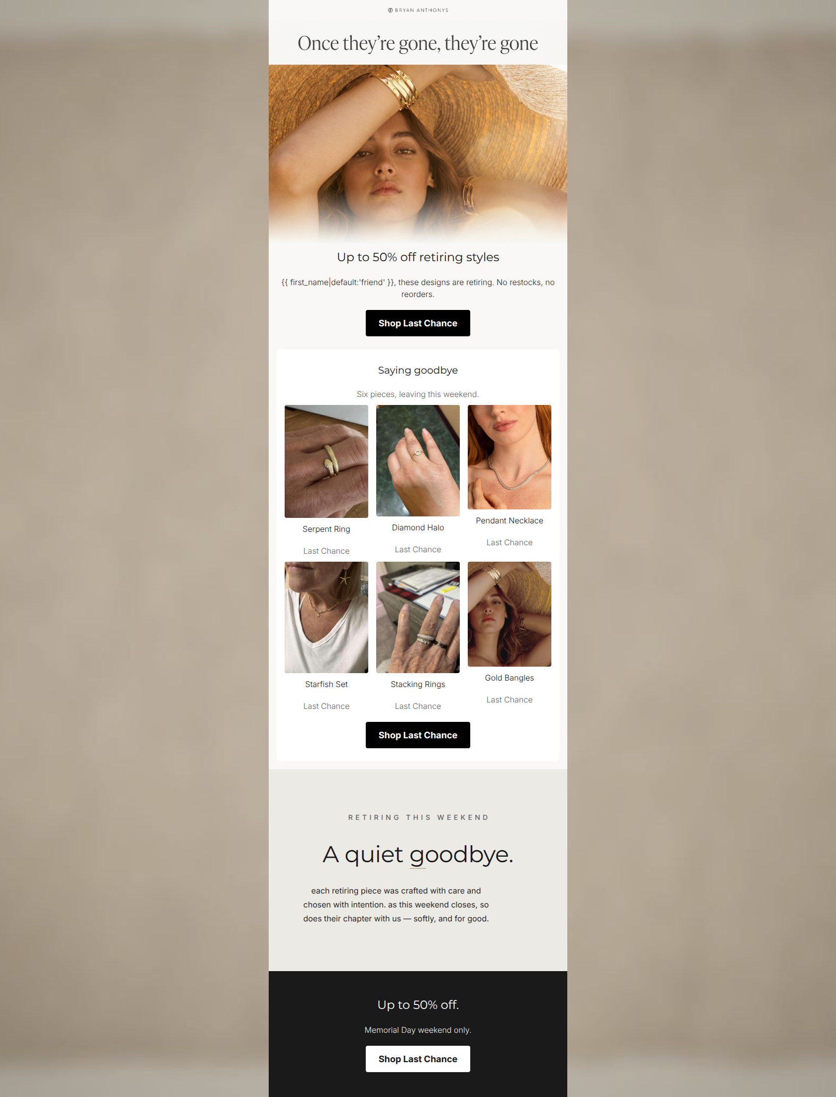
83/100This is a strong, conversion-focused campaign that effectively leverages scarcity and authentic urgency. The email successfully balances a hard promotional offer (50% off) with the brand's signature sentimental tone, particularly in the beautifully written 'quiet goodbye' section. The CTA strategy is excellent, featuring consistent phrasing and high-contrast styling that reduces cognitive load. However, the execution stumbles significantly in the product grid, where jarringly low-quality photography breaks the premium 'editorial sentimentality' established in the hero and degrades perceived value.
Create Your Own
Generate professional email designs like this one in seconds with Kopi AI.
Email Details
- Subject Line
- Last Chance styles are leaving soon.
- Brand
- Bryan Anthonys
- Industry
- Jewelry & Accessories
- Email Type
- Promotional
- Created
- May 20, 2026
Brand Colors
Email Copy
Up to 50% off retiring styles
friend, these designs are retiring. No restocks, no reorders.
→ Shop Last Chance
Saying goodbye
Six pieces, leaving this weekend.
Serpent Ring
Last Chance
Diamond Halo
Last Chance
Pendant Necklace
Last Chance
Starfish Set
Last Chance
Stacking Rings
Last Chance
Gold Bangles
Last Chance
→ Shop Last Chance
Up to 50% off.
Memorial Day weekend only.
→ Shop Last Chance
Why This Email Works
This is a strong, conversion-focused campaign that effectively leverages scarcity and authentic urgency. The email successfully balances a hard promotional offer (50% off) with the brand's signature sentimental tone, particularly in the beautifully written 'quiet goodbye' section. The CTA strategy is excellent, featuring consistent phrasing and high-contrast styling that reduces cognitive load. However, the execution stumbles significantly in the product grid, where jarringly low-quality photography breaks the premium 'editorial sentimentality' established in the hero and degrades perceived value.
Call-to-Action Strength
95/100- Consistent phrasing across all three buttons.
- High-contrast button styling ensures they stand out against both light and dark backgrounds.
- Strategic placement captures users at different stages of scrolling.
Hero Impact
82/100- Beautiful, golden-hour imagery that perfectly matches the brand aesthetic.
- Clear, immediate communication of the primary offer.
- Strong visual hierarchy leading directly to the primary CTA.
Visual Hierarchy & Layout
65/100- Effective use of whitespace around text blocks.
- Clear, centered alignment makes the email easy to scan.
- The stark black footer effectively anchors the email and draws attention to the final CTA.
Message Clarity & Tone
88/100- The 'quiet goodbye' copy perfectly matches the empathetic, sophisticated brand voice.
- Scarcity is communicated authentically ('No restocks, no reorders') rather than feeling like manufactured, aggressive urgency.
Copy Conciseness & Word Economy
84/100- Short, easily digestible sentences.
- No long paragraphs; the text serves to enhance the visual elements and drive action.
Quick Wins
- Swap out the 'Stacking Rings' and 'Serpent Ring' images for clean, brand-aligned shots. The current messy backgrounds degrade the perceived value of the products.
- Add a subtle 'Retiring' badge or discount percentage indicator directly onto the product images in the grid to increase immediate click intent.



Create Professional Email Designs
Generate beautiful, on-brand email designs in seconds. Just enter your brand URL and let AI do the rest.