Media & Entertainment Promotional Email Template
“La diferencia está en los números”
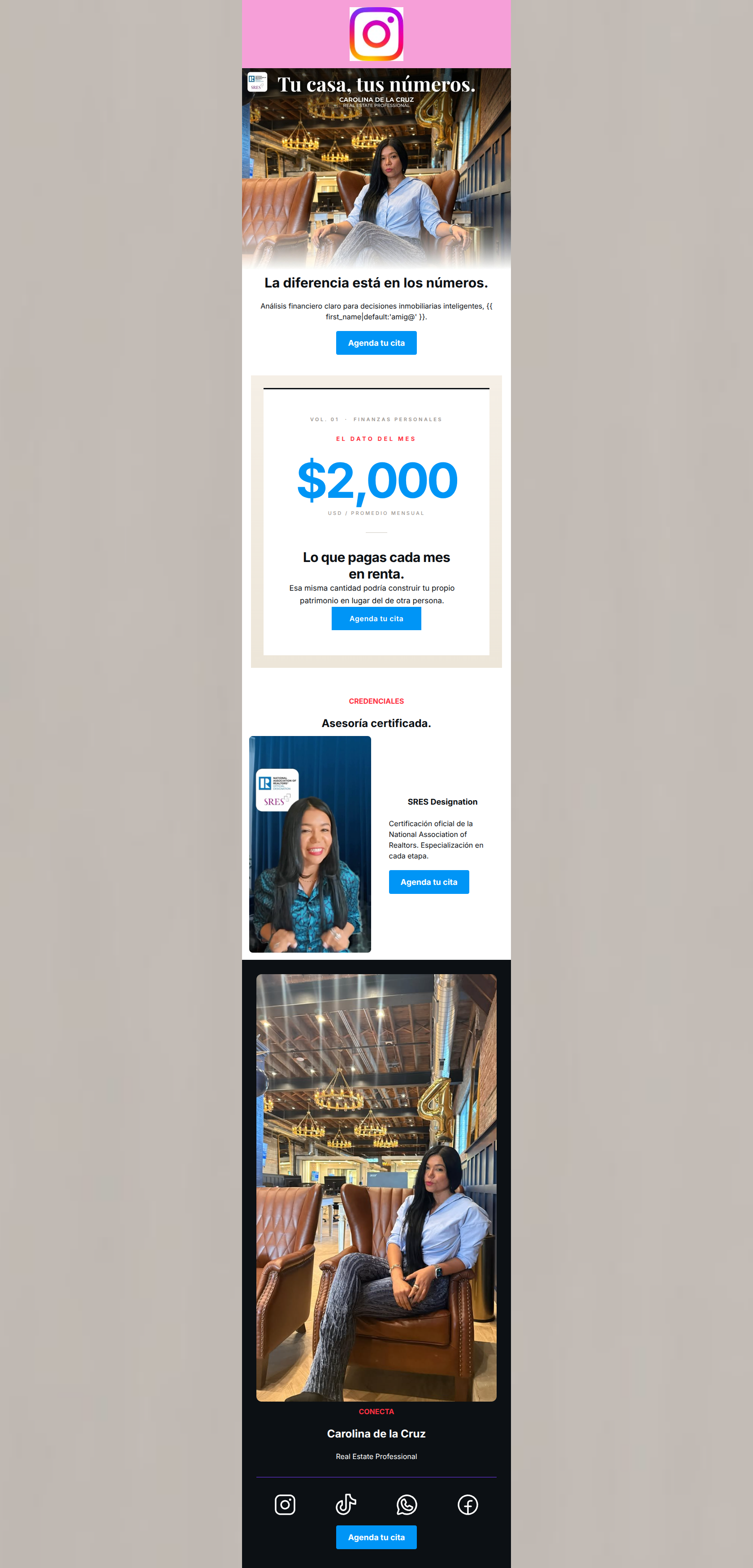
Design Score
77/100This email features a strong, concise core message and an excellent editorial centerpiece that effectively agitates a common pain point (paying rent). However, it suffers from a disjointed 'patchwork' visual identity—jumping haphazardly across color schemes—and a massive unforced error in using the exact same hero image twice. The flawless execution of a single, repeating CTA carries the score, but visual and demographic alignment need refinement.
Create Your Own
Generate professional email designs like this one in seconds with Kopi AI.
Email Details
- Subject Line
- La diferencia está en los números
- Brand
- Industry
- Media & Entertainment
- Email Type
- Promotional
- Created
- May 25, 2026
Brand Colors
Email Copy
La diferencia está en los números.
Análisis financiero claro para decisiones inmobiliarias inteligentes, amig@.
→ Agenda tu cita
CREDENCIALES
Asesoría certificada.
SRES Designation
Certificación oficial de la National Association of Realtors. Especialización en cada etapa.
→ Agenda tu cita
CONECTA
Carolina de la Cruz
Real Estate Professional
→ Agenda tu cita
Why This Email Works
This email features a strong, concise core message and an excellent editorial centerpiece that effectively agitates a common pain point (paying rent). However, it suffers from a disjointed 'patchwork' visual identity—jumping haphazardly across color schemes—and a massive unforced error in using the exact same hero image twice. The flawless execution of a single, repeating CTA carries the score, but visual and demographic alignment need refinement.
Hero (top/initial part) Impact
65/100- Clear, benefit-driven headline ('La diferencia está en los números').
- Immediate introduction of the primary CTA above the fold.
- Good use of dynamic personalization tag to greet the user.
Content Structure & Flow
75/100- Excellent use of the '$2,000' stat as a visual speedbump to break up the scrolling experience.
- Logical transition from problem (renting) to solution (expert guidance).
Visual Hierarchy & Layout
60/100- The layout of the editorial section ('EL DATO DEL MES') is visually striking and effectively draws the eye.
- Bold, red eyebrow copy ('CREDENCIALES', 'CONECTA') creates a predictable scanning rhythm.
Call-to-Action Strength
95/100- Perfect repetition of the primary CTA verb and destination.
- High contrast usage of the brand's primary blue (#0095F6) ensures buttons pop against all background colors used.
Message Clarity & Tone
82/100- Positions the agent as a financial advisor, not just a salesperson.
- Tone is professional, modern, and confident.
Readability & Scannability
85/100- Short, focused paragraphs prevent fatigue.
- Excellent typographic hierarchy in the '$2,000' section.
Offer & Value Proposition
78/100- Anchors the value prop in a tangible number ($2,000/month).
- Frames real estate as a financial decision rather than just a lifestyle choice.
Personalization & Audience Fit
70/100- Utilizes a personalized greeting in the opening text.
- The rent vs. buy argument is highly relevant to Instagram's core demographic.
Copy Conciseness & Word Economy
88/100- No walls of text or filler adjectives.
- The editorial block is a masterclass in concise, impactful copywriting.
Quick Wins
- Remove the solid pink background behind the top header logo to restore brand minimalism.
- Swap the duplicate hero image out of the bottom 'CONECTA' section.
- Remove the embedded 'Tu casa, tus números' text from the top hero image.
Create Professional Email Designs
Generate beautiful, on-brand email designs in seconds. Just enter your brand URL and let AI do the rest.