Fashion & Apparel Welcome Email Template
“Know what you're wearing.”
Design Score
87/100A highly competent, brand-aligned welcome email that effectively communicates Everlane's core differentiator of Radical Transparency. The minimalist design, high-contrast CTAs, and exceptionally concise copy create a premium feel that respects the reader's time. The color execution is strong, utilizing the brand's canvas background (#C8C0B8) to frame the stark white content area, allowing the black CTAs to command attention. However, the lack of a tangible welcome offer means it relies entirely on brand ethos to drive the initial conversion, which may leave some immediate revenue on the table.
Create Your Own
Generate professional email designs like this one in seconds with Kopi AI.
Email Details
- Subject Line
- Know what you're wearing.
- Brand
- Everlane [eval 2026-03-25]
- Industry
- Fashion & Apparel
- Email Type
- Welcome
- Created
- April 24, 2026
Brand Colors
Email Copy
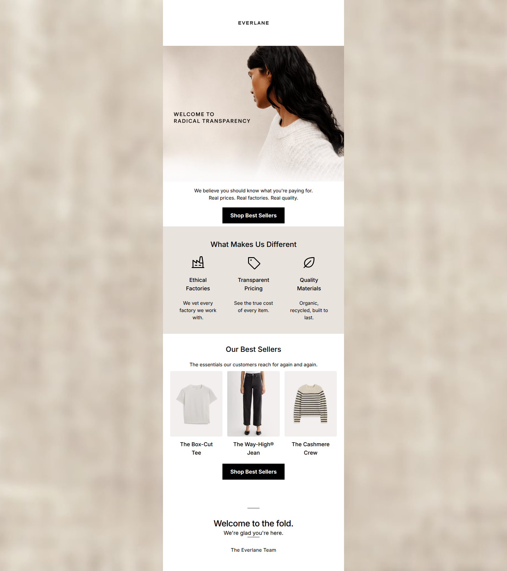
We believe you should know what you're paying for. Real prices. Real factories. Real quality.
→ Shop Best Sellers
What Makes Us Different
Ethical Factories
We vet every factory we work with.
Transparent Pricing
See the true cost of every item.
Quality Materials
Organic, recycled, built to last.
Our Best Sellers
The essentials our customers reach for again and again.
The Box-Cut Tee
The Way-High® Jean
The Cashmere Crew
→ Shop Best Sellers
Why This Email Works
A highly competent, brand-aligned welcome email that effectively communicates Everlane's core differentiator of Radical Transparency. The minimalist design, high-contrast CTAs, and exceptionally concise copy create a premium feel that respects the reader's time. The color execution is strong, utilizing the brand's canvas background (#C8C0B8) to frame the stark white content area, allowing the black CTAs to command attention. However, the lack of a tangible welcome offer means it relies entirely on brand ethos to drive the initial conversion, which may leave some immediate revenue on the table.
Hero (top/initial part) Impact
85/100- Striking, brand-aligned lifestyle photography.
- Clear, bold declaration of the brand's unique selling proposition right at the top.
Content Structure & Flow
88/100- Logical progression from brand education to product discovery.
- Distinct, well-padded sections make the email easy to parse visually.
Visual Hierarchy & Layout
88/100- Exceptional use of contrast for CTAs against the light backgrounds.
- Clean, uncluttered layout that perfectly matches the brand's elevated minimalism.
Call-to-Action Strength
95/100- Consistent use of identical CTA copy reinforces the primary conversion goal.
- High-contrast button styling makes the required action unmistakable.
Message Clarity & Tone
90/100- Punchy, memorable phrasing ('Real prices. Real factories. Real quality.').
- Tone builds trust and aligns heavily with the target audience's desire for authenticity.
Readability & Scannability
95/100- Excellent chunking of information into digestible blocks.
- Typography size and contrast choices support effortless reading.
Offer & Value Proposition
80/100- Clear, three-pillar articulation of the brand's ethical and quality standards.
- Positions the brand effectively against fast-fashion alternatives.
Personalization & Audience Fit
75/100- Strong alignment with the values and aesthetic preferences of the target demographic.
- Language choices reflect a deep understanding of the customer's desire for transparency.
Copy Conciseness & Word Economy
92/100- Distilled, intentional copy that communicates complex ideas (supply chain ethics) with very few words.
- Zero throat-clearing or unnecessary adjectives.
Quick Wins
- Ensure the hero image links to a relevant, shoppable destination, ideally the specific product featured.
- Add subtle hover states to the product images in the best sellers section to indicate clickability for desktop users.




Create Professional Email Designs
Generate beautiful, on-brand email designs in seconds. Just enter your brand URL and let AI do the rest.