Fashion & Apparel Welcome Email Template
“Know what you're wearing.”
Design Score
84/100This welcome email is a masterclass in brand positioning, utilizing concise copy and a striking data visualization to immediately establish Everlane's 'Radical Transparency' value proposition. It effectively educates the subscriber on why the brand is different. However, it relies entirely on brand affinity to drive the first click, missing fundamental direct-response mechanics—specifically, a clear welcome incentive and gender-segmented shopping paths. It functions beautifully as a brand manifesto but leaves money on the table as a conversion mechanism.
Create Your Own
Generate professional email designs like this one in seconds with Kopi AI.
Email Details
- Subject Line
- Know what you're wearing.
- Brand
- Everlane [eval-prod 2026-04-08]
- Industry
- Fashion & Apparel
- Email Type
- Welcome
- Created
- April 8, 2026
Brand Colors
Email Copy
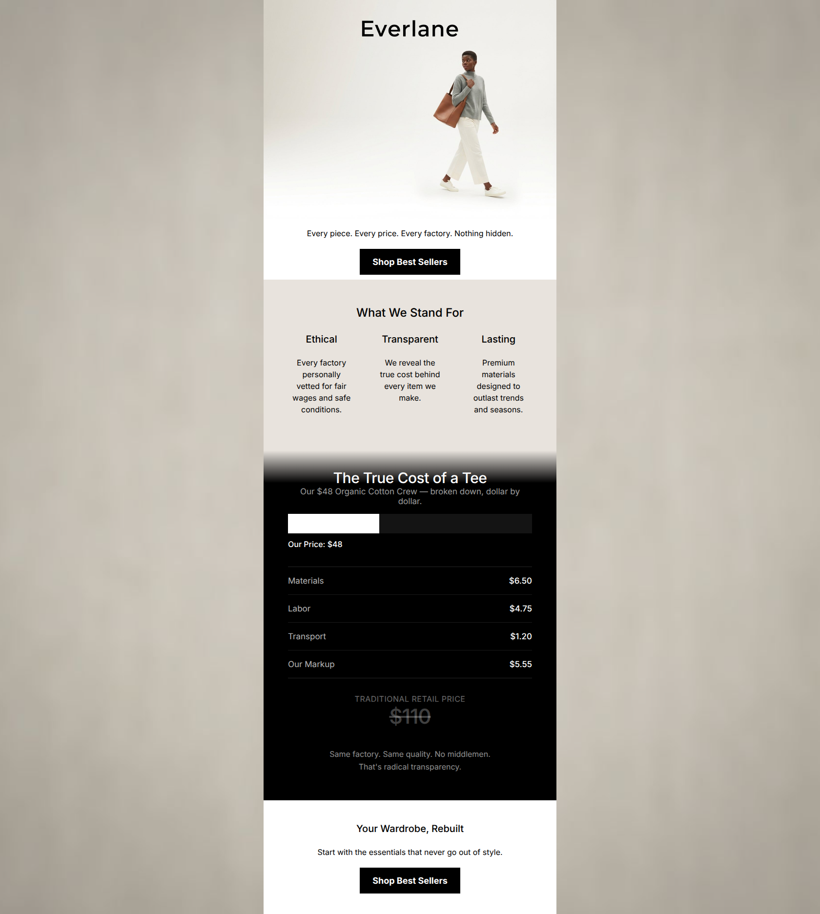
Every piece. Every price. Every factory. Nothing hidden.
→ Shop Best Sellers
What We Stand For
Ethical
Every factory personally vetted for fair wages and safe conditions.
Transparent
We reveal the true cost behind every item we make.
Lasting
Premium materials designed to outlast trends and seasons.
Your Wardrobe, Rebuilt
Start with the essentials that never go out of style.
→ Shop Best Sellers
Why This Email Works
This welcome email is a masterclass in brand positioning, utilizing concise copy and a striking data visualization to immediately establish Everlane's 'Radical Transparency' value proposition. It effectively educates the subscriber on why the brand is different. However, it relies entirely on brand affinity to drive the first click, missing fundamental direct-response mechanics—specifically, a clear welcome incentive and gender-segmented shopping paths. It functions beautifully as a brand manifesto but leaves money on the table as a conversion mechanism.
Hero Impact
78/100- Strong, immediate communication of the brand's 'Radical Transparency' pillar.
- Clean, distraction-free visual presentation.
Content Structure & Flow
92/100- Excellent pacing, breaking up brand philosophy and concrete proof.
- Logical progression from education to conversion.
Visual Hierarchy & Layout
88/100- Stark color contrast naturally pulls the reader through the email.
- The 3-column layout is easily digestible on desktop and mobile.
Call-to-Action Strength
65/100- High-contrast black buttons are impossible to miss against the light backgrounds.
- Action-oriented verb ('Shop') sets clear expectations.
Message Clarity & Tone
96/100- Zero filler words or marketing hyperbole.
- Perfect alignment with the target audience's desire for authenticity and transparency.
Readability & Scannability
94/100- Strict adherence to short line lengths.
- Complex pricing concepts are distilled into an easy-to-read infographic.
Offer & Value Proposition
68/100- The 'True Cost' breakdown is a highly compelling and differentiated brand value proposition.
Personalization & Audience Fit
75/100- Copy speaks directly to the audience's pain points regarding opaque pricing and unethical manufacturing.
Copy Conciseness & Word Economy
98/100- Ruthless editing; no throat-clearing openers or redundant phrasing.
- Strong use of parallelism in the hero copy.
Quick Wins
- Split the hero CTA into 'Shop Women's' and 'Shop Men's' to reduce post-click navigation friction.
- Add a brief 'Welcome' headline to contextualize the email within the subscriber journey.




Create Professional Email Designs
Generate beautiful, on-brand email designs in seconds. Just enter your brand URL and let AI do the rest.