Other Promotional Email Template
“Немецкий на лето: успейте на июль и август”
Design Score
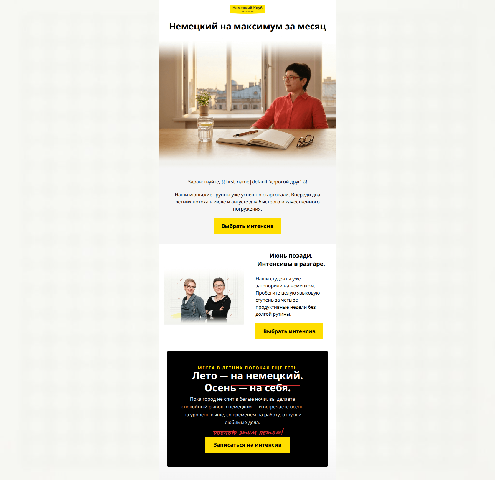
84/100This email effectively utilizes Deutsch-Klub’s ‘academic editorial’ brand identity to present a compelling seasonal offer. The value proposition—finishing a whole language level in four weeks—is clear and perfectly aligned with the professional, goal-oriented audience. The visual hierarchy is strong, particularly the high-contrast CTA buttons and the brand-consistent ‘red pen’ correction in the footer block. However, the email suffers from internal repetition; the middle two-column section essentially restates the information provided in the first text block without adding new evidence or deeper urgency.
Create Your Own
Generate professional email designs like this one in seconds with Kopi AI.
Email Details
- Subject Line
- Немецкий на лето: успейте на июль и август
- Brand
- Deutsch-Klub
- Industry
- Other
- Email Type
- Promotional
- Created
- June 22, 2026
Brand Colors
Email Copy
Preview text: Июньские группы уже вовсю занимаются. Успейте присоединиться к потокам в июле и августе для быстрого старта.
Немецкий на максимум за месяц
Здравствуйте, дорогой друг!
Наши июньские группы уже успешно стартовали. Впереди два летних потока в июле и августе для быстрого и качественного погружения.
→ Выбрать интенсив
Июнь позади. Интенсивы в разгаре.
Наши студенты уже заговорили на немецком. Пробегите целую языковую ступень за четыре продуктивные недели без долгой рутины.
→ Выбрать интенсив
Why This Email Works
This email effectively utilizes Deutsch-Klub’s ‘academic editorial’ brand identity to present a compelling seasonal offer. The value proposition—finishing a whole language level in four weeks—is clear and perfectly aligned with the professional, goal-oriented audience. The visual hierarchy is strong, particularly the high-contrast CTA buttons and the brand-consistent ‘red pen’ correction in the footer block. However, the email suffers from internal repetition; the middle two-column section essentially restates the information provided in the first text block without adding new evidence or deeper urgency.
Hero Impact
82/100- Clear, bold headline that immediately communicates the 'What' and 'How long'.
- Professional aesthetic that aligns with a high-value educational institution.
Content Structure & Flow
75/100- Strong 'Inverted Pyramid' in the final black block draws focus directly to the final CTA.
- Clear seasonal relevance.
Call-to-Action Strength
98/100- Perfect color contrast (Yellow on White/Black).
- Uniformity of destination ensures no user friction.
- Consistent action-verb usage ('Выбрать' / 'Записаться').
Message Clarity & Tone
90/100- Focus on 'outcome' (completing a level) over 'process'.
- No-nonsense, professional language.
Copy Conciseness & Word Economy
72/100- The copy in the final black block is exceptionally tight and evocative.
Visual Hierarchy & Layout
88/100- Expert use of brand colors to create focal points.
- The 'red pen' effect in the final block is a great nod to the 'teacher's authority' brand pillar.
Quick Wins
- Delete the first text block ('Здравствуйте... Выбрать интенсив') and move the greeting directly above the 50/50 split section to reduce redundancy.
- Bold the 'one language level' (целую языковую ступень) text in the second section to make it pop for scanners.

Create Professional Email Designs
Generate beautiful, on-brand email designs in seconds. Just enter your brand URL and let AI do the rest.